Inflation in the EU Zone
Sep 12, 2023
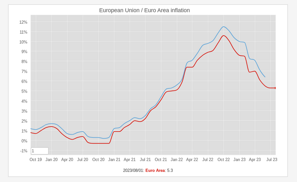
On the Eurostas website, inflation data for the Eurozone and the European Union reveals a decrease when compared to the peak observed nearly one year ago. Nevertheless, as reported by Euronews, the European Commission has revised its economic projections downward, citing that continuously high prices for goods and services are exerting a more substantial adverse influence than originally foreseen.
In 2023 and 2024, it is anticipated that inflation within the nations utilizing the common currency will climb to 5.6% and 2.9%, respectively. However, these figures still fall significantly short of the European Central Bank's (ECB) annual target of 2%, which it aims to attain through interest rate increases.
Hotest Day in Record
Jul 6, 2023
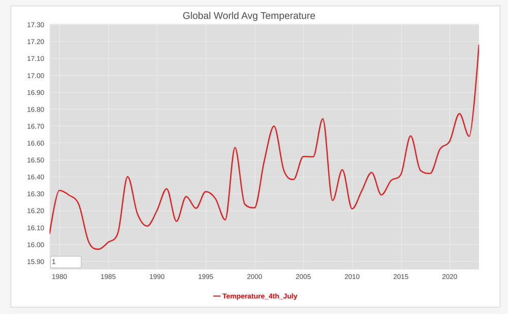 Meteorological organizations and climate research institutions maintain historical weather data and climate records, including temperature measurements from various locations. The Climate Change Institute at the univsersity of main is one of those institutions. And accordingly to the data collected since 1976, yesterday while the US was celebratiing their US independence day, that day turned out to be the hotest in record on that dataset.
Inflation in Europe 2021 - 2023
Apr 13, 2023
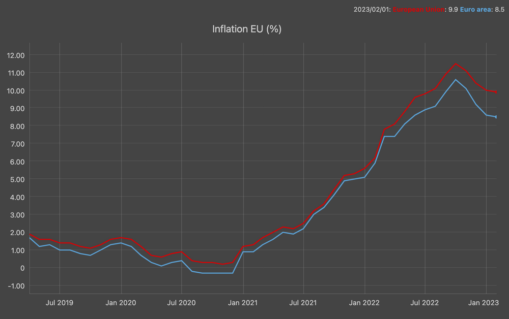 The inflation in Europe has been on the rise since the start of 2021, driven by a number of factors, including the COVID-19 pandemic, the war in Ukraine, and supply chain disruptions. In October 2022, inflation in the Eurozone reached an all-time high of 10.6%. It has since declined slightly, but it is still well above the European Central Bank's target of 2%.
The chart above generated with data provided by Eurostat, shows this trend, including the October peak and the downwards trend.
The inflation in Europe has been on the rise since the start of 2021, driven by a number of factors, including the COVID-19 pandemic, the war in Ukraine, and supply chain disruptions. In October 2022, inflation in the Eurozone reached an all-time high of 10.6%. It has since declined slightly, but it is still well above the European Central Bank's target of 2%.
The chart above generated with data provided by Eurostat, shows this trend, including the October peak and the downwards trend. State of JS Frontend Libraries
Jan 19, 2023

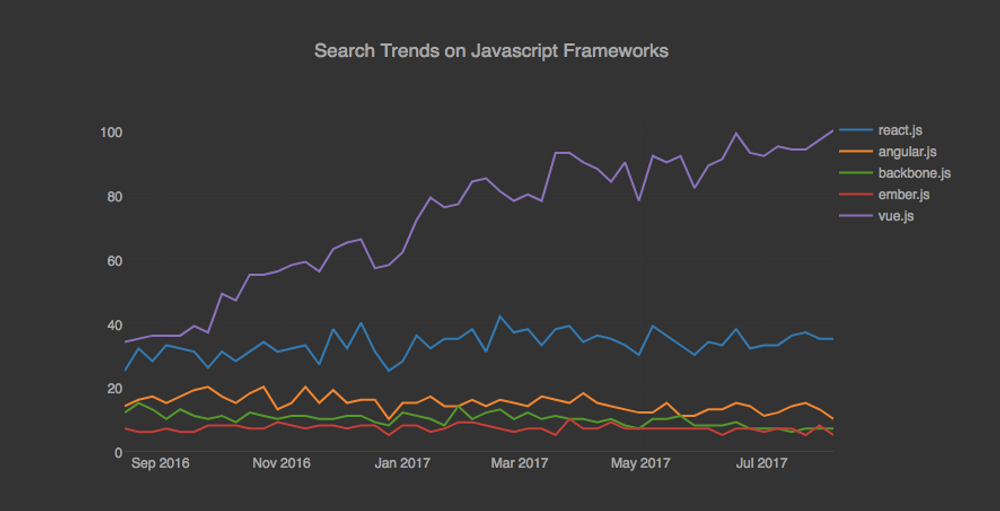
State of Javascript is an online survey that since 2016 collects and analyze data from JS developers in order to detect the current trends of ecosystems and identify the upconming trends. Quite interesting!. A couple of days ago the 2022 version was released and the results are quite interesting.
React continues to be very strong both in number of users and its retention ratio (percentage of users who would use a library again). I have been lucky to work this library during the last years of my professional life and despite its drawbacks, I can understand why is stil quite appealing.
It is also interesting to see what happens with the other two big ones (Angular and Vue.js):


While Vue.js has similar retention levels to react, its number of users has not yet reached the same levels. Angular.js interest and retention levels are really low. This is surprising given that it is still one of the most sought after frameworks in the industry.
European countries starting to relax covid rules
Feb 20, 2022
Last Friday I learned that the day before the federal council of Switzerland had reached an agreement to relax the covid measures, so that the use of masks is limited to public transport and health institutions only. This morning I was reading that also in other European countries, these measures are being adopted also in other countries like the UK, Norway, France, Germany and Austria.
It is true that vaccination rates have reached important levels in most of these countries, that covid cases have decreased significantly and that fortunately omicron-related cases have been milder than previous variants; but in any case it feels a bit surreal to enter stores and restaurants without having to wear that mask that has been part of the essential accessories during these long months of pandemic.
Fingers crossed that the situation continues to evolve so positively!.
Earth is warming significantly and rapidly
Jan 30, 2022
A couple of weeks ago, NASA issued a press release explaining that "Earth’s global average surface temperature in 2021 tied with 2018 as the sixth warmest on record, according to independent analyses done by NASA and the National Oceanic and Atmospheric Administration"
The NASA Administrator Bill Nelson was sounding the alarm in the same PR: "Eight of the top 10 warmest years on our planet occurred in the last decade ...". The news was barely cover by the mainstream media, echoing some of the points exposed in the recently brilliant movie "Don't look up" by Adam McKay.
Global Warming is real and the issue should be taken seriously by each goverment and each citizen of this planet earth.
Omicron is spreading like crazy
Jan 12, 2022
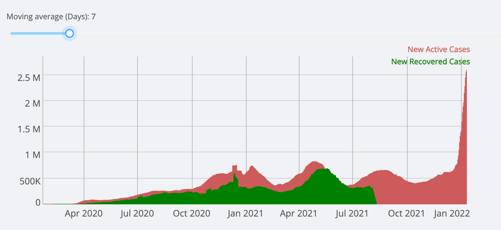
Almost two years ago I created a dashboard to track the Covid-19 cases based on data provided by the Center for Systems Science and Engineering (CSSE) at Johns Hopkins University. When I deployed that little application, I thought it would only be useful for a couple of months.
Almost two years later, it is still useful for tracking cases in different countries and following trends at the national or global level. In the different podcasts I follow, they have mentioned in the last couple of weeks that the omicron variant is different, in the sense that it is way much more contagious, but does not affect the lungs in the same way as the previous variants did.
Last night I was checking my dashboard and indeed the number of cases has skyrocketed, more than with any other variant. Fortunately the number of deaths associated with the virus has remained stable as you can see above. It is still true that this huge number of cases will necessarily add additional stress on health care systems around the world.
Although we are all sick to death of this pandemic, we must continue to get vaccinated and take protective measures to avoid the virus as much as possible.
US Northwest Melting
Jun 30, 2021
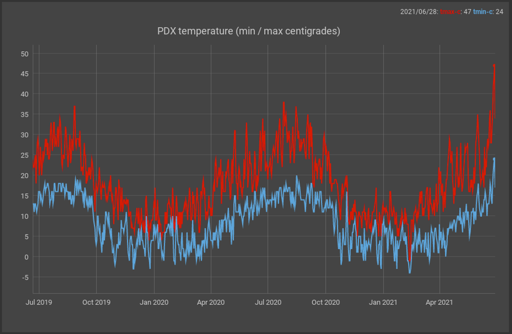
I have been reading the news for the last few days as the northwestern United States has experienced a strong heat wave that has broken all records in its major cities including Seattle and Portland.
There are even reports that it is mentioned that part of the infrastructure of those cities is literally melting due to that heat wave. The PDX airport maintains records of the highest and lowest temperatures every day since 1938 (see charts above) and when observing a graph of these data it is clear that the temperatures of the last days are surprising for that region of the country.
I have been saying it for a while in this blog: Global warming is not a joke!
COVID-19 Situation in Switzerland in November
Nov 17, 2020


The number of cases of covid-19 in Switzerland increased dramatically in November, reaching more than 10,000 at the beginning of the month which forced the cantonal and federal authorities to take strict measures to prevent contagion.
One of the main differences with respect to the wave that occurred during the spring time, is that the number of hospitalizations has increased significantly as can be seen in the graph above. We hope that those measures taken by the authorities will help to control this new peak. Of course everybody has to their part: #wearamask.
COVID-19: Cases increasing across Europe
Sep 20, 2020
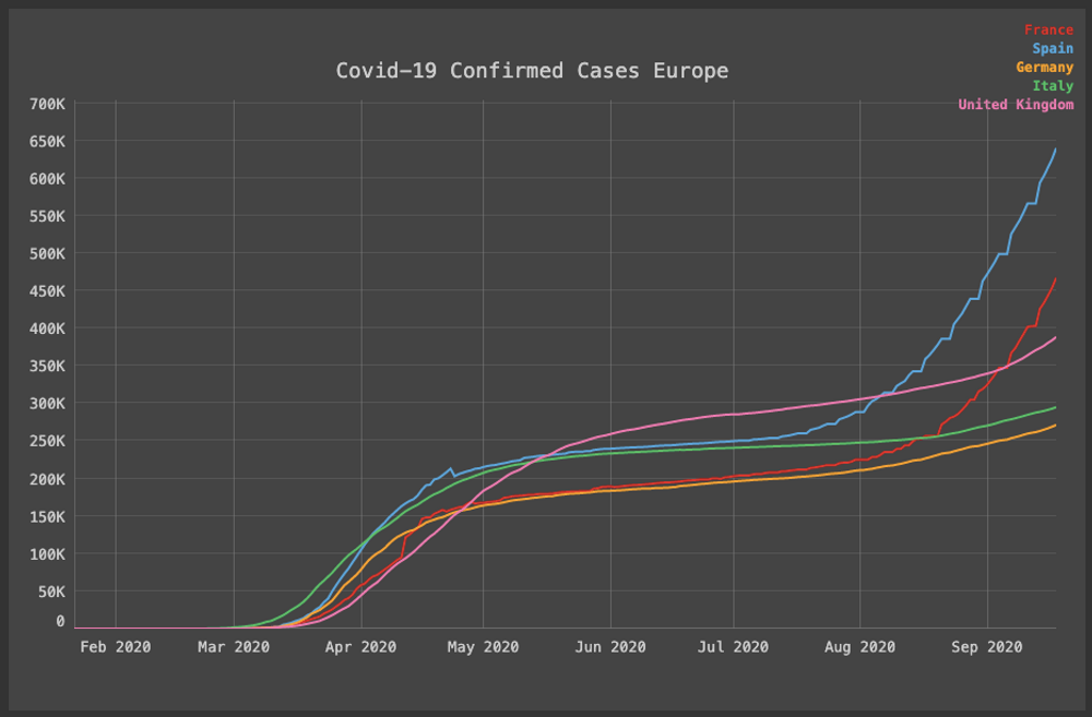
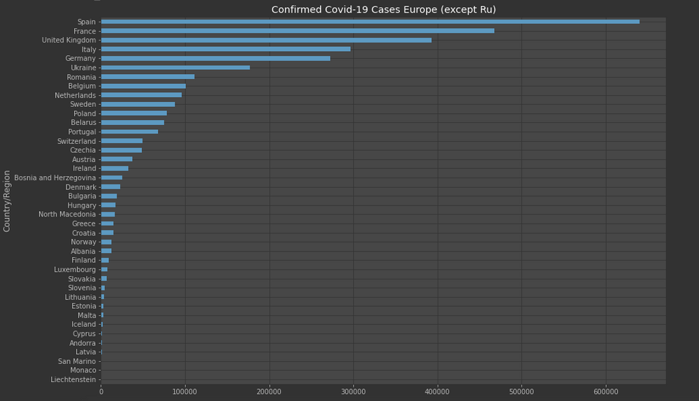
According to the EDCD website, in many countries across the EU/EEA and the UK, an increase of COVID-19 cases is being observed following the lifting of lockdowns and the relaxation of preventive measures such as physical distancing.
This new "wave" has been reported regarding countries such as Spain and France where the timeseries graph of confirmed cases shows a clear sigmoid curve. I personally understand the "COVID-19 Fatigue", but the virus is still there, and it's not possible to forget about it.
COVID-19 in Switzerland
Aug 26, 2020


Both in Basel city and Zurich it is required to wear facemask with the objective to reduce the COVID-19 transmission. The country flattened the curve but as soon as it began to reopen, the cases started to up again. The cantons of Geneva, Vaud and Zurich are the most affected as it can be observed in the previous graph.
GDP and COVID-19 in Europe
Aug 03, 2020
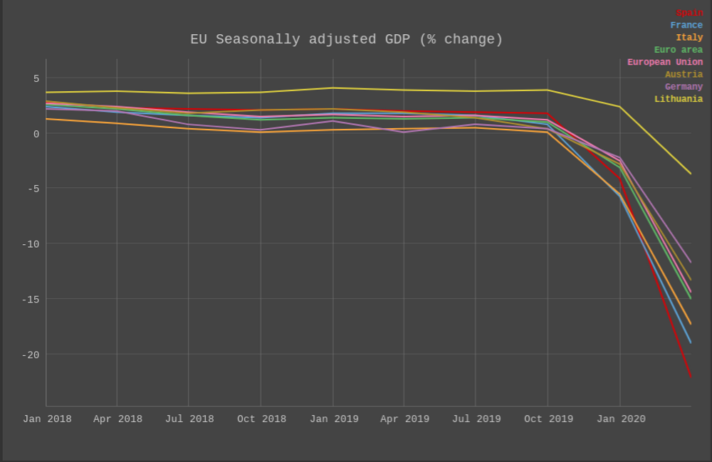
A couple of days Eurostat released a preliminary report of the GDP growth rate in the EU and Euro zones. It's not not surprising but the COVID-19 situation and the required mitigation measures have taken a toll in the economy in Europe. The report discussed how "Seasonally adjusted GDP decreased by 12.1% in the euro area and by 11.9% in the EU, compared with the previous quarter," The graph above shows this dramatic trend.
Unemployment rate in the European countries affected by the 2008 crisis
Feb 24, 2020
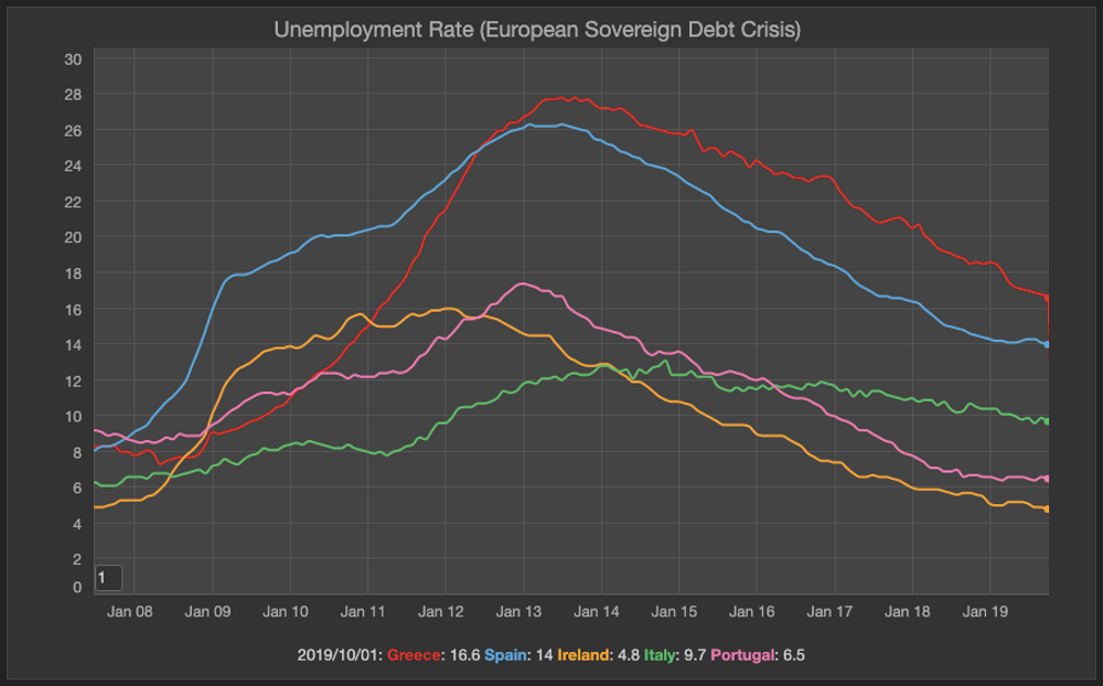
The 2008 Crisis, with the collapse of Iceland’s banking system, spread primarily to Portugal, Italy, Ireland, Greece, and Spain in 2009. 10 years later most of this countries have bounced back, but still unemployment is high in countries like Greece and Spain, compared to points before the crisis started.
US Democratic primaries search trends
Feb 02, 2020
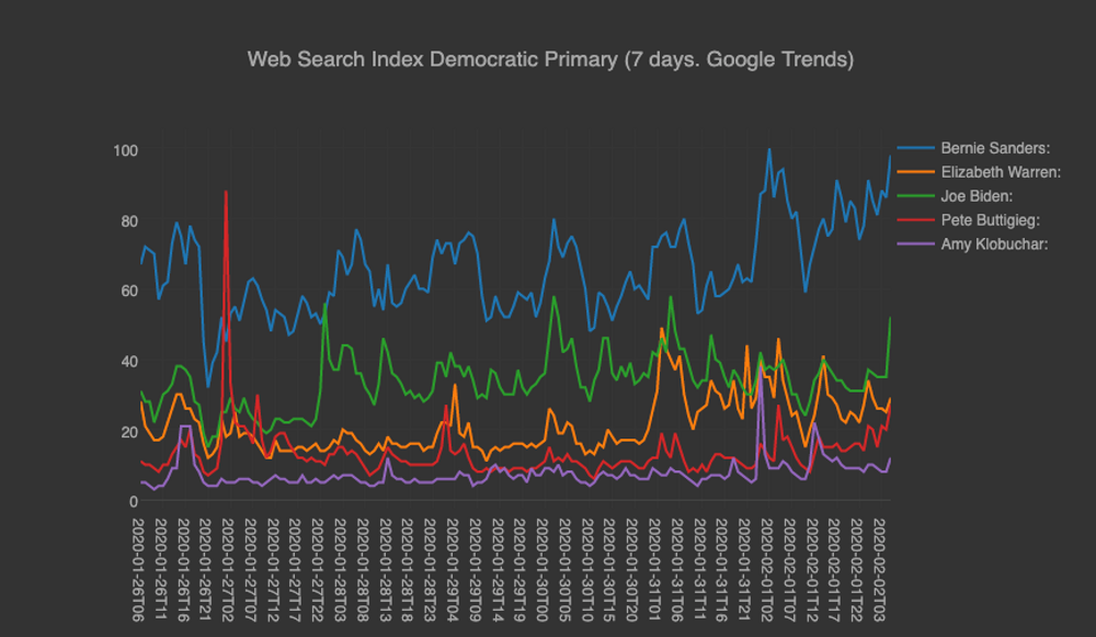
The US democratic primaries are around the corner with the first state voting next monday. I was curious how the Google Search Trends in the last 7 days, reflect on each one of top tier candidates. Bernie Sanders is clearly winning on that “interest” field. Interesting to see what will happen in the actual Iowa caucuses.
100 seconds to midnight
Jan 27, 2020
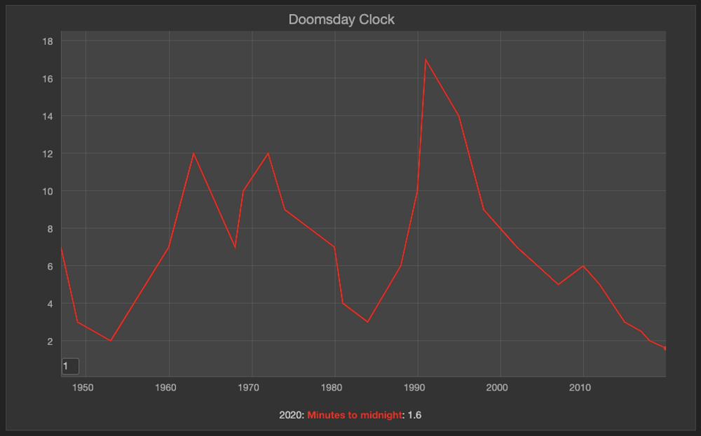
A couple of days ago I stumble into the headline ‘Doomsday Clock is now 100 seconds from midnight’, published by space.com. I wasn’t aware but this clock is a metaphor for close we are in the world to a man-made global catastrophe. This device was setup in 1947 by the members of the Bulletin of the Atomic Scientists, when nuclear weapons were considered the main threat. Today the global warming issue is also considered in the equation on how to calculate this time.
Unfortunately but not surpising this time around in 2020, it’s the closest it has been to midnight. 2019 was the second hottest year in history, the growing inestability in the middle east and even the possible AI use in warfare don’t help to move this time backwards. The picture is not a pretty one but there is at least one more voice reminding world leaders what is at stake here.
The hotest June and July ever recorded
Sep 18, 2019
Last summer felt really hot! There were quite a few days when most of the headlines in the news were about how the thermometer was about to break historic records in many cities. It is no surprising therefore that the earth temperature change measured by NASA during the months of June and July was the highest ever recorded.
The "breaking record" headlines are following the same pattern year after year. I don't remember anytime in my lifetime when the global warming was such a clear and present danger!.
Mass shootings in the US Again
Aug 5, 2019
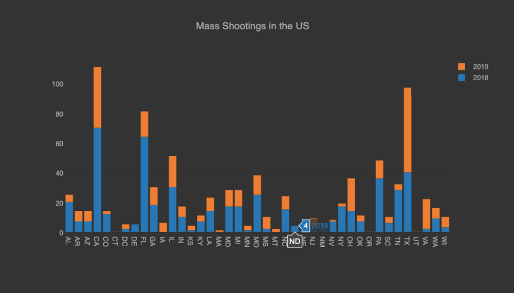
In february last year, I was blogging about how the mass shootings in the US were happening constantly and 86 people had been killed at the time of the Parkland massacre (528 ended up dying that year according to the data from the massshootingtracker.org project). The current year unfortunately has followed a similar pattern (347 people have been killed) and as the NY Times put it: "In a country that has become nearly numb to men with guns opening fire in schools, at concerts and in churches, the back-to-back bursts of gun violence in less than 24 hours were enough to leave the public stunned and shaken..."
The shootings have followed a darker tone this time, as hate speech has been added to the motivation of these horrible events, like the ones that just happened in El Paso, TX.
Tour de France Winners
Jul 30, 2019
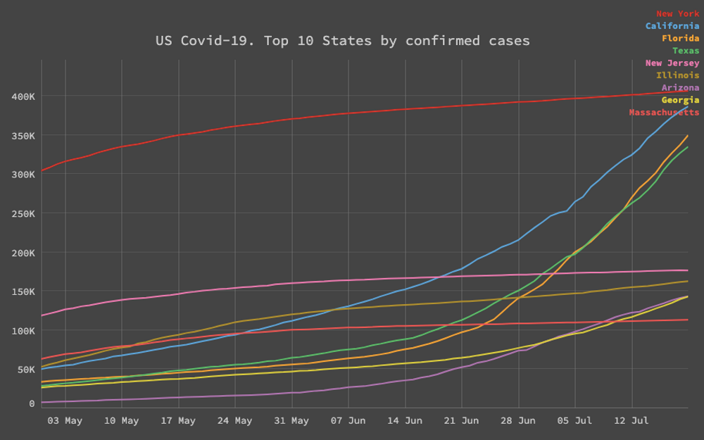
The US has more than 3.7 Million confirmed cases of Covid-19 cases and it's therefore the country with the highest number of those in the world. What it has been in the news lately is how states that rushed up to reopen as quickly as possible such as Texas and Florida, have an steady and exponencial increase on the total number of cases.
Next to California, who has seen also a sharp increase in the number cases, mainly in Los Angeles county, those states are getting closer to match the numbers of New York. It feels like a cautionary tale, that "going back to normal", won't as the precovid-19 normal until there is an effective vaccine or treatment in place.
Fortunately the an mRNA vaccine trial preliminary report in the NEJM stated the vaccine induced anti–SARS-CoV-2 immune responses in all participants, and no trial-limiting safety concerns were identified. Crossing the fingers for the next phases of those promising results.
Employment rate in Europe
Jun 09, 2019
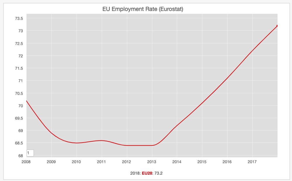
In 2018, the employment rate in the European Union was 73.2%, compared to 72.2% in 2017, as reported by Eurostat. Those results shows a continuous growth in the region as can be observed in the chart above. Fortunately the dip recorded after the financial crisis of 2008 is not present anymore.
Democratic Primaries Polls
May 07, 2019
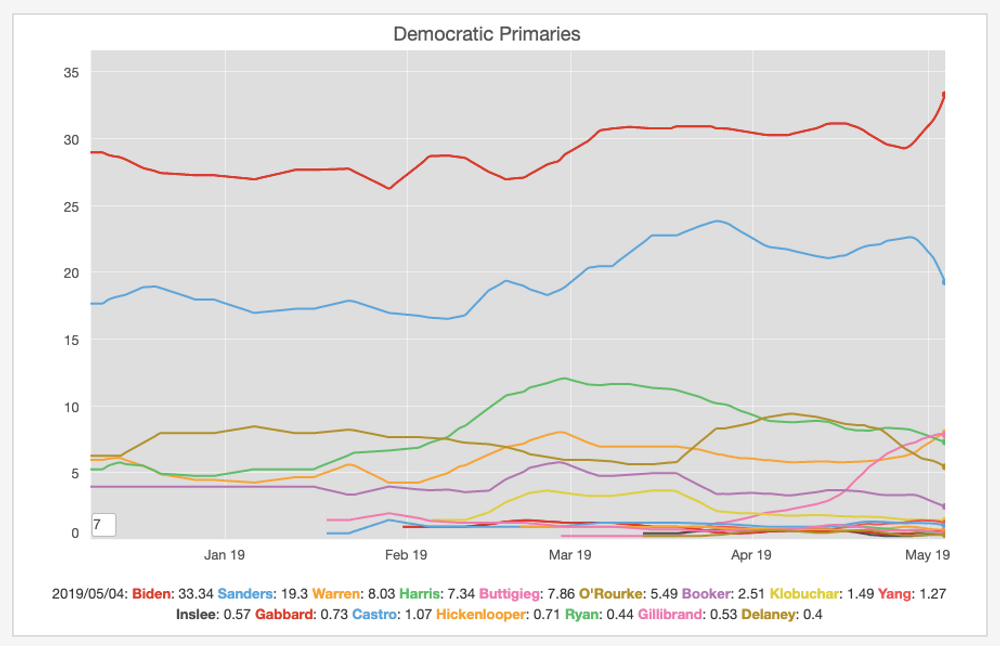
On the 25th of April, Joe Biden announced he was joining the crowded democratic primaries race. The aggregate polls show an interesting trend. Even before his announcement he was leading the polls, but there was a clear but in his numbers afterwards. It's interesting to see what will happen in the months ahead. Will those trends continue and the main race is going to be between him a Bernie Sanders? or will there be another candaidate getting into the top spot?. Time will tell.
Ireland Unemployment Rate
Apr 18, 2019
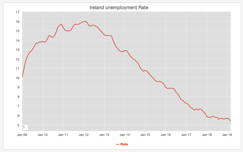
I have been tracking the unemployment in Ireland using data from the central office of statistics in Ireland website cso.ie for some time and the changes are remarkable compared to the peak of unemployment in 2012. Currently the figure stands in 5.4% for the month of March 2019.
Brexit and GBP
Feb 28, 2019
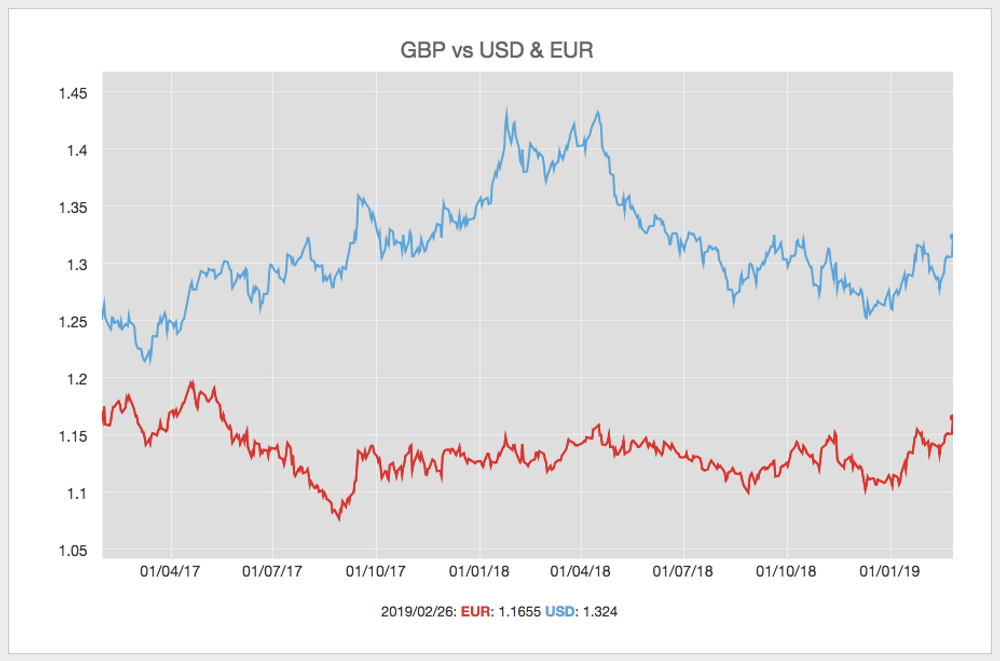
The official FX Data from the bank of england site, shows the changes related to the whole Brexit process. Yesterday it was reported that MPs have voted overwhelmingly to hold Theresa May to her commitment to give them a vote on delaying Brexit if her withdrawal agreement fails to win a majority within the next two weeks.. It's interesting how everytime Brexit seems to be further away ... the better the British currency performs.
US Congress party control over time
Nov 28, 2018
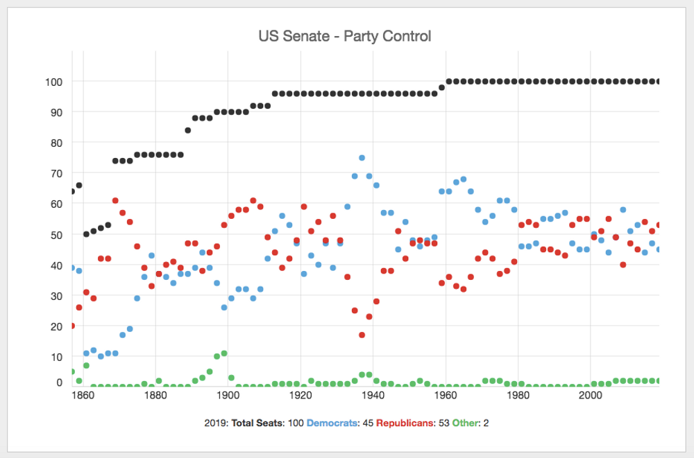
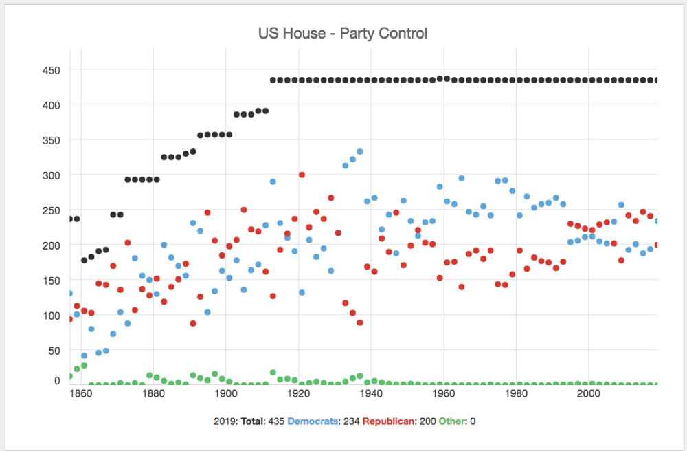
The previous charts show the US Senate and US House party control over time since the 19th century.
Air travel statistics in Europe
Aug 19, 2018
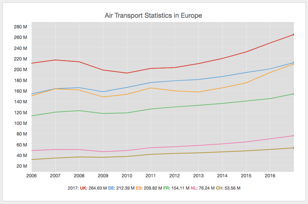
Eurostats offers an interesting dataset about air travel in the continent, including the number of passengers per country. As you observe in the previous chart, the United Kingdom, Germany and Spain, had the highest number of air travelers through their airports in 2017.
Mass shootings in the US
Feb 15, 2018
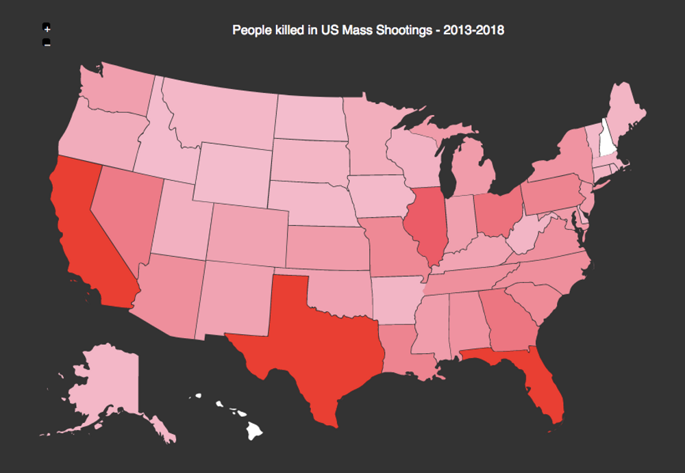
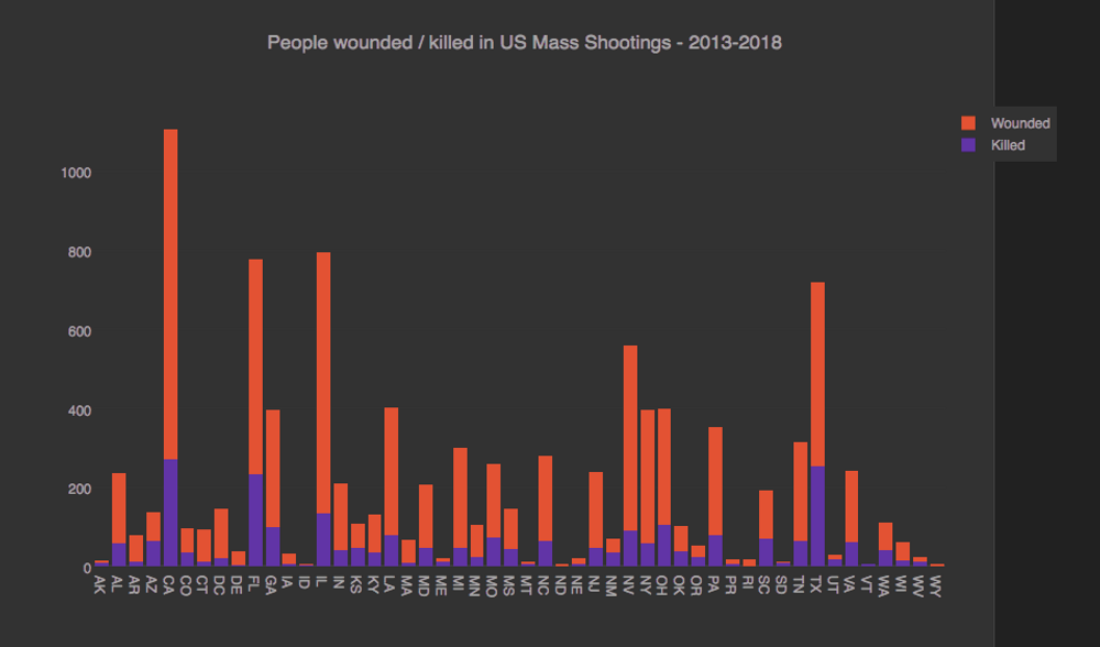
Unfortunately another day and another mass shooting in the US (In Florida this time). The massshootingtracker.org website compiles all the public data available of those type of incidents in the news and the numbers are staggering. Just this year 86 people have been killed and 142 wounded on those type of incidents. The charts above show how this affect every single state on that country.
Is it time now to discuss sensible gun control laws? or how many more are needed?
Mobile OS Market Share
Jan 30, 2018
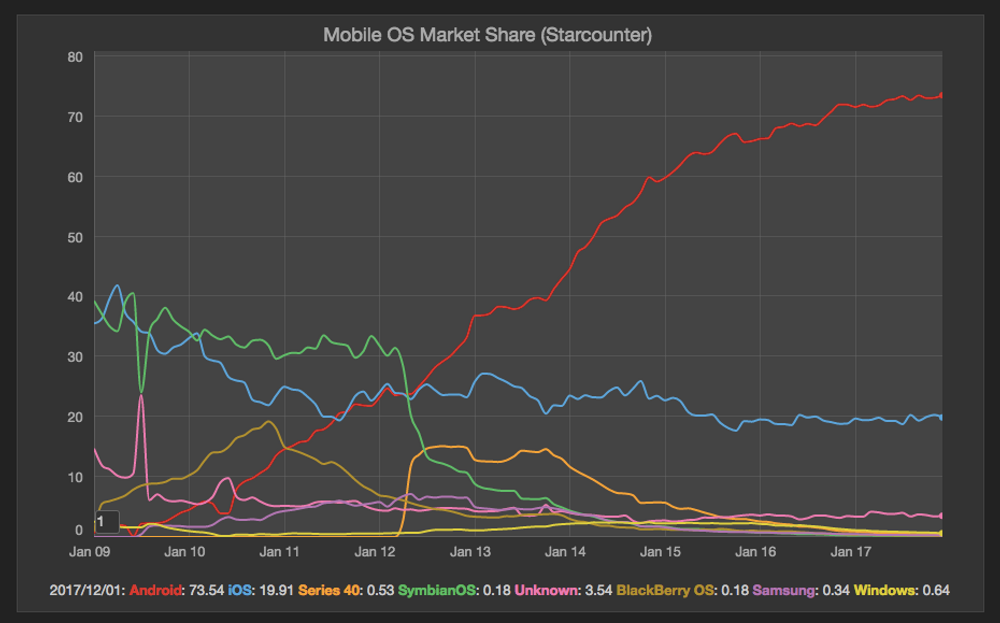
A couple of weeks ago an article in business insider stated that Apple’s iOS was losing market share in Europe's four largest markets (Great Britain, France, Italy, and Spain) besides Japan. I haven't checked the mobile global market in a while and today checking the starcounter stats, Android is clearly dominant on a global scale. It's true Android has some issues, including the well known fragmentation, but I still prefer the flexibility of this OS over the iOS one.
Tropical Storms per year in the atlantic
Sep 06, 2017

In a couple of week we have in the news stories about Harvey and now Irma. Harvey caused a lot of havoc in Texas and now Irma seems to be on the same path in the caribbean islands and florida. The Hurricane Division of the Atlantic Oceanographic and Meteorological Laboratories track on their website the number of storms per year and based on the data it looks like the number is steadly increasing. sigh ... climate change.
Vue.js very popular in the last year
Aug 13, 2017
Some weeks ago when I finished working, I was about to leave the building and I saw in the wall a sheet of paper with information about a vue.js meetup here in Berlin. I thought I have never heard about this vue.js and the more I read, the more interested I became into this front-end javascript framework.
Google Search trends show vue.js has been the post popular framework in the last 12 months. Vue.js is self described as "a progressive framework for building user interfaces. Unlike other monolithic frameworks, Vue is designed from the ground up to be incrementally adoptable". I gave it a go and it's quite interesting.
Average Internet Connection Speed
Jun 08, 2017
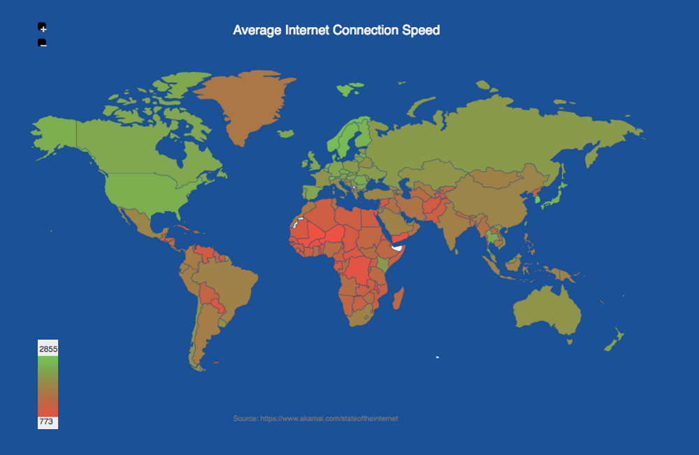
The content delivery company Akami publishes an State of the Internet report where it's possible to get an internet connection speeds and broadband adoption by country. On this dataset is not surprising that South Korea is on top of the chart:
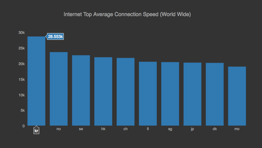
Followed by Norway and Sweden. Most of the South American and African countries are still behind.
Unemployment in Europe in April 17
Jun 05, 2017

At the end of last month Eurostat published a report related to the Unemployment Rate in Europe. This reports shows how Germany, Malta and Czechia had the lowest rates, whole Greece and Spain still have the highest. Still it's remarkable how it has decrease both in Spain and Ireland.
Uk general election 2017 Polls
May 31, 2017

When Theresa May announced her intention to seek a general election back in April, the conservative lead on the polls over labor was around 21%. As you can see in the graph above this lead has been shrinking over time. It's very interesting to see what is going to happen in this election next month.
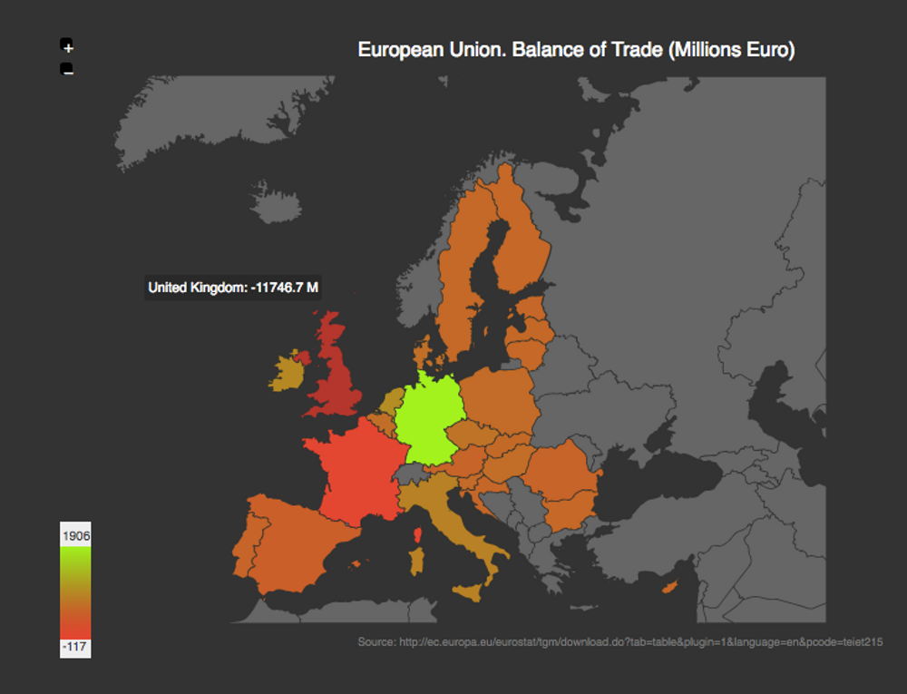
EU Balance Trade
Apr 01, 2017
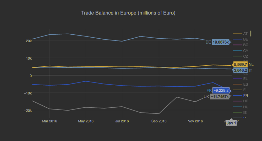
Eurostats offers a balance of trade dataset showing the trade surplus and deficit of each one of the European Union members. Germany is still the country with the highest surplus, compared to France and the UK that have the highest deficits:
Population in Europe Experiencing Depression
Mar 26, 2017

Eurostats has an interesting dataset showing the percentage of the population experiencing depression in Europe. The map above shows that Hungary, Portugal and Sweden and the countries with a higher percentage of population experiencing depressive symptoms.

A breakdown by Sex shows that Portugal is the contry with the highest percentage of female population experiencing depression.
Pay Gap in Europe
Mar 10, 2017
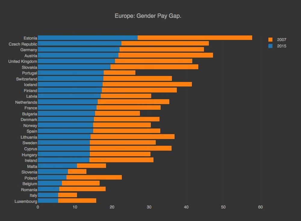
A couple of days ago, on march th 8th, it was the international women's day. I was chatting with some family member about this day should exist at all (there were arguing that the day should be everyday). I was checking the pay gap between Man in Women in the European countries and I think there is still a reason to celebrate this day.
Trump Polluting the news headlines
Feb 15, 2017
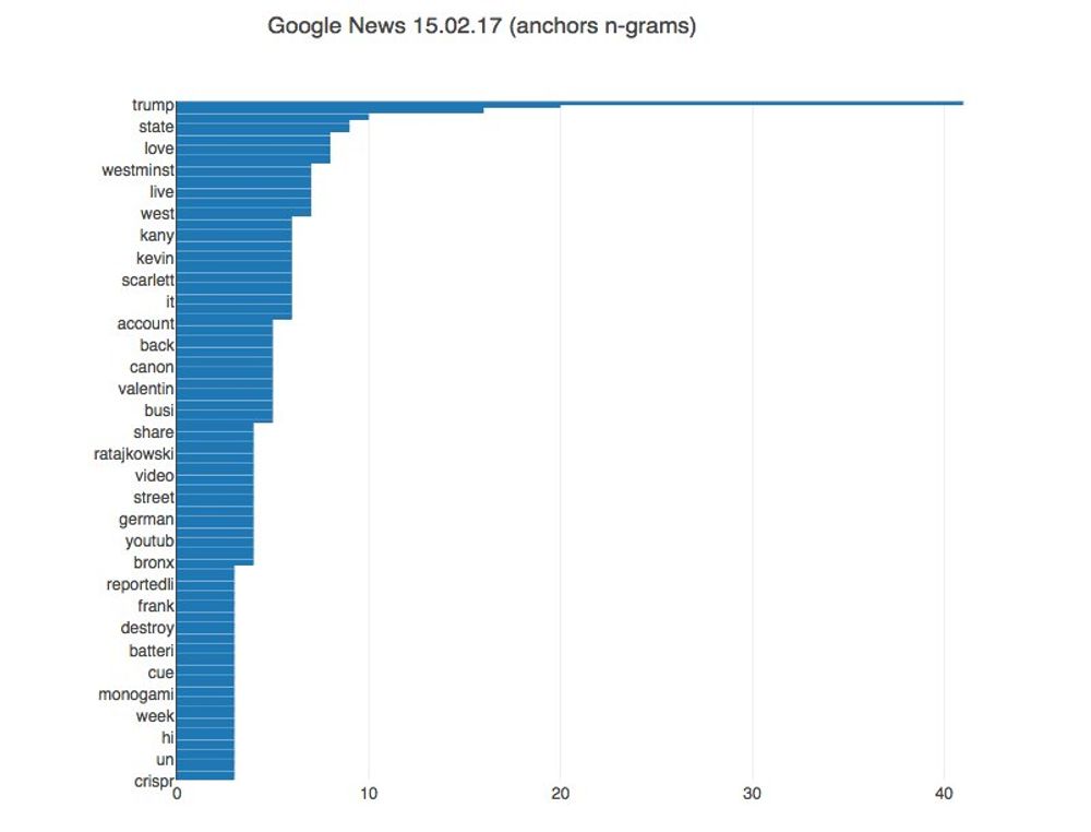
For many years now, Google News has been my main source for information since the algorithm stacks and order quite nicely headlines coming from multiple news sources. Since Trump was inagurated I had the subjective impression that his name is overtaking most of the headlines (He is newsworthy of course, but still). I was making a quick n-grams check on the headlines anchors and his name is indeed taking many of the headline spots.
Percentage Arable Land per Person
Feb 10, 2017
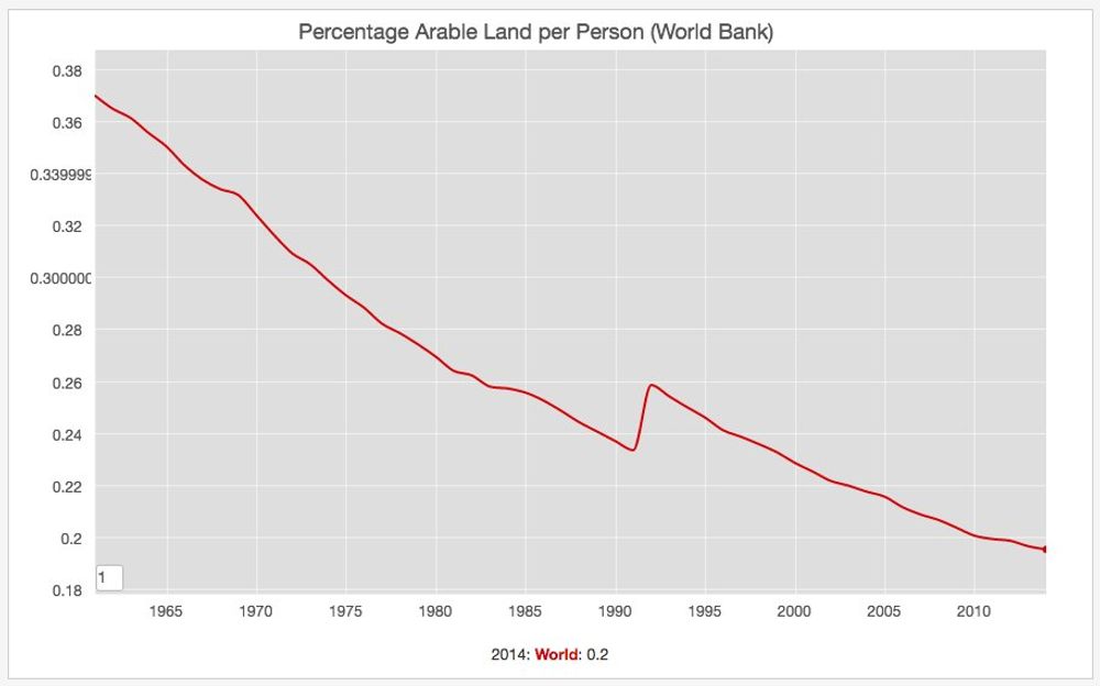
Data from the World Bank shows that the percentage. of arable land per person has been steadily decreasing since the 1960's until now.
Trump Unfavorable Ratings
Jan 24, 2017
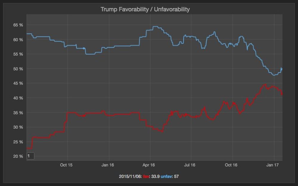
The polls aggregates from Real Clear Politics shows that Trump opinion has never been more favorable than unfavorable. In fact it has been reported he assumed office as one of the most unpopular presidents in the modern history. The trend show it's again down after a short increase following the election.
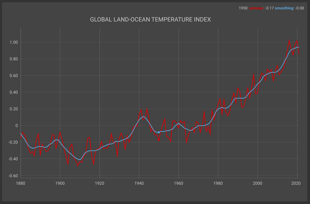
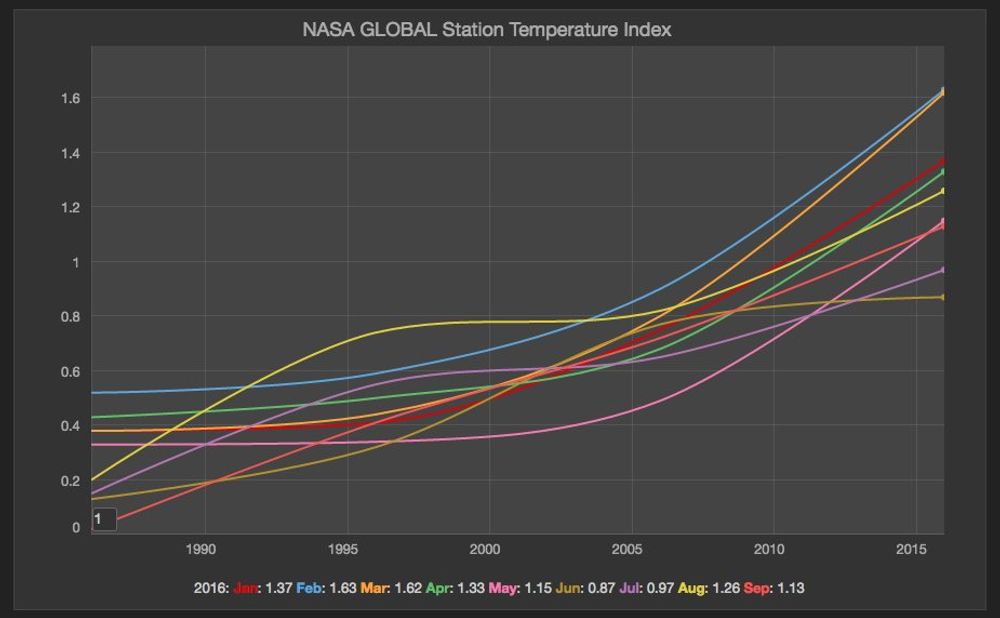
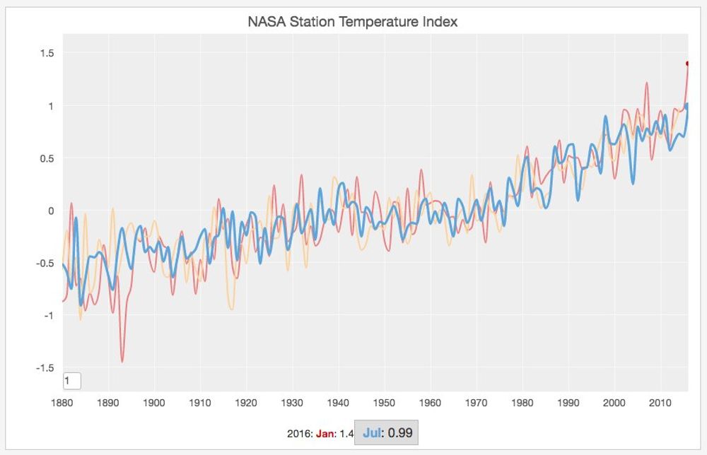
2016 Hottest Year Ever
Jan 18, 2017
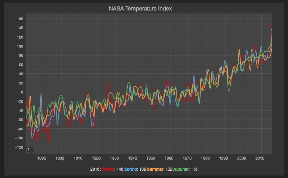
It's very unfortunate but not surprising that 2016 was the hottest year ever recorded. NASA revealed the consolidated reports and the data doesn't lie. Global warming is quite real. See the average by season chart.
Live births in Switzerland
Jan 17, 2017

Wikipedia has a useful page with a lot of stats about Switzerland Statistics. The chart above shows the number of live births per year. Very relevant information today.
Unemployment Rate in Europe
Jan 9, 2017


Eurostat updated its unemployment rates figures http://appsso.eurostat.ec.europa.eu/nui/show.do?dataset=une_rt_m&lang=en. Iceland has one the lowest unemployment rate in Europe (followed by the Czechia and Germany), while Greece still have the highest, followed by Spain.
CO2 Emissions per country
Jan 8, 2017
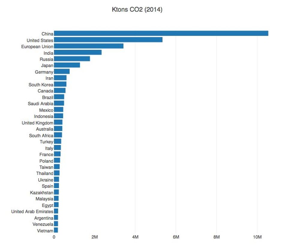
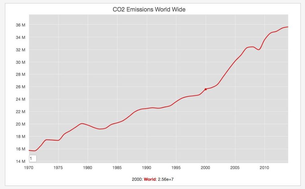
The European Union EDGAR database contains useful information about the CO2 emissions per country and worldwide. The previous graph shows the country with the highest CO2 Emissions (USA and China) and the total Emissions world wide. It's inside the spike the world experienced since 2000.
Trump tremendous defeat in California
Dec 29, 2016
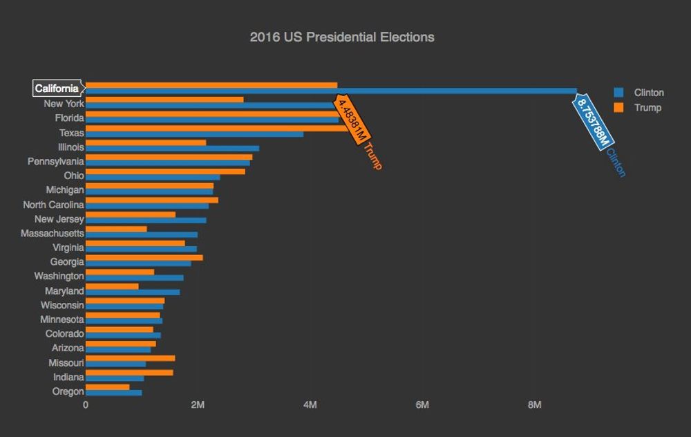
Looking at the final 2016 US presidential election results, it's remarkable how bad trump lost in California. 8.7 million vs 4.4 million votes. It's not surprising that on the days after the election the #calexit hashtag started to trend. Clinton won the popular vote, so many Americans will feel underrepresented based on the electoral college system they have in place, but nowhere this is more dramatic than in California.
Personal Money Transfers in the EU
Dec 11, 2016
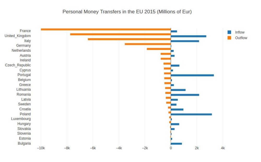
Interesting dataset from Eurostats regarding personal transfer inflow / outflow across the European Union. On one hand France has biggest negative balance and on the other side Poland has the biggest positive one.
Insane Irish GDP Growth
Nov 21, 2016
This morning I was checking the GDP growth data in the European nations and I found out that last year it was particularly high in Malta, Czechia, Iceland and Sweden ... but in Ireland it was insane!. An interesting article from The Irish Times, explains how despite this number being statistically correct it's due to huge multinational companies moving assets to their Irish branches, for tax reasons.
Global Warming Reminder
Nov 15, 2016
Not surprising. The earth temperature measured by NASA in September was the highest ever warmest month. http://data.giss.nasa.gov/gistemp/tabledata_v3/GLB.Ts.txt. This follows the same pattern as every month this year. The Paris climate agreement clearly recognized the wide impact of Global Warming, but with the recent results of the US Elections, this issue needs to be raised all the time.
Last US presidential polls
Nov 7, 2016

Alright, the last 4 way presidential polls still put Clinton slightly ahead. Crossing the fingers the lead will hold. Yesterday the FBI director sent a letter clarifying there was nothing new in the emails from last week, so I hope the voters in the US will be able to compare the flaws of the democratic nominee against the real sexists, racist, protectionist and xenophobic positions of the Republican nominee.
Android vs IOS market share 2016
Nov 1, 2016
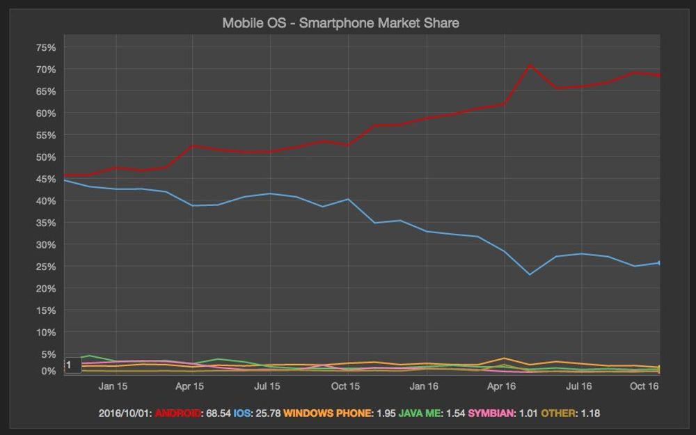
I haven't checked the Mobile OS market share in a while. According to net market share Android has 68.5% and IOS has 25.8% in the last month. I'm curious how this will be affected with the whole Note 7 issue. But still it's impressive the growth compared with just 2 years ago.
Halloween Interest in the World
Oct 31, 2016
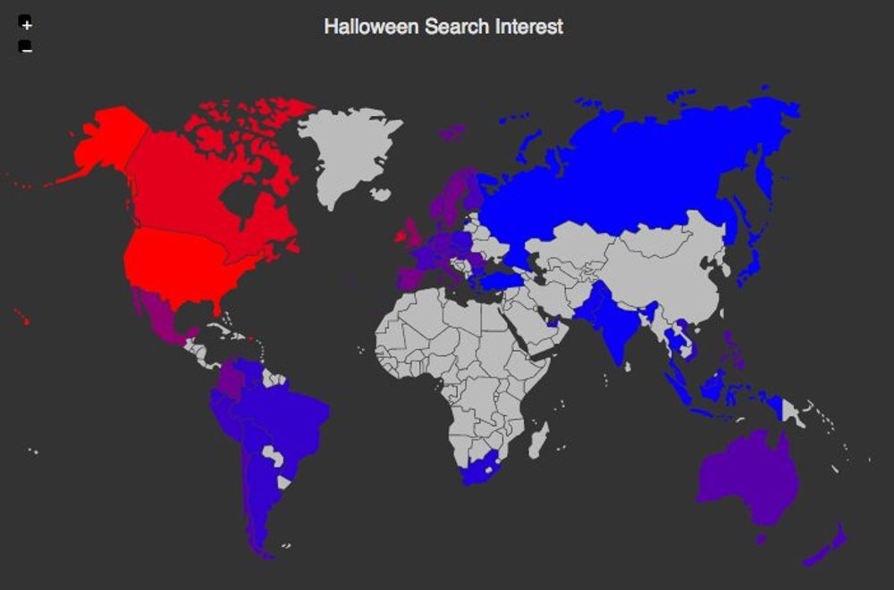
The Halloween query data from Google Search Trends shows some interesting points. The countries most interested in this tradition originated from Celtic harvest festivals are the US, Canada and Ireland
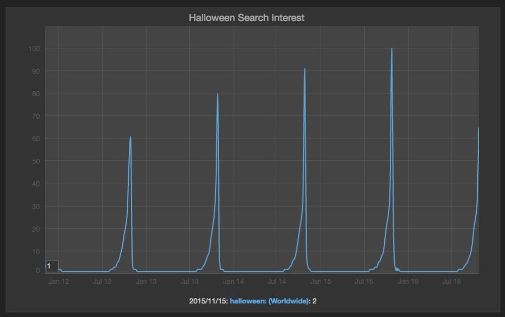
On the other hand the search queries for halloween always spiked a week before the actual celebration (Looking for costumes).
R vs Python in Data Science
Oct 29, 2016
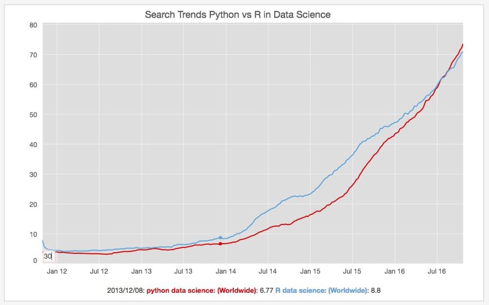
I have been using Python for many years and I recognize how powerful it is with libraries like Pandas and Scikit-Learn for Data Science. In a previous I have the opportunity to use R, but I haven't touched it in a while. I was curious to see what is the interest between in R vs Python in the Google Search Trends and you can see the graph above plotted with this data source.
Most popular Javascript Frameworks
Oct 17, 2016
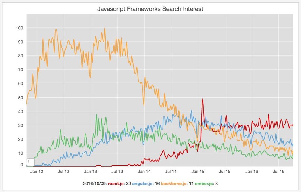
Last weekend I finish converting the FX calculator I developed during my career break to React.js. I have briefly touched some code at work but I wanted to get my hands dirty and understand better the advantages and the challenges of this library.
I was also checking today some interesting [Google Trends data](https://t.co/aCOxxTOhUo) about the most popular Javascript frameworks in terms of search interest and React is definitively winning the interest war.
Clinton vs Trump First Debate
Sep 29, 2016
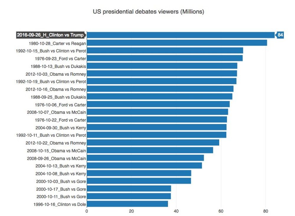
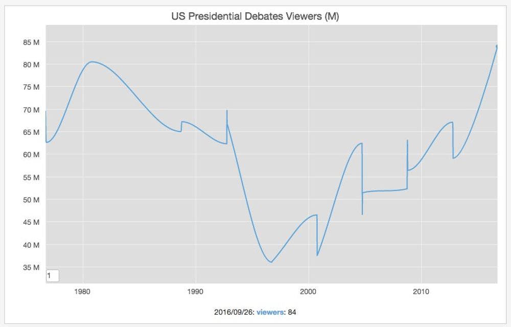
According to Nielsen, the presidential debates number of viewers are out, for the first debate between Trump and Clinton, and this was the most viewed debate in the history of the presidential debates (84 Million viewers). The second closest was the one that happened in 1980 between Reagan and Carter.
Search engines global market share
Sep 6, 2016
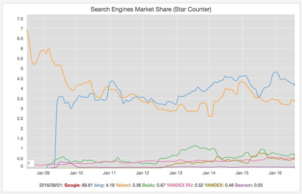
I haven't checked the global search engines market share in a while because clearly Google dominates in almost every country but yesterday I heard an interesting podcast on BBC about the power of Google and I was curious about the position of the 2nd and 3rd players. The chart above is generated with data from startcounter.
Wikimedia Visits by OS Family
Sep 2, 2016
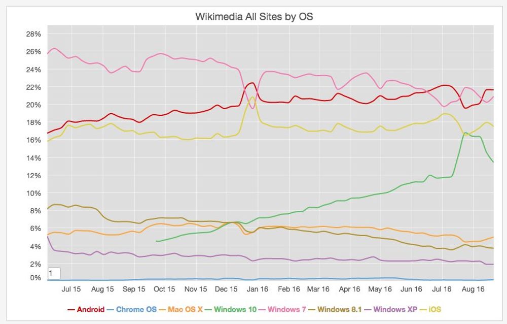
Alexa and Similar web rank Wikipedia as the 7th and 9th most visited site on the web, so the visit statistics produced by the foundation are a good proxy for getting data on the most popular platforms on the web. The previous chart shows the visits by OS family. As you can observe there windows 7 is the most popular desktop OS, but the mobile OS (Android and IOS) are responsible for almost 40% of the visits to those sites.
Global Warming Keeps Beating Records
Sep 1, 2016
According to an article published in the Guardian, the earth is warming at a pace unprecedented in 1,000 years. I discussed this point already three times in this blog, but I think it's worth to keep bring it up, because some people are not still convinced this is a real phenomenon.
Europe Crude Marriage Rate
Aug 17, 2016

The Eurostas office has an Interesting dataset containing the crude marriage rate data for the last decades across EU. It's quite remarkable how even if Portugal has one of the lowest rates in EU, it used to be one of highest in the 70's.
US Presidential Election Polls
Aug 16, 2016

The US presidential election is far from over, since there are still some days ahead until November, but it's comforting to see evidence in the polls that Trump's divisive campaign is not 'winning' at all.
Population Change in Europe
Aug 5, 2016

Eurostats have an interesting dataset showing the population change across Europe including both the natural change and the net migration contribution. The graph above shows how the rapid decline trend is slowly reversing, but how migration is the main component of this change.
Unemployment Rate in Ireland
Aug 4, 2016
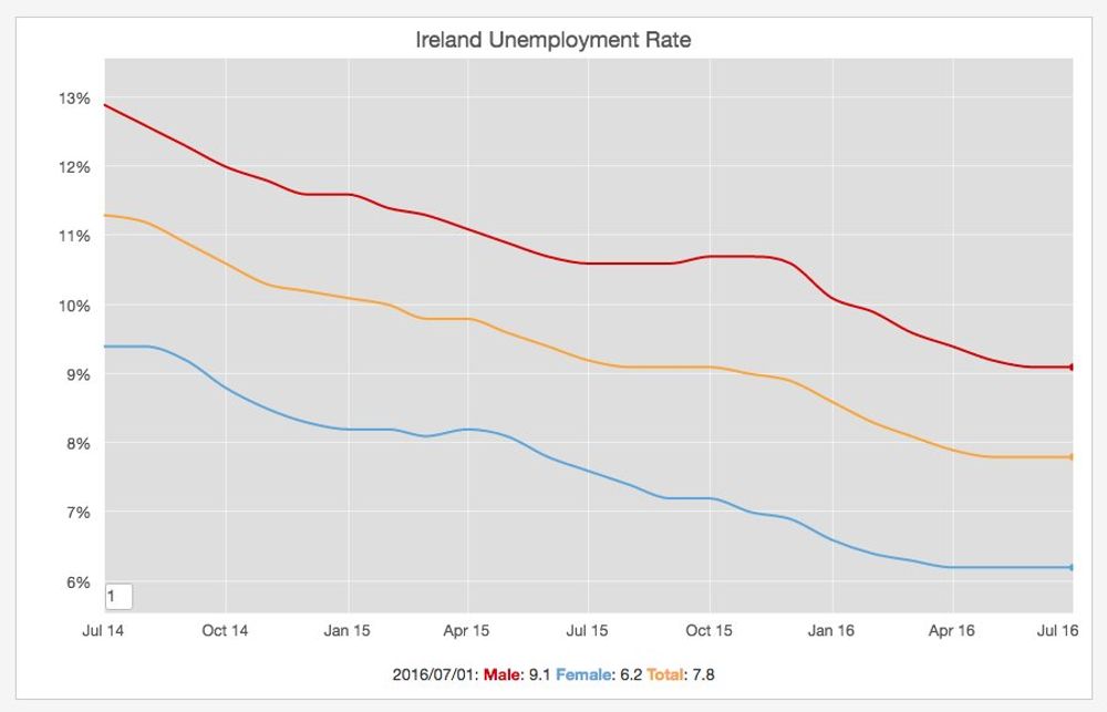
According to the central statistics office of ireland, the adjusted unemployment rate in the country during the last 2 months has been 7.8%. The trend is definitively going down. I blogged about it in January and it was more than 8% back then.
President Obama Approval Rate
Jul 28, 2016
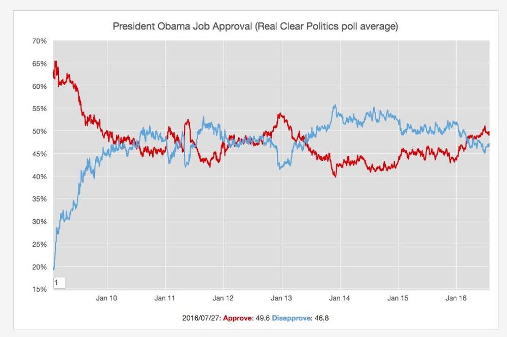
This morning I was reading in the fivethirtyeight site an interesting section dedicated to the US elections. They try to predict who will win the election based on the polls and historic data. They have been very accurate in the past so there are definitely an interesting source.
One of the articles linked on this site was a post titled why obama might be trump's biggest challenge where they discussed how president Obama is enjoying a high approval rate. The chart above is generated with the >>>Real Politics>"http://www.realclearpolitics.com/epolls/other/president_obama_job_approval-1044.html" data they were mentioning in the post.
US Violent Crime Drop
Jul 25, 2016
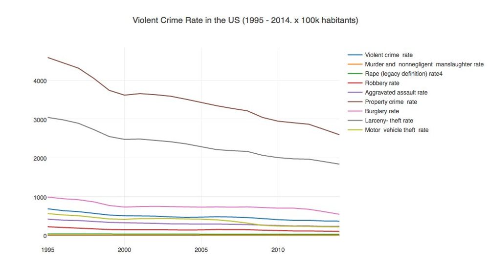
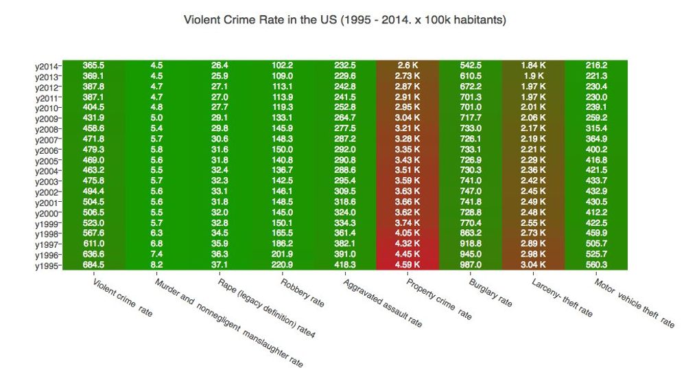
Last week tonight discussed how the RNC "fear" topic related to crime in the US was not backed by facts. The previous charts generated with FBI data support this.
React Trending
Jul 21, 2016
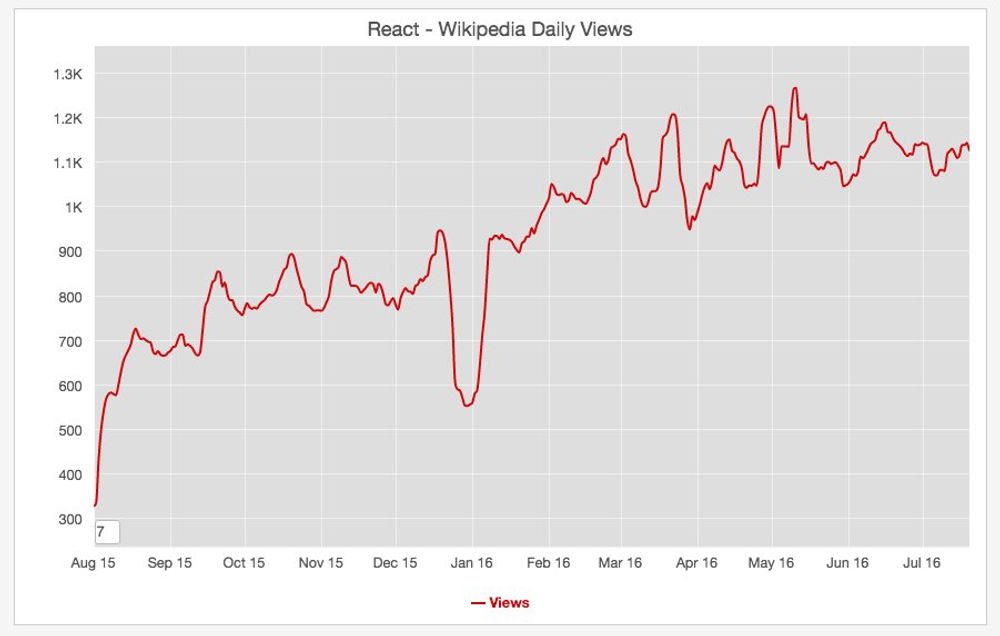
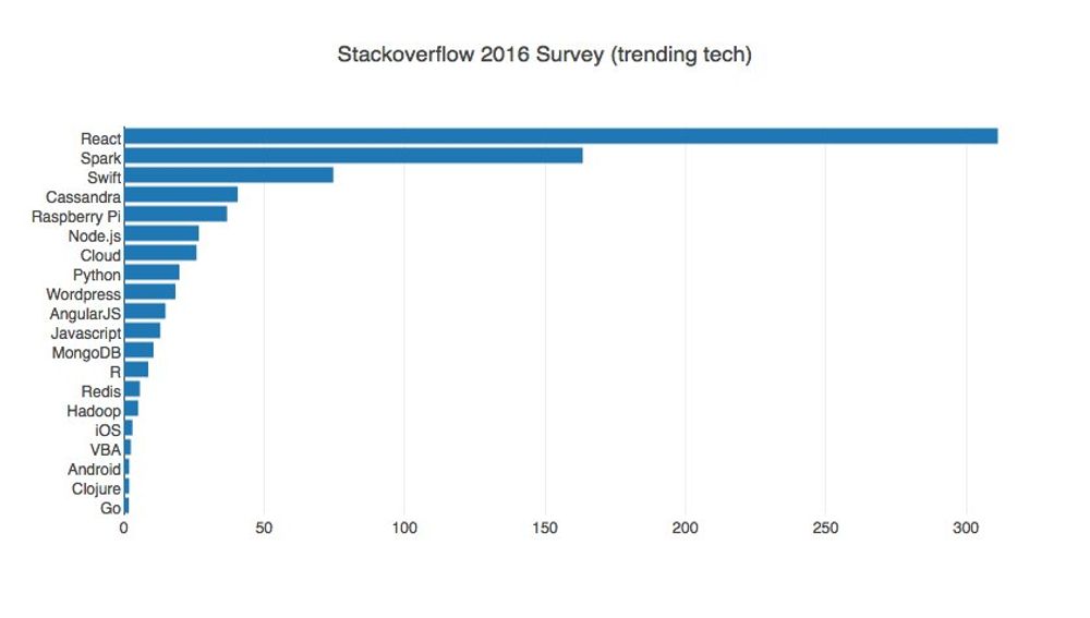
I was discussing it with a colleague a couple of days ago. The Facebook React is definitely going to stay around. Look on the previous graphs the wikipedia page views increase during the last year and the trend increase in stackoverflow.
Pokemon Go Madness
Jul 13, 2016
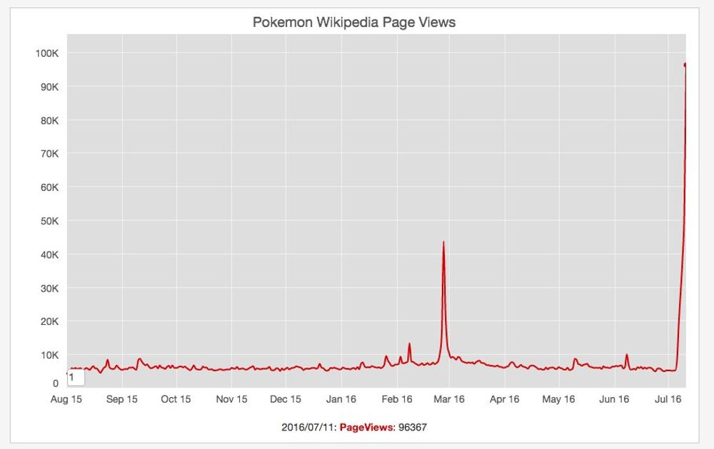
Last Monday we were chatting at the office how everybody is talking about this new augmented reality game: Pokemon Go. In a nutshell this game "allows players to capture, battle, and train virtual Pokémon who appear throughout the real world". I was checking the WIkipedia trends about the Pokemon page and its popularity has increased exponentially during the last 3 days.
Black Lives Matter
Jul 9, 2016
One of the most commented topics on the news this week were 2 separate incidents where black men were shot in what appear to be an excessive use of force by the police. Unfortunately these type of incidents have been a constant during the last years and that have led to the creation of Black Lives Matter, "an international activist movement, originating in the African-American community, that campaigns against violence toward black people"
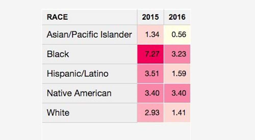
The guardian newspaper has a very interesting section where they track the total number of people killed in fatal shootings by the police in the US both in total and per million habitants. Using this data is clear that people from the black race proportionally died more frequently in those incidents than any other race in 2015 (and next to native americans in 2016).
If you read the numbers you will see the movement definitely has a point.
Unemployment In Europe
Jul 5, 2016


The charts above contain unemployment data extracted from the Eurostat data sources. Even if the trend is going down it still quite high in countries such as Spain and Greece.
Iceland Population
Jul 3, 2016
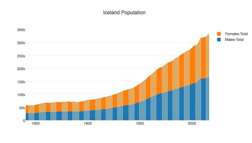
Iceland Population. It's amazing how such a small country was able to go so far in the Eurocup. Well done Iceland!
Top UK artists in history
Jun 30, 2016
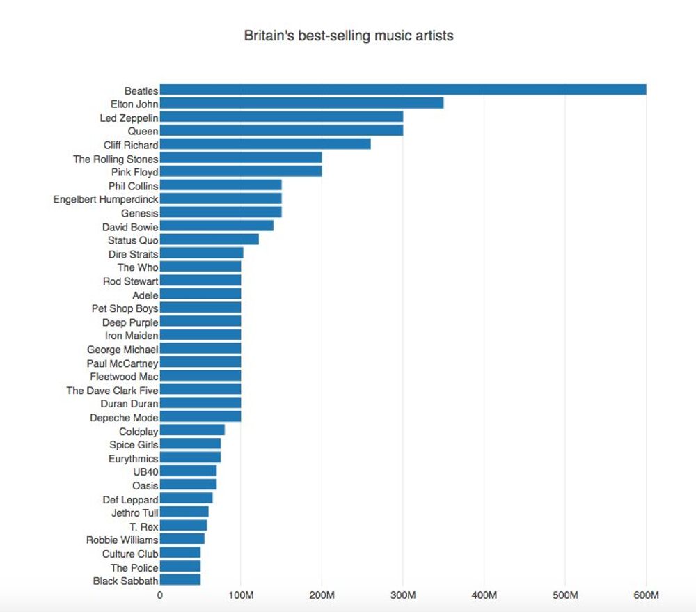
Interesting chart about the top UK selling music acts in history. Data from wikipedia
Wikipedia brexit trends
Jun 27, 2016


In the aftermath of the UK referendum on the European Union, the news media were discussing how there was a "regret" feeling and how the biritish people were trying to understand what they have voted for. If you look at the wikipedia trends about the UK Brexit and Irish Passport articles it seems to confirm this point.
Brexit breakdown results per region
Jun 26, 2016

The chart above contains a breakdown per region of the brexit vote results. In a nutshell England and Wales voted to leave (with the exception of london) and Scotland and Northern Ireland voted to remain.
Colombians living abroad
Jun 25, 2016

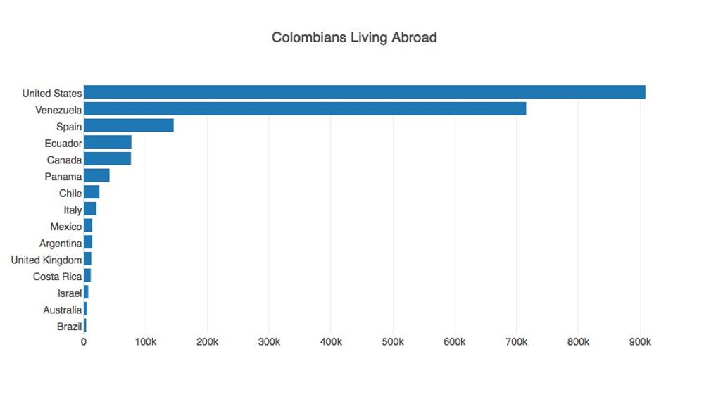
Wikipedia contains an interesting article about emigration from Colombia. It has a constant phenomenon for political and economic reasons. The map and chart above shows the preferred destinations for the Colombians are USA, Venezuela, Ecuador and Canada. The data is a bit stale but nevertheless interesting.
Browser usage
Jun 23, 2016
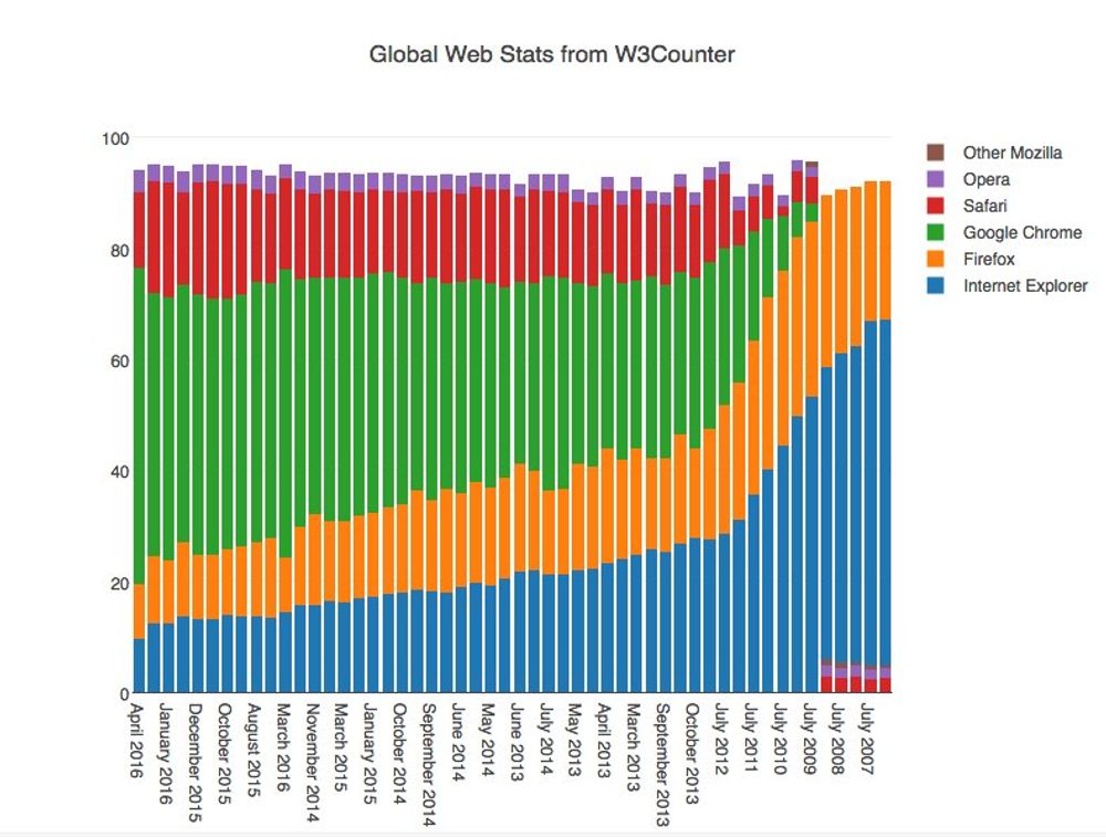
Browser usage according to the Wikipeida article on browser usage and the global stats reported by W3Counter. Not surprising Chrome is the most popular browser today and fortunately IE is in a complete decline.
Brexit Polls
Jun 21, 2016
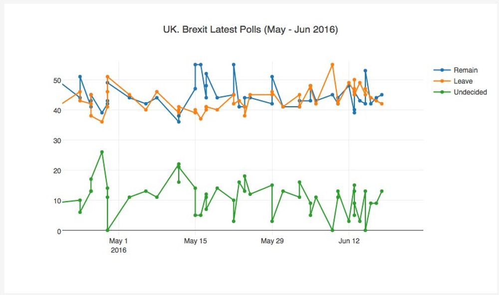

According to this wikipedia article that tracks all the polls related to the British referendum on the European Union membership (Brexit), it's going to be a close call even if the remain vote has been gaining ground in the last days.
In the last episode of last week tonight, John Oliver summarised quite nicely why [leaving the European Union](https://www.youtube.com/watch?v=iAgKHSNqxa8) would such a bad deal for the United Kingdom. Crossing the fingers.
Update on the Zika virus in America
Jun 18, 2016
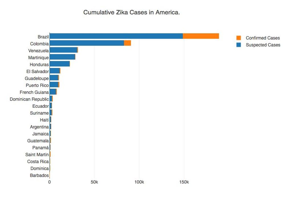
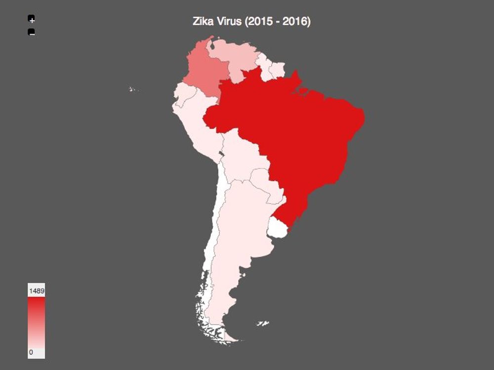
According to the Panamerican Health Organization, Brazil, Colombia, Venezuela and Martinique are the countries most affected by Zika, based on the cummulative incident suspected and confirmed cases. Brazil is by far the most affected country with more than 148k cases suspected and almost 40k cases confirmed.
The Most Bike Friendly Cities
Jun 13, 2016
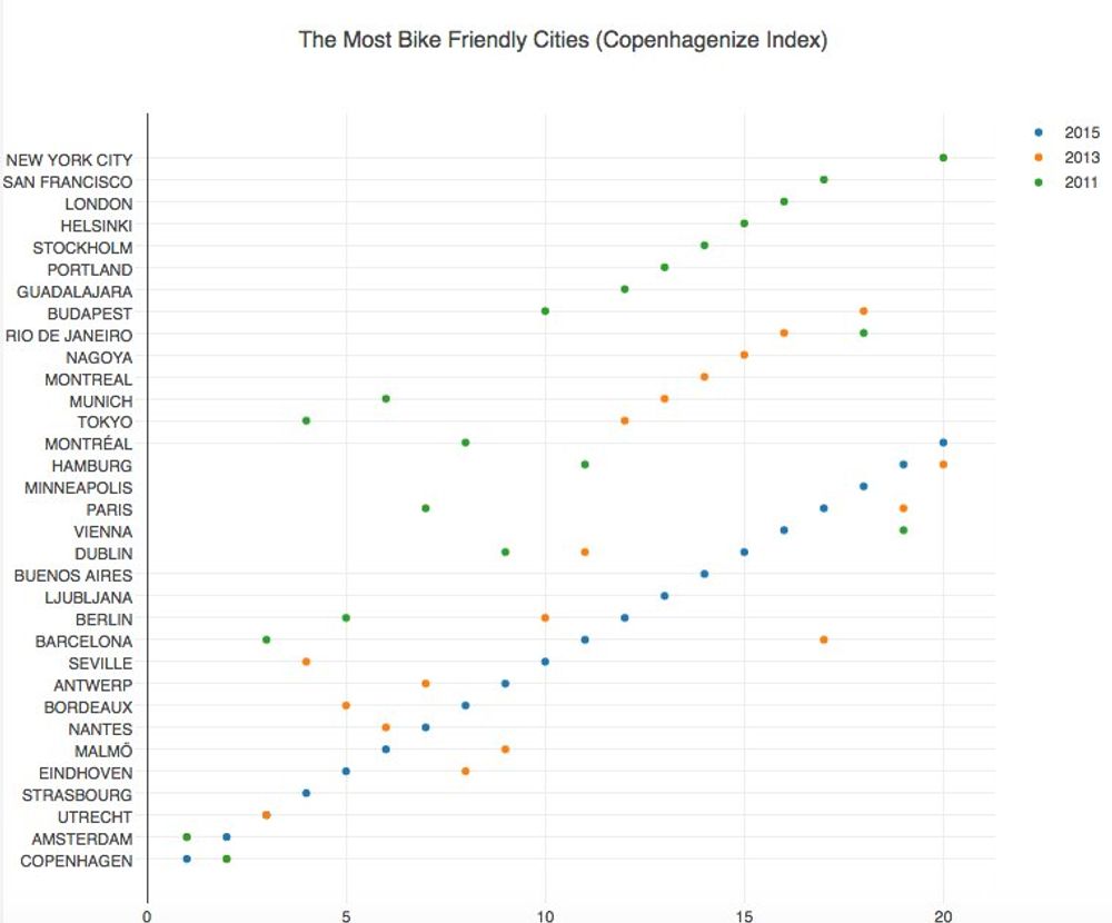
Amsterdam and Copenhagen are the most bike friendliest cities in the World based on the Copenhagenize Index
Europe Death Statistics
Jun 8, 2016
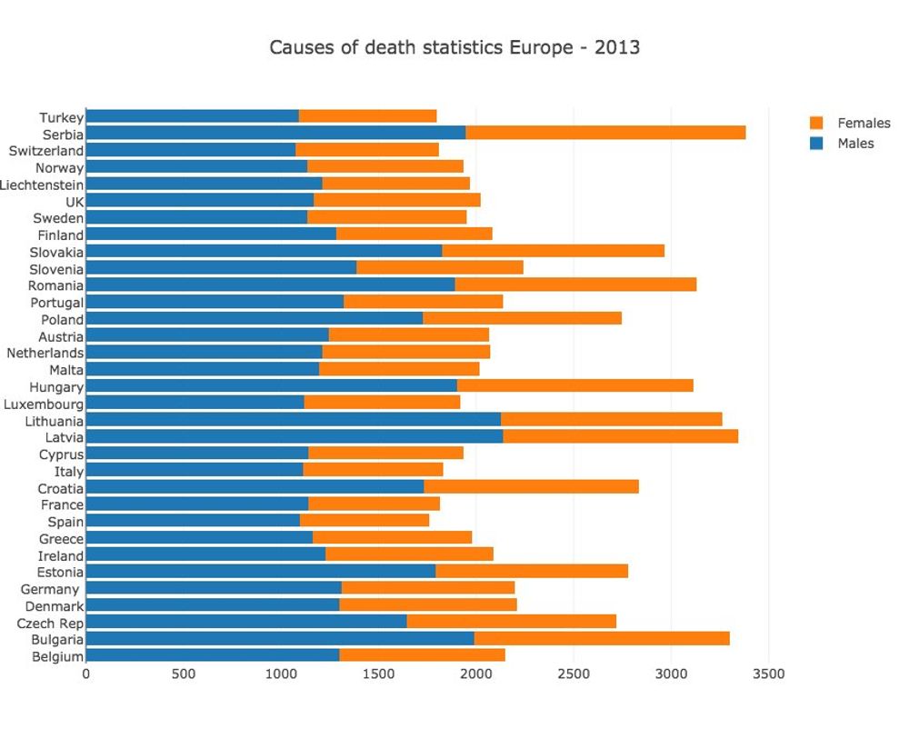
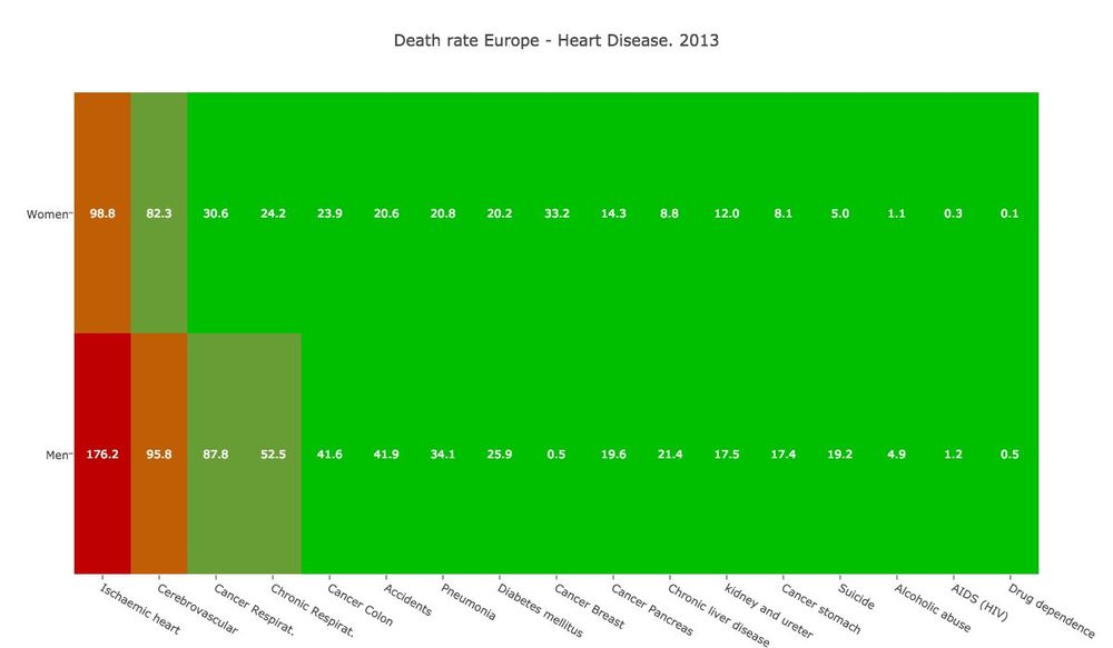
Eurostat has a dataset with statistics on causes of death in the European Union (EU). The highest rate happened in the baltic countries of Latvia and Lithuania and Heart disease is the leading cause of death across Europe.
Newspaper jobs trend
Jun 4, 2016
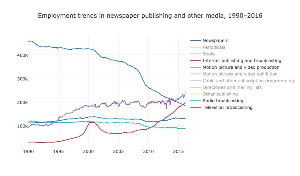
Some people were sharing an article today written with data coming from a very interesting US of Labor Statistics dataset, showing the publishing jobs trends.
The data shows how the information technology had a very important impact in the traditional publishing jobs, particularly in the newspaper industry, during the last 25 years.
US Wealth Redistribution through taxes
Jun 1, 2016
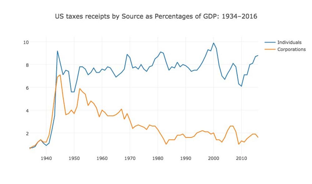
The Bernie Sanders campaign describe on his campaign website on the section Income Inequality of how Wall Street and the billionaire class has rigged the rules to redistribute wealth and income to the wealthiest and most powerful people of this country.
The white house publishes different [data tables](https://www.whitehouse.gov/omb/budget/Historicals/) related to the collected taxes and one of them shows the percentage paid by the individuals and corporations as percentage of the GDP over time.
Plotting this data in a time series shows that vermont senator clearly has a point.
Europe Population Structure
May 25, 2016

The european union statistical office has an interesting article related to the impact of demographic ageing within the European Union (EU). One of the data tables shows the breakdown of the population in the ages 0-14 years, 15-64 and more than 65. The previous chart shows this breakdown by country in the 0-14 and +65 brackets. It's interesting how Ireland is the youngest country by far.
Inflation in Venezuela
May 22, 2016
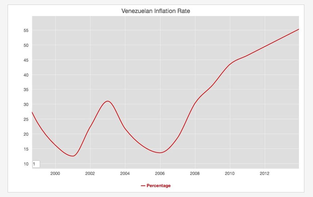
I was reading today in the news that the Vezuelan economy is in real troubles with an inflation going up to the roof and a lot of shortages even in the most basic products. It's sad that the country with one of the biggest oil reserves in the world is in such a bad shape. The IMF publishes data about the inflation and even if the newest data is from 2014 you can see the upward trend.
The world is becoming obese
Apr 9, 2016
A recent article published by the lancet magazine shows that obesity is becoming a real world health problem above the underweight issue. They used population-based data sources, with more than 19·2 million adult participants in 186 of 200 countries and found out that the number of obese people has increased from 105 million in 1975 to 641 million in 2014.
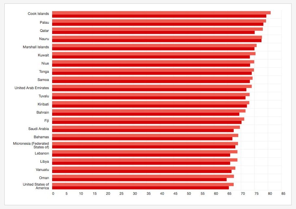
The world health organization also publishes data about Obesity and Overweight and the percentage of population with overweight (BMI > 25) is more than half of the population in almost all the industralized countries in the world:
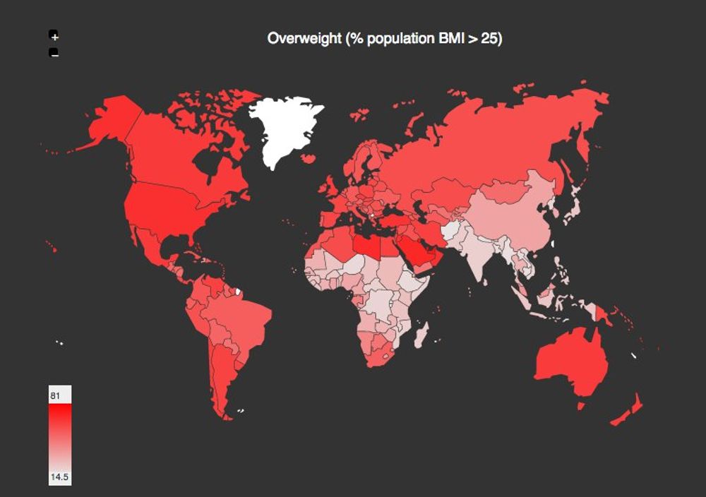
This problem is particularly bad in the pacific islands.
Acquisition Of Irish Citizenship Statistics
Apr 2, 2016
The european union stats office publishes interesting statistics related to the acquisition of citizenship in the EU. Yesterday it was the anniversary of my Irish one, so I pulled out some stats related to the green island.
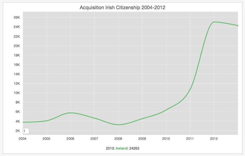
The first chart shows the increase in the number of new citizens from 2011, when the goverment streamlined the process of reviewing the applications, cutting a very important backlog.
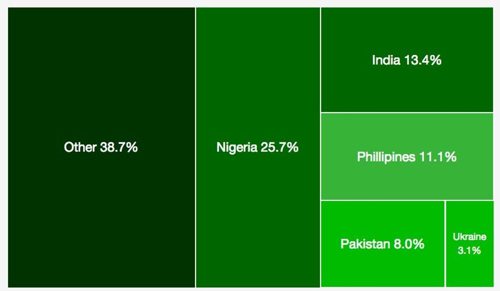
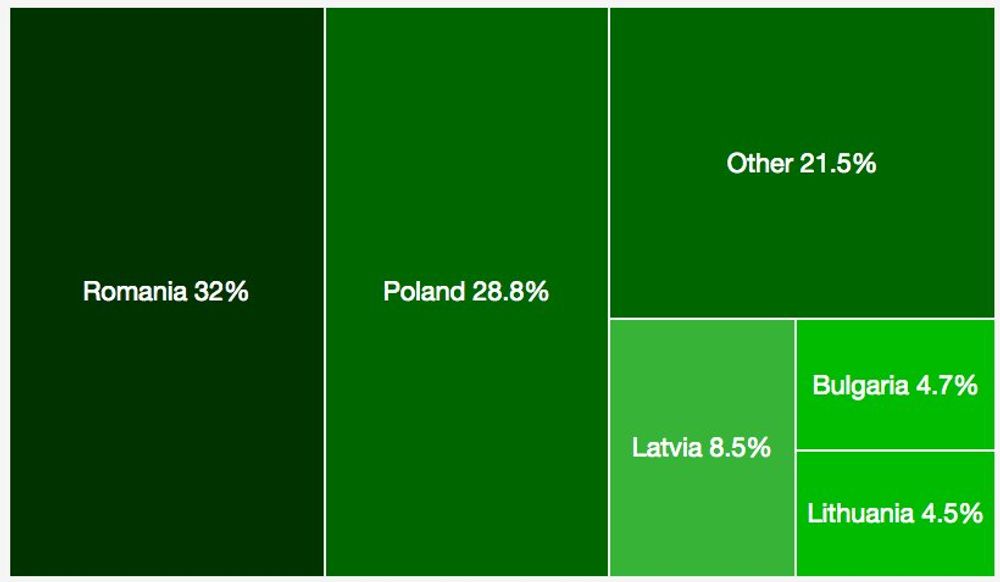
The data has some additional information about the origin of the naturalised citizens both from the EU and Non-EU countries:
Living in Europe with an European passport defintively makes life way easier, so thank you very much Ireland.
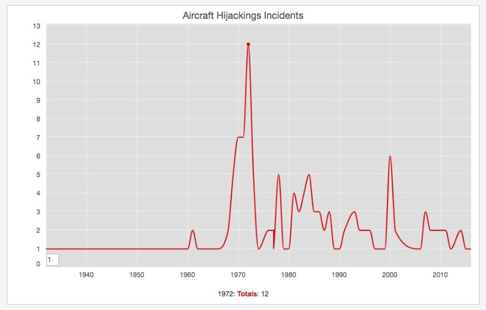
Aircraft Hijacking Statistics
Mar 30, 2016
Last night when I was reading about the EgyptAir hijacking I was thinking that fortunately these type of incidents are now very rare. I remember when I was a kid that these was one of the cliches in the American movies of the 80's (ie. Delta Force), but with the tough security measures in place in most of the airports, this doesn't happen as often.
Wikipedia has a detailed compilation on the aircraft hijacking incidents and there is defintively a decrease compared to the peak on the 70s.
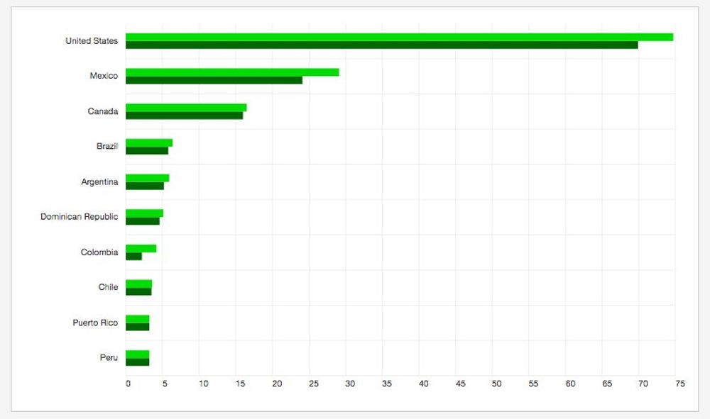
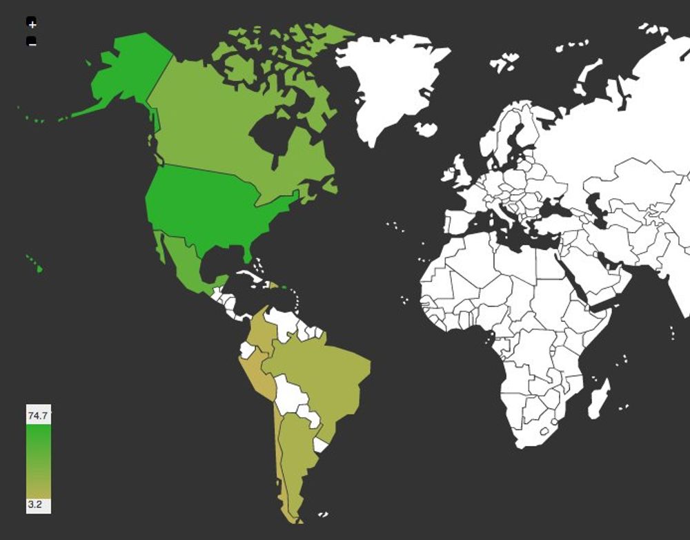
Tourism In The American Continent
Mar 21, 2016
Last weekend I was checking out different alternatives for holidays in the American continent and I started to wonder what is the most visited country on that region. US and Mexico are the most visited countries. Brazil and Argentina are the most visited in South America and the Dominican Republic in the Caribbean.
The following chart shows the number of visitors in millions during 2014 (light green) and 2013 (dark green)
Another Global Warming Record
Mar 14, 2016
Back in February I wrote on this blog how the world was really warming up and the data from February 2016 is even worst. The NASA reported that this month had the biggest temperature raise recorded in modern history:
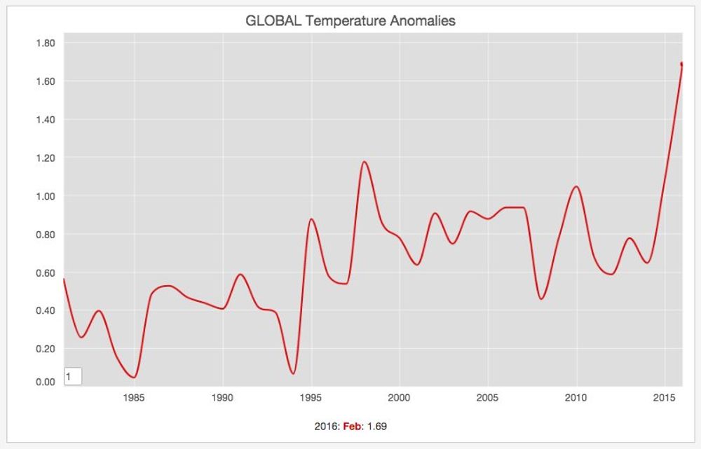
Again the world is warming up!
Asylum Seekers In Europe
Mar 7, 2016
Asylum is defined as the protection granted by a nation to someone who has left their native country as a political refugee, mainly for fear of being persecuted for reasons of race, religion, nationality, membership of a particular social group, or political opinion. The raging conflict in Syria there has been sharp increase in the number of refugees coming to Europe.
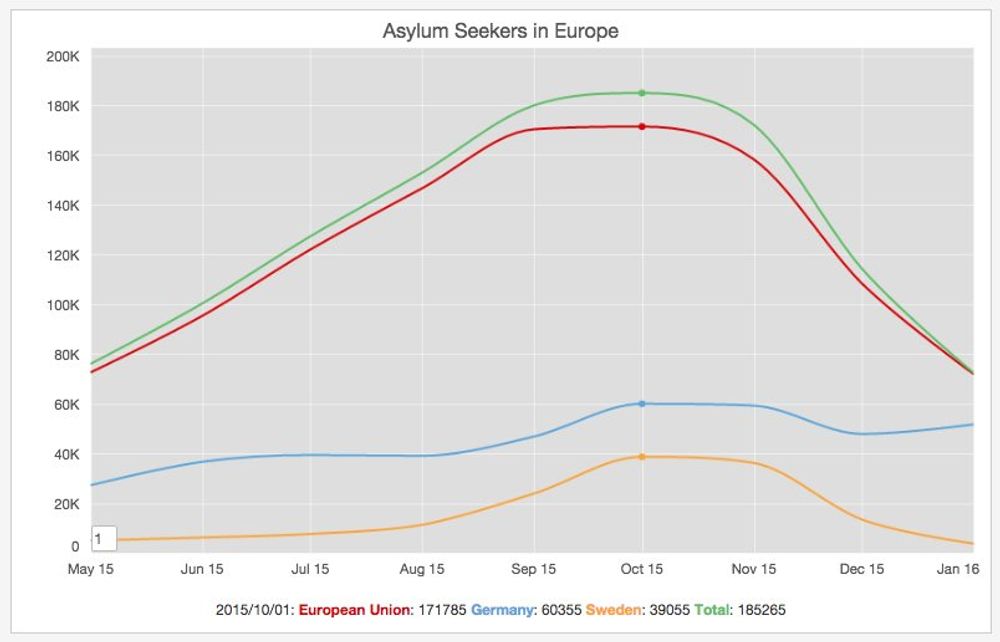
The last quarterly data report by Eurostat demonstrates this upwards trend. Germany and Sweden have been the countries who have welcomed the highest number of asylum seekers.
Top Operating Systems In Desktop And Mobile
Mar 4, 2016

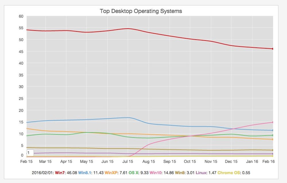
I haven't check the operating systems market share in Desktop and Mobile and based on the data from starcounter the usual suspects: Windows and Android dominate in each sector respectively.
European Passenger Train Percentage
Feb 18, 2016
Last december I have a slight problem with my ear and unfortunately I wasn't able to fly for a little while. I was glad there is an amazing train system in Europe, so I had alternative to travel from an to Berlin. Here is a chart with percentage of train transportation percentage by country in Europe, coming from a dataset published by the European Stats office:

I have been lucky enough to use the trains on all those countries.
Top Wine Producing Countries In The World
Feb 13, 2016
Yesterday I finished the week with a couple of nice wine glasses from Portugal. This morning when I woke up and I was looking at the bottle, I started to ask myself what are the top counties in the world in terms of wine production. I thought about France?, Italy?, Spain?.
Fortunatelly wikipedia has an article with data coming from the UN Food and Agriculture Organization (FAO), sorting the countries by their volume of wine production for the year 2013 in metric tonnes.
There are no suprises in the Top 3 positions (they are indeed France, Italy and Spain), but it's interesting how China has climbed to the 6th position, above Argentina and Australia:
World Is Warming Up
Feb 9, 2016
Last sunday it was really warm here in Berlin. I was able to get on my bike and do a nice ride to the north part of the city. Nevertheless I remembered some data I read back in January about how the world is really warming up:
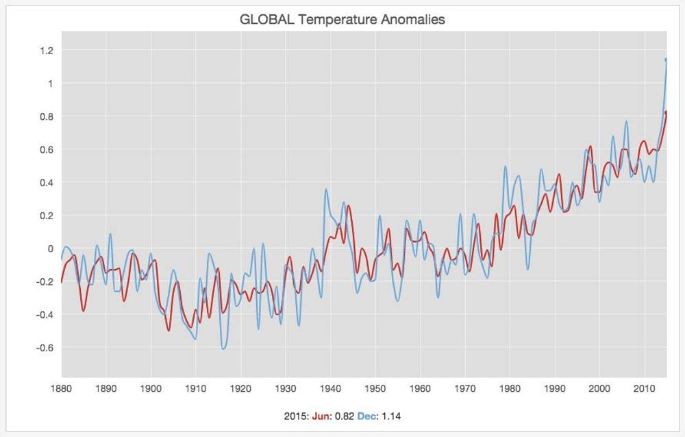
This winter has been really mild in Berlin.
Cities By Murder Rate.
Feb 7, 2016
The Economist published a couple of days ago in their daily chart section an interesting graph with the most violent cities in the world (in terms of homicide rate). They have an analysis on how the Venezuelan economy is in turmoil and how according to a Mexican report "Venezuela's capital Caracas had the highest murder rate in the world last year"
Wikipedia also offers a page compiling a List of cities by murder rate. Unfortunately most of the Top 50 cities from this list are located in South America (and many of those in Brazil!). Take a look at the following chart and map:
US Presidential Democratic Primaries
Feb 6, 2016
Last night I was reading in Business Insider the headline about how Bernie Sanders just melted away a 30-point Hillary Clinton lead in a new poll, related to the US presidential elections. Wikipedia has a useful article where they track the different polls for both parties. The results of those polls are reported here on that page: Democratic Primaries.
It's true that the last poll conducted by the Quinnipiac University shows a preference of: Clinton: 44% and Sanders 42%, and with a 4.5% margin of error, they are virtually tied. There is even a newer one performed by "Reuter/Ipsos" showing a similar trend: Clinton: 48% and Sanders 45% (with a 5% margin of error).
It's fascinating to see how this candidate without any of the infamous [superpacs](https://en.wikipedia.org/wiki/Political_action_committee#Super_PACs) behind him has been able to attrack so much attention and how it has become a real contender in the US 2016 presidential elections.
US 30 Year Mortgage Rates
Feb 5, 2016
This morning I was reading on the news how the "Average 30-year mortgage rate falls for a 5th straight week" (3.72%)>. I was checking if the data was available to double check this headline. Fortunately the Federal Reserve Bank of St. Louis offers this data set on their website. It's called MORTGAGE30US and the data goes back all the way to 1971.
Looking at the data it's true that the 30-year mortgage rate has been falling during the last couple of weeks. Nevertheless it's not the lowest point in the graph. Actually last year, around the same time it was even lower (3.59%):
Foreign Europeans In Berlin
Feb 1, 2016
Following my post yesterday I kept digging in the data published by the Statistical Office of Berlin-Brandenburg. I wanted to discover where most of the "Foreign" Europeans living in Berlin come from. Since the European Union agreement allows the free movement of people across the state members I was expecting that the number 1 slot was going to be taken by a country within the EU borders. Actually it's Turkey the place with most immigrants living in Berlin with almost 100k people:
Now the second and third positions are from countries from the European Union: Poland and Italy. This is followed by one of the newcomers in the union: Bulgaria.
South Americans In Berlin
Jan 31, 2016
The Statistical Office of Berlin-Brandenburg publish some very interesting reports including: Einwohnerinnen und Einwohner im Land Berlin (Residents in the State of Berlin, 31 December 2014). One of the remarkable sections of this document, is about the country of origin, of the foreign residents living in Berlin. It offers a break down per continents, regions and countries, so I was curious about the top countries in South America:
I'm not surprised to discover Brazil (3948 people) is the top #1 on the list but I wasn't expecting that Colombia (1527) was going to be second one in that region. Interesting.
IOS vs Android Market Share.
Jan 27, 2016
Yesterday I was reading the news about the Apple: On Tuesday they reported the financial results of their fiscal first quarter. One of the conclusions from this event is that even if they had records on profits, on the other hand the iPhone sales rose less than 1 percent from a year earlier.
I was checking the Mobile & Table operating systems market share data published by netmarketshare.net and this trend downwards is clear:
I never owned an iPhone. I really like the quality of the hardware and software produced by this company (In fact I'm writing this post on a macbook air), but I don't like the closed restricted ecosystem associated to their business model. It's refreshing to see so many different android devices on the market.
Unemployment In Ireland
Jan 25, 2016
The central office of statistics in Ireland website cso.ie has some interesting data tables that can downloaded, so yesterday I decided to pull out the unemployment data and plot it.
I was curious because when I arrived to the country the economy was doing really good, but I saw the changes during the crisis of 08. I thought it would be interesting to see what happened in the last years. Even if the unemployment level hasn't reached yet the numbers of 2005, I think the trend is definitively positive.