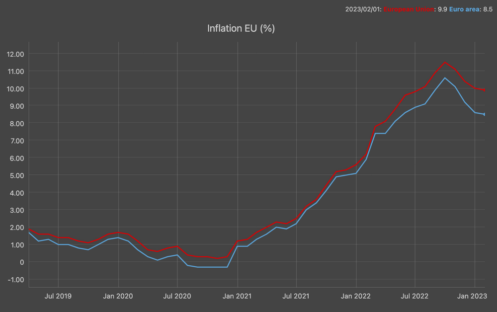
Inflation in the EU Zone
Sep 12, 2023
On the Eurostas website, inflation data for the Eurozone and the European Union reveals a decrease when compared to the peak observed nearly one year ago. Nevertheless, as reported by Euronews, the European Commission has revised its economic projections downward, citing that continuously high prices for goods and services are exerting a more substantial adverse influence than originally foreseen.
In 2023 and 2024, it is anticipated that inflation within the nations utilizing the common currency will climb to 5.6% and 2.9%, respectively. However, these figures still fall significantly short of the European Central Bank's (ECB) annual target of 2%, which it aims to attain through interest rate increases.
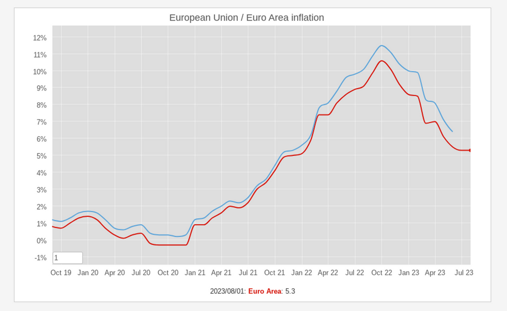
Inflation in Europe 2021 - 2023
Apr 13, 2023
 The inflation in Europe has been on the rise since the start of 2021, driven by a number of factors, including the COVID-19 pandemic, the war in Ukraine, and supply chain disruptions. In October 2022, inflation in the Eurozone reached an all-time high of 10.6%. It has since declined slightly, but it is still well above the European Central Bank's target of 2%.
The chart above generated with data provided by Eurostat, shows this trend, including the October peak and the downwards trend.
The inflation in Europe has been on the rise since the start of 2021, driven by a number of factors, including the COVID-19 pandemic, the war in Ukraine, and supply chain disruptions. In October 2022, inflation in the Eurozone reached an all-time high of 10.6%. It has since declined slightly, but it is still well above the European Central Bank's target of 2%.
The chart above generated with data provided by Eurostat, shows this trend, including the October peak and the downwards trend. GDP and COVID-19 in Europe
Aug 03, 2020
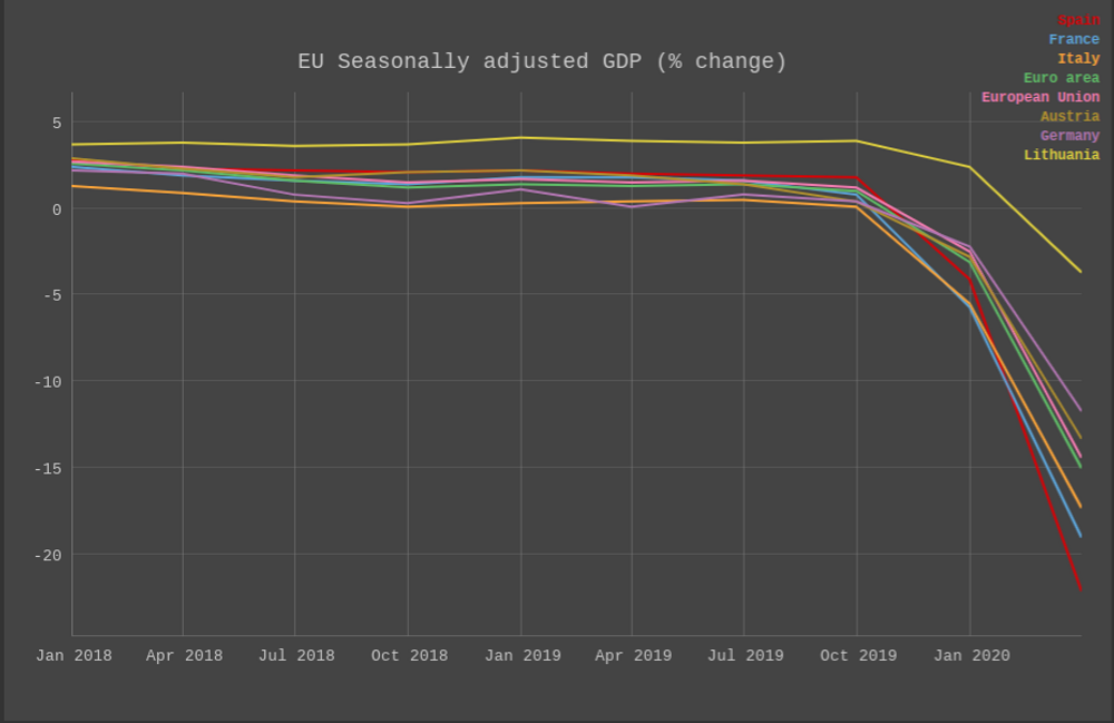
A couple of days Eurostat released a preliminary report of the GDP growth rate in the EU and Euro zones. It's not not surprising but the COVID-19 situation and the required mitigation measures have taken a toll in the economy in Europe. The report discussed how "Seasonally adjusted GDP decreased by 12.1% in the euro area and by 11.9% in the EU, compared with the previous quarter," The graph above shows this dramatic trend.
Good country index
Feb 12, 2018
According to their website, the good country index attempts to measure what each country on earth contributes to the common good of humanity, and what it takes away, relative to its size. The index takes into account several data points in different areas such as: Science & Technology, Culture, International Peace & Security, World Order, Planet & Climate, Prosperity & Equality, Health & Wellbeing. The concept is quite interesting because but truly live in one single planet so the policies taken by any single country have effects on the rest of the world. The results for 2017 are:
|
|
Income Inequality
Jan 6, 2017

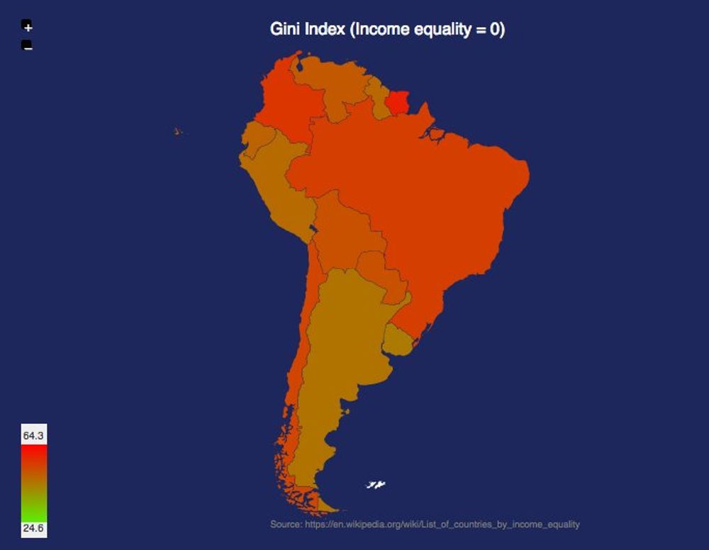
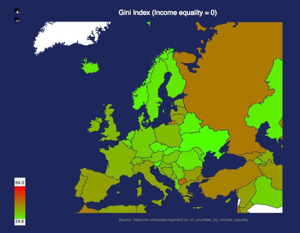
One of the many controversies of the incoming US presidential administration is the incoming cabinet composed of very wealthy individuals. It's interesting to note that the US is not a very equal country compared to all the other western democracies. Even it's northern neighboor is way more equal comparing the Gini index.
It shoud be noted that this inequality is even worst in the south. The comparison between South America and Europe is striking:
Personal Money Transfers in the EU
Dec 11, 2016
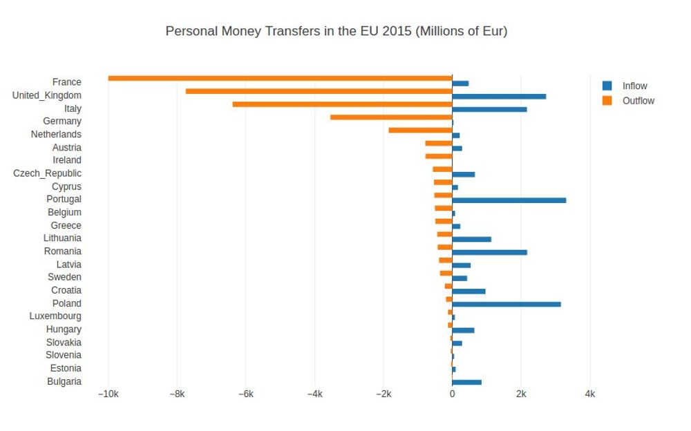
Interesting dataset from Eurostats regarding personal transfer inflow / outflow across the European Union. On one hand France has biggest negative balance and on the other side Poland has the biggest positive one.
Big Mac Index
Jul 27, 2016
According to their website "THE Big Mac index was invented by The Economist in 1986 as a lighthearted guide to whether currencies are at their 'correct' level". It's interesting because even if it was designed to compare the purchasing-power parity, it shows the imbalance between different currencies. This map shows the last calculated index in July 2016.

Alcohol inflation in Europe
Jul 2, 2016
Inflation data from Eurostats. Alcohol is a big item in many of the "vodka belt" countries:
Newspaper jobs trend
Jun 4, 2016
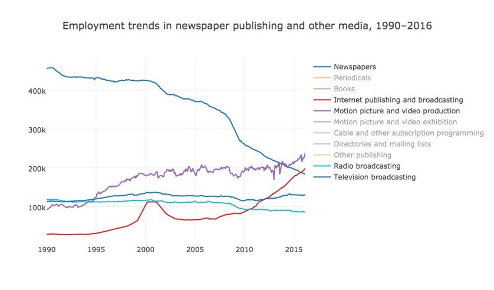
Some people were sharing an article today written with data coming from a very interesting US of Labor Statistics dataset, showing the publishing jobs trends.
The data shows how the information technology had a very important impact in the traditional publishing jobs, particularly in the newspaper industry, during the last 25 years.
US Wealth Redistribution through taxes
Jun 1, 2016
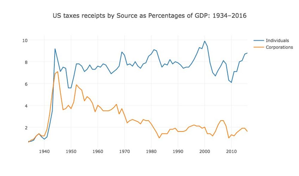
The Bernie Sanders campaign describe on his campaign website on the section Income Inequality of how Wall Street and the billionaire class has rigged the rules to redistribute wealth and income to the wealthiest and most powerful people of this country.
The white house publishes different [data tables](https://www.whitehouse.gov/omb/budget/Historicals/) related to the collected taxes and one of them shows the percentage paid by the individuals and corporations as percentage of the GDP over time.
Plotting this data in a time series shows that vermont senator clearly has a point.
Inflation in Venezuela
May 22, 2016
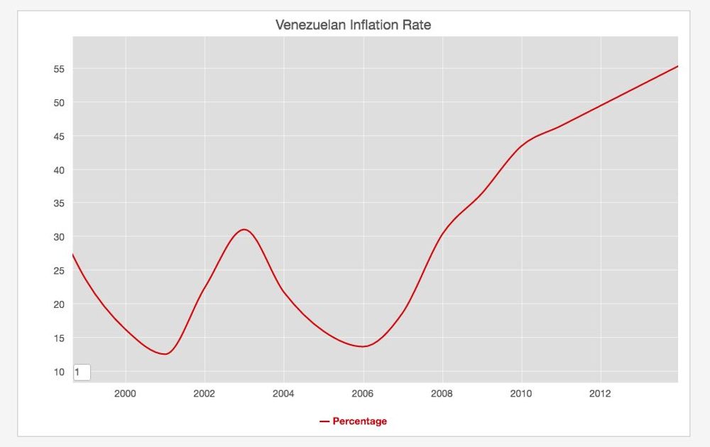
I was reading today in the news that the Vezuelan economy is in real troubles with an inflation going up to the roof and a lot of shortages even in the most basic products. It's sad that the country with one of the biggest oil reserves in the world is in such a bad shape. The IMF publishes data about the inflation and even if the newest data is from 2014 you can see the upward trend.
Berlin Salary Report
May 12, 2016

Yesterday at Jobspotting, the company where I work, we published the very interesting Berlin Salary Report with data and analysis related to the wages in the German capital city. One of the most interesting charts of the report is the treemap above that summarises the salary median based on the years of experience and the area of work.
As you can see on the graph the people working in Management and Software Development, have the highest salaries in the scale, and this is related with the years of experience. Interesting. #BerlinStartupSalaries
1st. May Workers Day
May 1, 2016
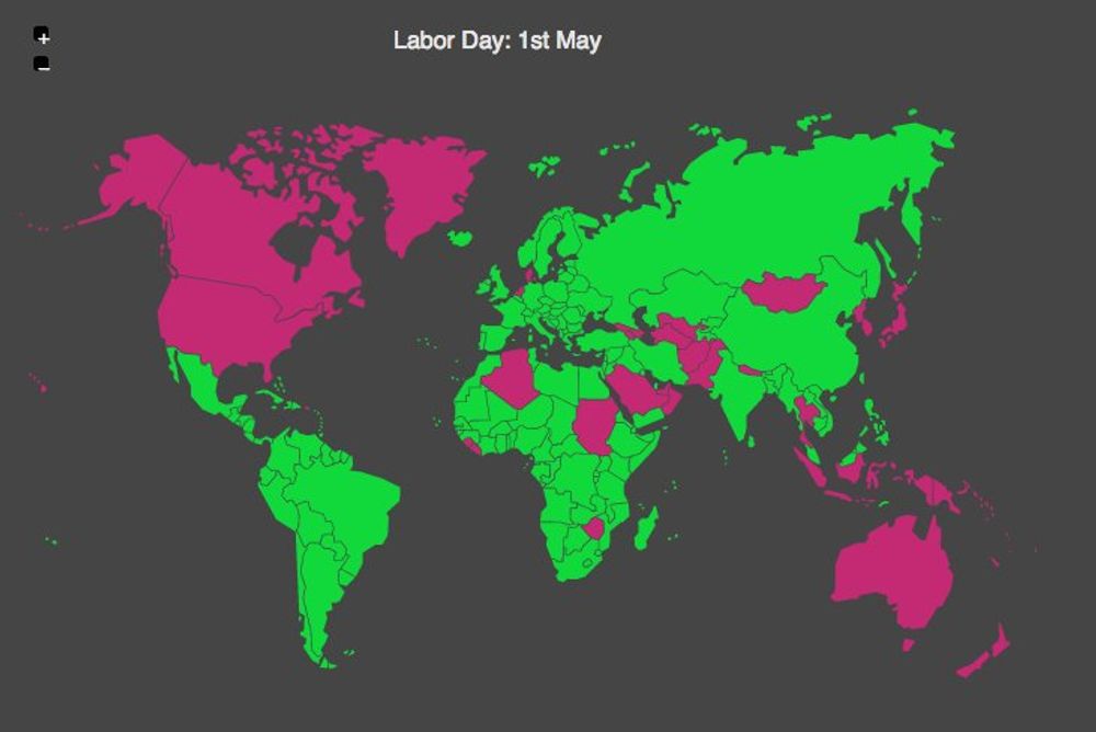
May 1st. was chosen to be the International Workers' Day in order to commemorate the events that happened on May 4, 1886 at Haymarket in Chicago. The police tried to disperse a public meeting during a general strike demanding for eight-hour workday, when an unidentified person threw a bomb at police. The Police responded by firing on the workers, killing four protesters.
This day is celebrated in many countries either today or tomorrow.
Minimum Wage Worldwide
Apr 5, 2016
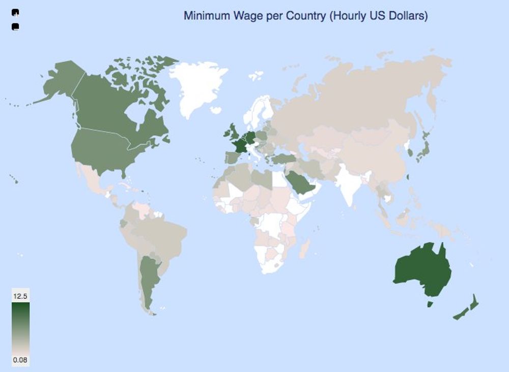
This morning I was reading in the news about the discussion in the US primaries related to the minimum wage in the US, particularly in NY and CA. Wikipedia contains an article tracking the mininum wage worldwide. The map above summarises the data.
European Union GDP Treemap
Mar 25, 2016
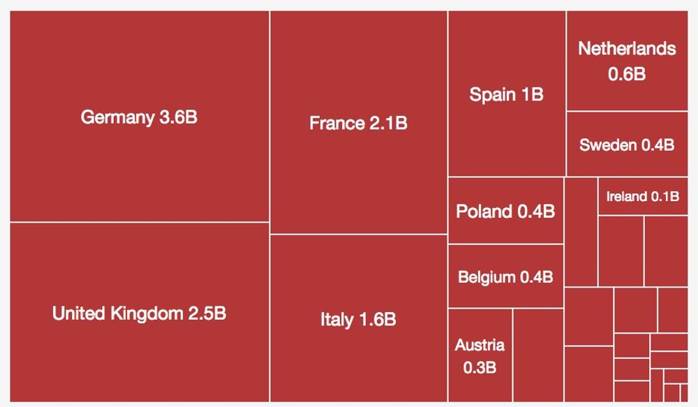
Playing with treemaps. Here is one with the GDP of the countries from the European Union. Germany and the United Kingdom are the biggest ones.
Inflation In Europe
Feb 29, 2016
Last Thursday the Eurostats Office published the inflation data for January 2016. Even if those numbers are definitively better than the hyperinflation happening in other regions of the world (cough ... Venezuela), there is always the risk on deflation:
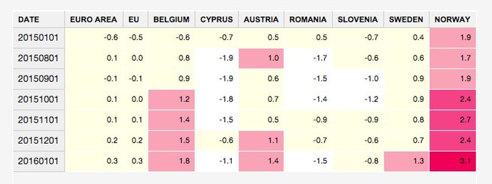
Now it's remarkable how the highest rate in Europe was Norway, a pretty expensive country already. I'm sorry for my Norwegian friends.
Podcast About When CEO Pay Exploded
Feb 11, 2016
Last night I was walking around the neighbourhood, while I was listening a very interesting podcast from NPR, explaining how and when the CEOs compensation packages exploded. You can get it here. What they discussed in a nutshell was that the enterprises tried to match the compensation of their CEOs with the performance (fair enough) using Stock Options, but the companies didn't realize what was the exact value of those offers.
The economic public institute published an article last year about how the CEOs make [300 times the salary of an average worker](http://jco.im/300-times).
