89 seconds to midnight
Feb 15, 2025
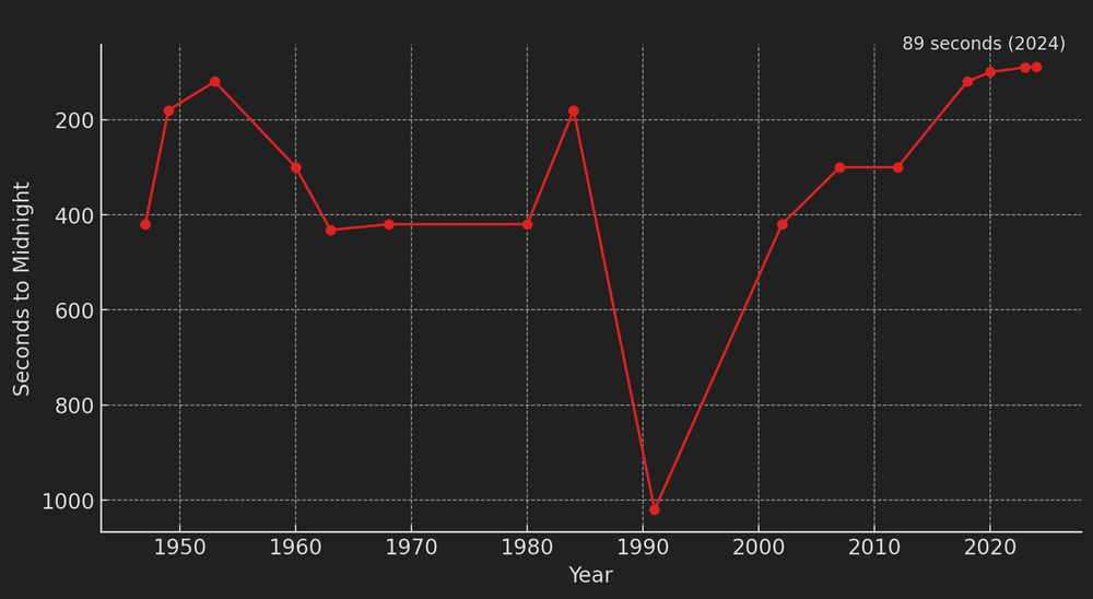
According to the Bulletin of the Atomic Scientists, the Doomsday Clock is now at 89 seconds to midnight, the closest ever, due to escalating global threats. Key factors include nuclear tensions from Russia’s war in Ukraine and expanding arsenals, climate change with record-breaking temperatures, biological risks like pandemics and bioweapons, AI-driven threats including autonomous weapons and disinformation, and geopolitical instability from U.S.-China tensions and Middle East conflicts. These risks highlight the urgent need for international cooperation, diplomacy, and climate action to prevent global catastrophe.
The first time I heard about this Clock was five years ago, when it was already at 100 seconds to midnight. In just five years, the situation has become even more dire, with the clock moving closer to catastrophe. This alarming trend underscores the need for even more urgent intervention to address these growing threats.
Hotest Day in Record
Jul 6, 2023
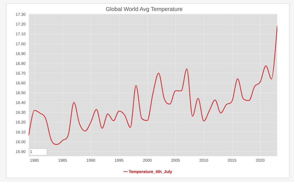 Meteorological organizations and climate research institutions maintain historical weather data and climate records, including temperature measurements from various locations. The Climate Change Institute at the univsersity of main is one of those institutions. And accordingly to the data collected since 1976, yesterday while the US was celebratiing their US independence day, that day turned out to be the hotest in record on that dataset.
Winter World Cup
Dec 5, 2022
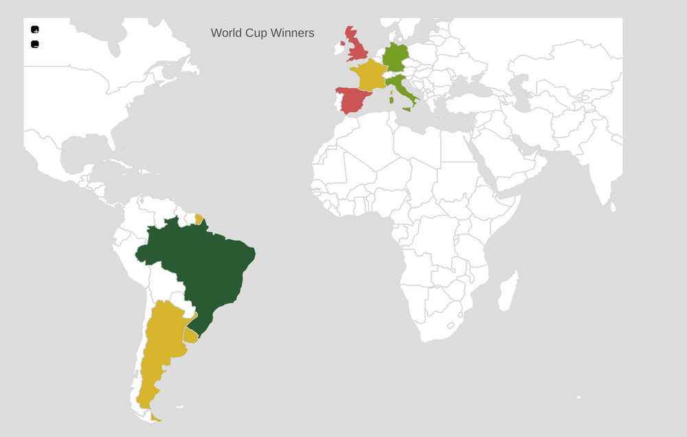
A couple of days ago I was chatting to one of my colleagues that this world cup has been really weird. Leaving aside all the justified controversies about the way Qatar treats migrant workers, the fact that this world cup is being played at Christmas time has been really strange. Since I live in Europe I have always associated this event with summer and people enjoying themselves outside, watching the games and having a good time. That has not been the case in 2022.
Now I wonder if any of the countries that have won the cup before will manage to do it again? Italy didn’t even qualify, Spain is out this week, Germany and Uruguay didn’t make it past the first round. So it could be Brazil or Argentina again? or European teams like France or the UK? We will see soon, but again this winter cup has lost a bit of its charm.
West united against russian invasion
Mar 5, 2022
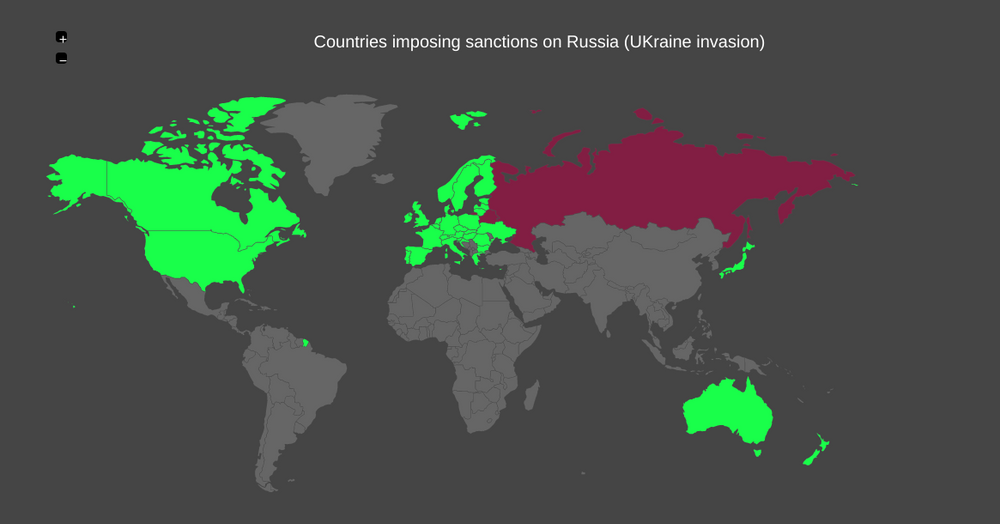 It has been 9 days since the beginning of the Russian invasion of the Ukrainian nation, which unfortunately has been catastrophic for this country. More than 1 million refugees have fled to neighboring countries, mainly Poland and several Ukrainian cities have been heavily bombed.
At least all western countries have condemned in unison this unprovoked invasion and have uniformly applied sanctions against the Russian regime. Hopefully they will make it economically impossible to sustain this senseless war.
Earth is warming significantly and rapidly
Jan 30, 2022
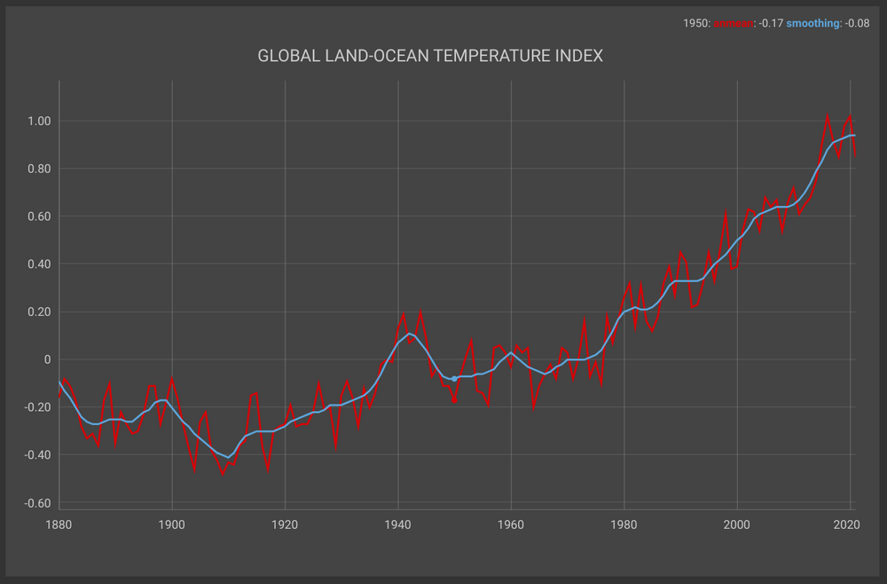
A couple of weeks ago, NASA issued a press release explaining that "Earth’s global average surface temperature in 2021 tied with 2018 as the sixth warmest on record, according to independent analyses done by NASA and the National Oceanic and Atmospheric Administration"
The NASA Administrator Bill Nelson was sounding the alarm in the same PR: "Eight of the top 10 warmest years on our planet occurred in the last decade ...". The news was barely cover by the mainstream media, echoing some of the points exposed in the recently brilliant movie "Don't look up" by Adam McKay.
Global Warming is real and the issue should be taken seriously by each goverment and each citizen of this planet earth.
Omicron is spreading like crazy
Jan 12, 2022
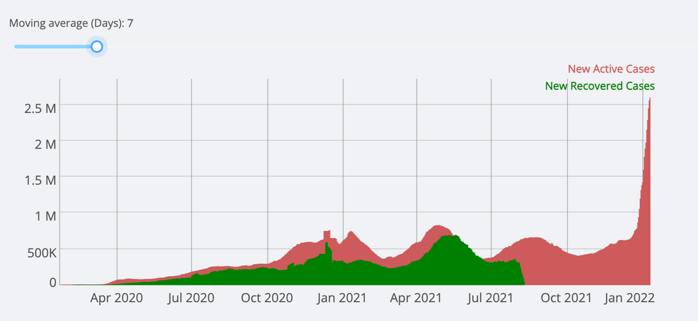
Almost two years ago I created a dashboard to track the Covid-19 cases based on data provided by the Center for Systems Science and Engineering (CSSE) at Johns Hopkins University. When I deployed that little application, I thought it would only be useful for a couple of months.
Almost two years later, it is still useful for tracking cases in different countries and following trends at the national or global level. In the different podcasts I follow, they have mentioned in the last couple of weeks that the omicron variant is different, in the sense that it is way much more contagious, but does not affect the lungs in the same way as the previous variants did.
Last night I was checking my dashboard and indeed the number of cases has skyrocketed, more than with any other variant. Fortunately the number of deaths associated with the virus has remained stable as you can see above. It is still true that this huge number of cases will necessarily add additional stress on health care systems around the world.
Although we are all sick to death of this pandemic, we must continue to get vaccinated and take protective measures to avoid the virus as much as possible.
2021 Year Review
Dec 29, 2021
In a couple of days the year 2021 will be over. It seems incredible to me how fast the time passed and how the seasons and months went by so fast that this period is indeed going to end. The covid-19 pandemic continues to present serious problems, particularly with the new Omicron variant, and perhaps that is one of the reasons why this year and last year have passed so quickly: It has been a tug-of-war of hope and despair associated with the desire we all have for this pandemic to end once and for all!
Anyway, since I don't update this blog much lately, I wanted to take this time to write a longer post and remember what are the events that marked this year through a few illustrations. In my opinion these events were the most important of this year:
James Webb Telescope

The James Webb Space Telescope (JWST) developed by NASA with contributions from the European Space Agency (ESA), and the Canadian Space Agency (CSA) was launched on the 25th of December. This telescope will support a broad array of research across the fields of astronomy and cosmology.
Facebook Files

Beginning in September 2021, The Wall Street Journal published "The Facebook Files: A Wall Street Journal Investigation", a series of news reports "based on a review of internal Facebook documents, including research reports, online employee discussions and drafts of presentations to senior management." A couple of weeks later the face of this whistleblower materialized in Frances Haugen, a courageous former product manager for the Civic Integrity team, which was in chage to curb misinformation and other threats to election security
It's not news that Social Media has been used for years to spread misinformation. But having an "insider" to document and record the action (or inaction) coming from the senior management of the social giant, was quite a moment.
Tokyo Summer Olympics

A year later than budgeted and with a lot of restrictions associated with it, but finally the summer olympic games took place in tokyo this year. A number of athletes discussed the importance of participating in the games, but also they expressed their frustration for the lack of spectators and the confinement, not able to enjoyone of the most interesting cities in the world!
COVID-19 vaccine rollout

In January started the COVID-19 vaccine rollout, naimly in the industrialized countries, leaving the poorest nations behind). But then the scarcity of this valueable resource became clear, having many nations compiting for the same vaccines.
There was a lot of criticism in particular about the EU, since he pace of the roll-out was quite slow at the start.
Insurrection at the US Capitol

I remember I was working at home in January when those images of people attacking the US congress appeared in my news feeds, so I switched to a live a streamming to check what was going on.
My first thought was "there can't be a coup d'etat in the USA!" ... but they weren't that far off, from everything that has been discovered so far. Democracy can be quite fragile.
PS: All the source pictures used on the illustrations come from wikimedia commons.
Summit for Democracy
Nov 24, 2021
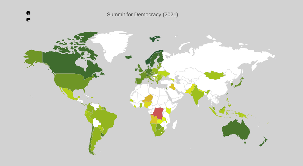
The US department of state published a list of the countries invited to the virtual "Summit for democracy" that will take place next month.
Although certainly the USA doest not have at this moment a great moral authority to lead such conferences (cough January 6, cough new voting restrictions laws across the country), in any case it is a very good initiative to highlight how democracy is a right that should be protected and should not be taken for granted.
Covid-19 Vaccination in the world
Apr 26, 2021

After a long wait, finally I was able to get an appointment today for the first dose of the covid-19 vaccine. I still need to wait another month, but having a spot in the queue is such a relief!. I was curious about what countries have the highest vaccination rate (using data from our world) and I realized that gibraltar has almost all the adult population innoculated.
I know the situation is bad in India nowadays, so I really hope at certain most of the countries will be able to have the same numbers as gibraltar, or the USA for that matter. The new administration definitely did wonders there!.
COVID-19: 4m Cases Worldwide
May 10. 2020
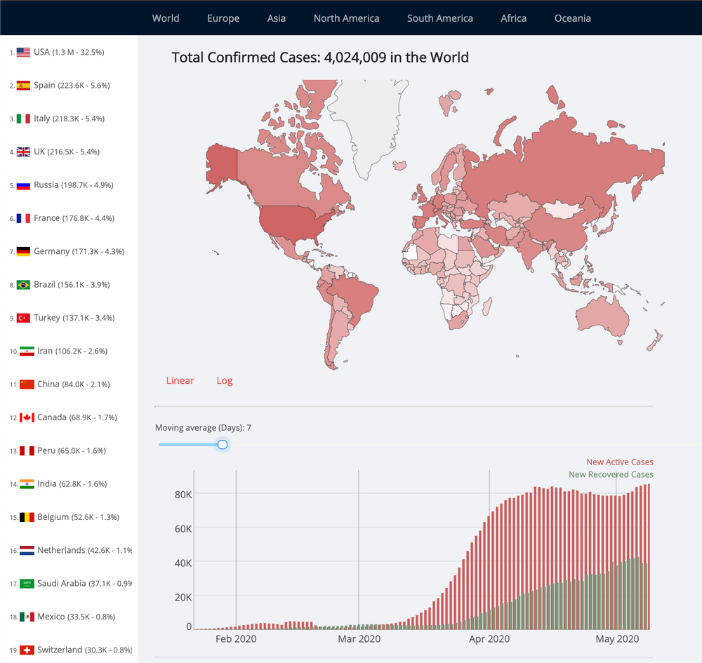
Last easter holidays I setup this COVID-19 dashboard in one of my personal domains to follow the cases around the world, particularly in Europe. I used the data provided by the Johns Hopkins university, in particular their daily cases, death and recoveries time series. Using those data points and doing some data wrangling it’s possible to get a lot of insights about what’s currently happening in the world.
The last time I blogged about this topic was exactly one month ago and there have been a lot developments since then:
- In April I mentioned the US has become the new epicenter of the COVID-19 Pandemia and that’s still the case, but on a different scale. With over 1.3 million active cases, the United States accounts for 32.5% of all cases worldwide today. The situation in New York City is much better than it was then, but there are now multiple cases in rural areas, particularly in towns with meat processing plants
- The situation in the United Kingdom is dire as well. As of yesterday they have reported 31.3k deaths and 216.5k active cases.and they have less than 1k patients recovered from the disease. Famously Boris Johnson got infected himself, required hospitalization and even ICU admission for a couple of days.
- In contrast Germany has been recognized as of the countries who has dealt with the Pandemic in a responsilbe way using a scientific based approach. There are still in the list of the Top 10 countries most affected by the disease but the death rate has been really low, during the evolution of the pandemia.
- The Kiwi strategy has been one of the most succesful ones in the world. A headline in the prestigious Lancet magazine summarises all: New Zealand eliminates COVID-19. The administratrion of Jacinda Ardern couldn't be more proud of their decisions!.
COVID19: More than 1.5 millon cases
Apr 10, 2020
Talking about exponencial growth ... back on the 31st of January, when I heard the novel corona virus mentioned in the news I blogged abpit how there were "9776 cases confirmed affecting 20 countries already, with the vast majority in China", regarding this '2019-nCoV' virus as it was known back then.
2.5 months later, this number has jumped to more than 1.5 millon cases, becoming a pandemic, affecting most of the nations in the world. Italy and Spain were hard hit, as well as the US, country that has become by far the new epicenter of this disease.
The strict social distancing rules have slowed down the transmission in the communities adopting this measures (with the unfortunate side effect of paralyzing the economies). Let's cross the fingers all those efforts will contain this nasty virus.
83k COVID19 Cases in the US
Mar 27, 2020
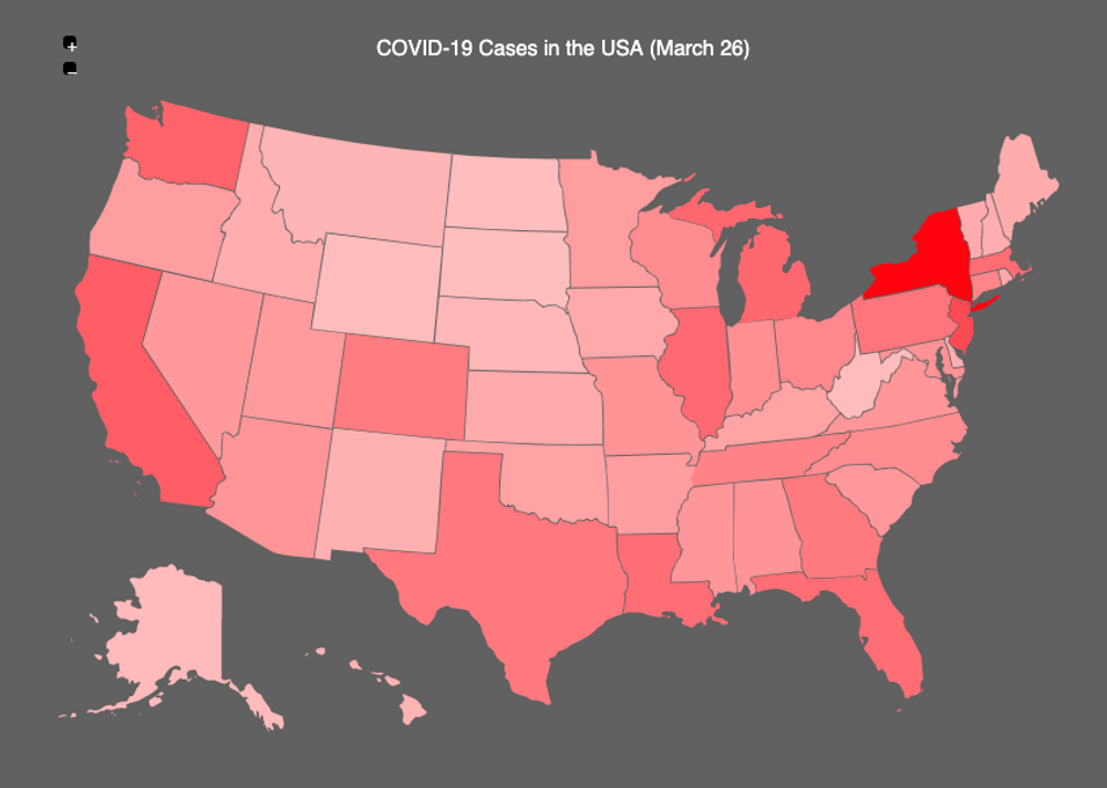
The COVID-19 cases continue to climb in the world and the United States of America clearly has become the new epicenter with 85,991 confirmed cases, 18,050 more compared with the previous day. They really need to setup a working national policy!
COVID-19 307k Cases World Wide
Mar 22, 2020
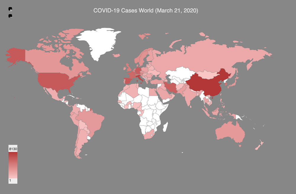
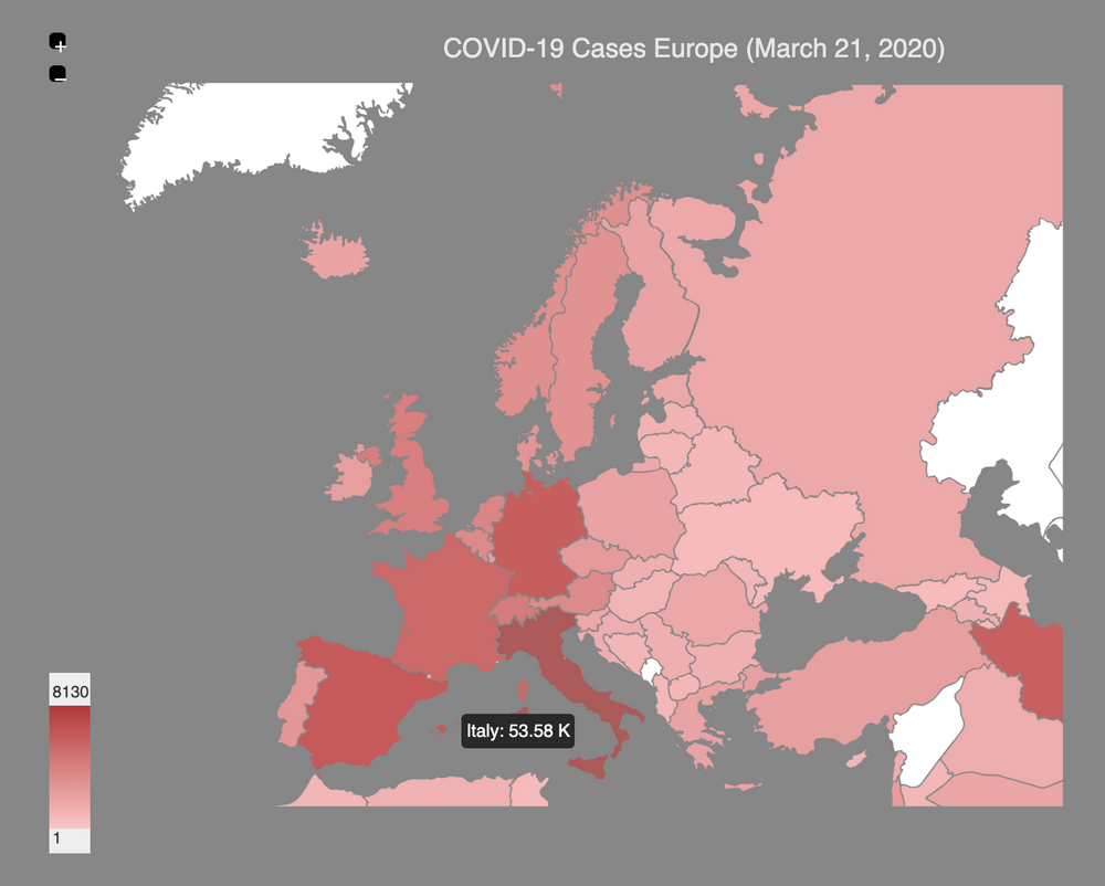
According to the latest data aggregated by the John Hopkins university world cases dashboard, there are 307277 COVID-19 confirmed cases in the world. Europe is still an epicenter of the disease with more than 50k cases in Italy, but also more than 10k cases in France, Germany and Spain.
There are more death cases reported in Italy (4825) than they were repored during in China (3265). The US has the highest number of active cases (26747) after Italy.
In many places of the world there are measures in place to encourage or force people to stay home. Please stay safe!
COVID-19 Worldwide Cases
Mar 03, 2020
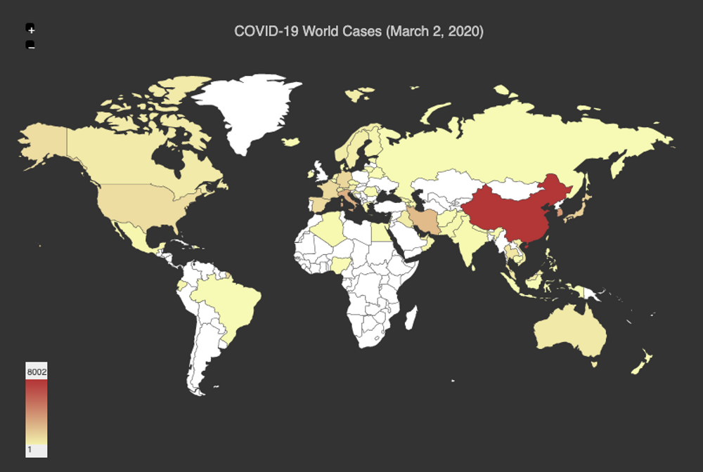
One month ago I was blogging about how the 2019-nCoV coronavirus had been in the news headlines lately because of the human-to-human transmission and its rapid spread both in China and outside its borders.
At the end of January there were 9776 confirmed cases in China, but one month later this number is around 80k and Iran, South Korea and Italy have become additional geographical points with more than 1k cases.
The COVID-19 Virus as it’s called now, it’s a public issue all around the world and prevenive measures will have to be in place to slowdown the spread of this disease.
The following animation from wikipedia shows how the virus have been spreading fast in a couple of months.
Again for reference this is the John Hopkins university world cases dashboard, using the most recent data available.
Corona Virus (2019-nCoV) Cases
Jan 31, 2020
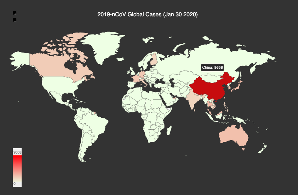
The 2019-nCoV coronavirus have been in the news headlines lately because of the human-to-human transmission and its rapid spread both in China and outside its borders. This virus apparently originated in animals and it was first identified in seafood and animals markets in Wuhan, China
As of yesterday there are 9776 cases confirmed affecting 20 countries already, with the vast majority in China. The John Hopkins university is maintining this world cases dashboard, using the most recent data available.
100 seconds to midnight
Jan 27, 2020
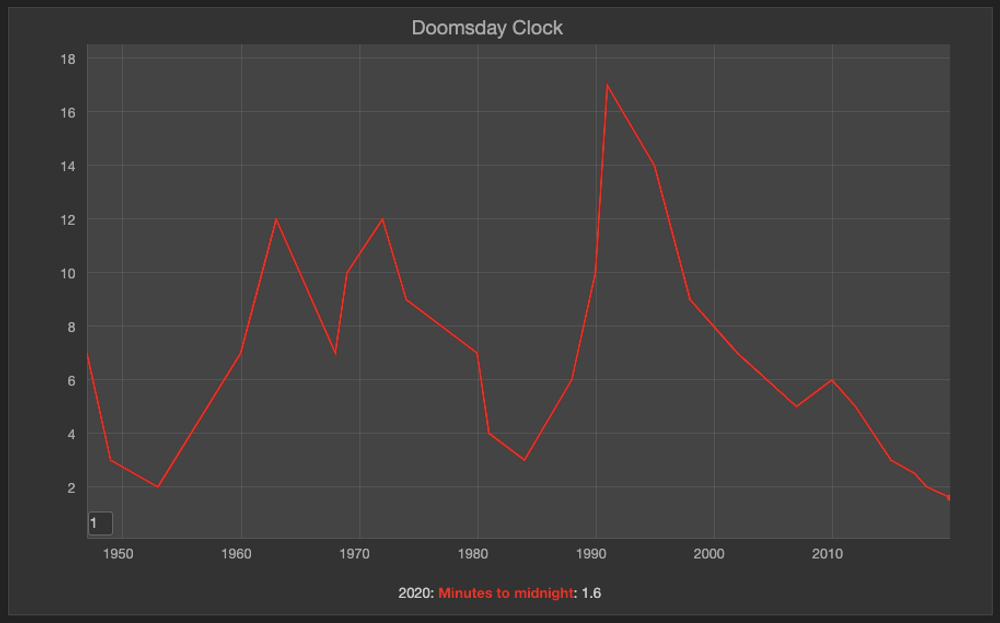
A couple of days ago I stumble into the headline ‘Doomsday Clock is now 100 seconds from midnight’, published by space.com. I wasn’t aware but this clock is a metaphor for close we are in the world to a man-made global catastrophe. This device was setup in 1947 by the members of the Bulletin of the Atomic Scientists, when nuclear weapons were considered the main threat. Today the global warming issue is also considered in the equation on how to calculate this time.
Unfortunately but not surpising this time around in 2020, it’s the closest it has been to midnight. 2019 was the second hottest year in history, the growing inestability in the middle east and even the possible AI use in warfare don’t help to move this time backwards. The picture is not a pretty one but there is at least one more voice reminding world leaders what is at stake here.
The hotest June and July ever recorded
Sep 18, 2019
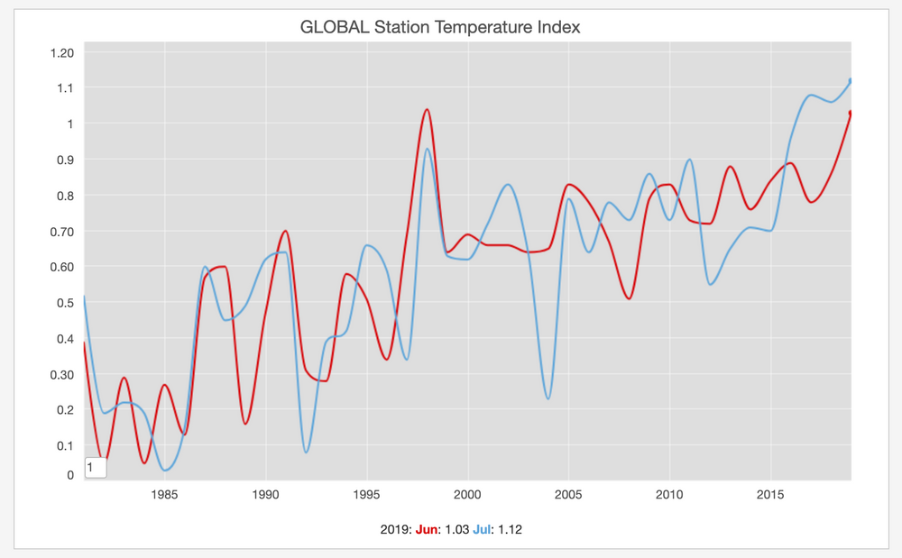
Last summer felt really hot! There were quite a few days when most of the headlines in the news were about how the thermometer was about to break historic records in many cities. It is no surprising therefore that the earth temperature change measured by NASA during the months of June and July was the highest ever recorded.
The "breaking record" headlines are following the same pattern year after year. I don't remember anytime in my lifetime when the global warming was such a clear and present danger!.
Tour de France Winners
Jul 30, 2019
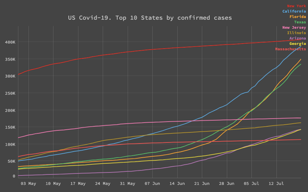
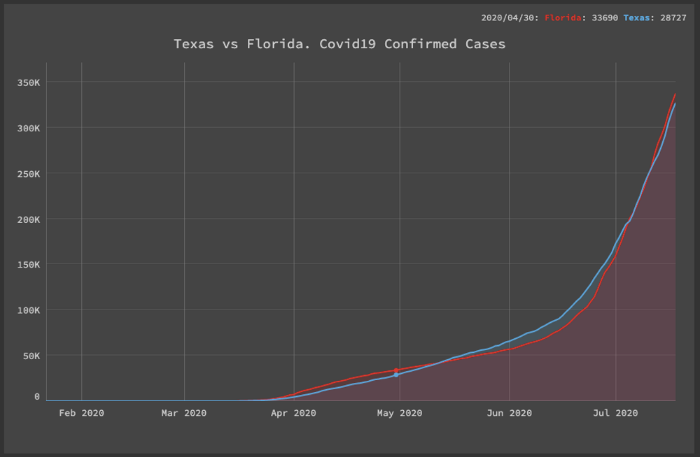
The US has more than 3.7 Million confirmed cases of Covid-19 cases and it's therefore the country with the highest number of those in the world. What it has been in the news lately is how states that rushed up to reopen as quickly as possible such as Texas and Florida, have an steady and exponencial increase on the total number of cases.
Next to California, who has seen also a sharp increase in the number cases, mainly in Los Angeles county, those states are getting closer to match the numbers of New York. It feels like a cautionary tale, that "going back to normal", won't as the precovid-19 normal until there is an effective vaccine or treatment in place.
Fortunately the an mRNA vaccine trial preliminary report in the NEJM stated the vaccine induced anti–SARS-CoV-2 immune responses in all participants, and no trial-limiting safety concerns were identified. Crossing the fingers for the next phases of those promising results.
Good country index
Feb 12, 2018
According to their website, the good country index attempts to measure what each country on earth contributes to the common good of humanity, and what it takes away, relative to its size. The index takes into account several data points in different areas such as: Science & Technology, Culture, International Peace & Security, World Order, Planet & Climate, Prosperity & Equality, Health & Wellbeing. The concept is quite interesting because but truly live in one single planet so the policies taken by any single country have effects on the rest of the world. The results for 2017 are:
|
|
Merry Xmas
Dec 24, 2017
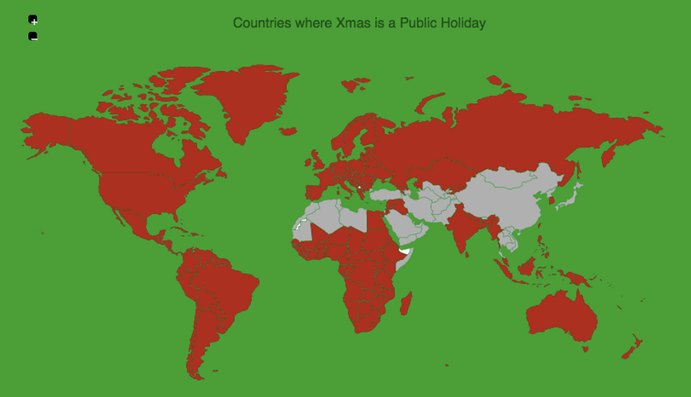
Duw to the historic Christianity expansion and the colonial history of America, Africa, Asia and Oceania, Xmas is a public holiday in the majority of countries around the world. So if you are celebrating Christmas today, I wish you a merry one!
Where to be born index
Aug 22, 2017
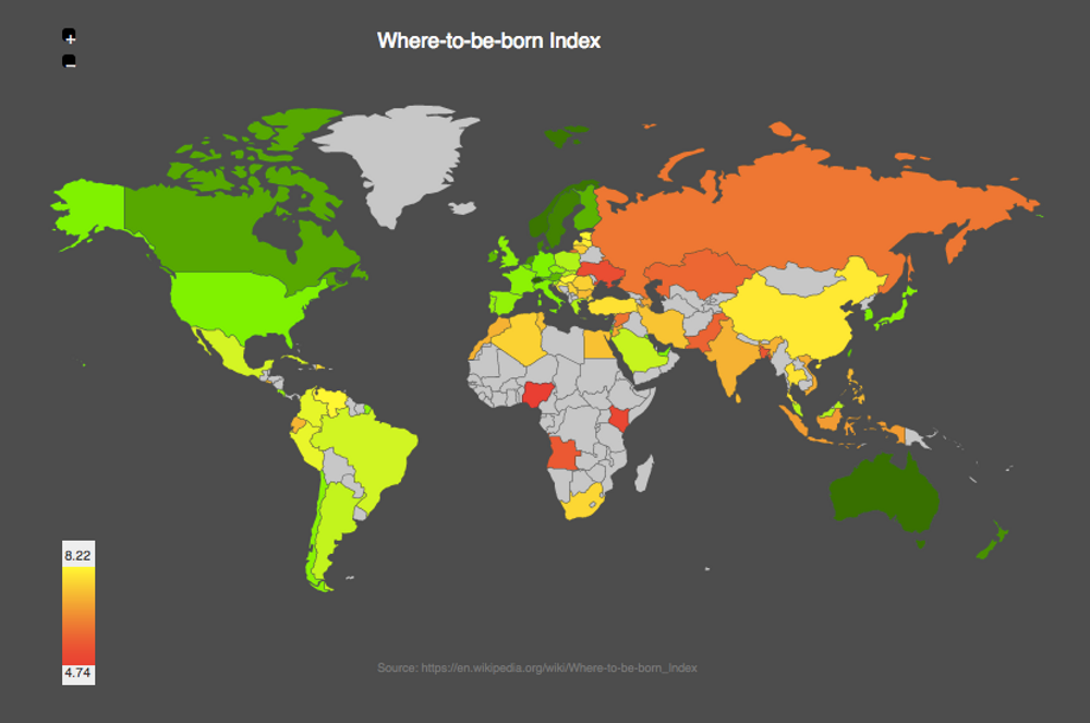
Wikipedia has an interesting article called Where to be Born Index where they discussed an article published by the economist about the classification of countries based on the criteria of which one provide the best opportunities for a healthy, safe and prosperous life in the years ahead.
Not surprising Switzerland and the Scandinavian countries are on top of the list joined by Australia, Canada, New Zealand and Singapore.
World Drug Related Deaths
Aug 21, 2017
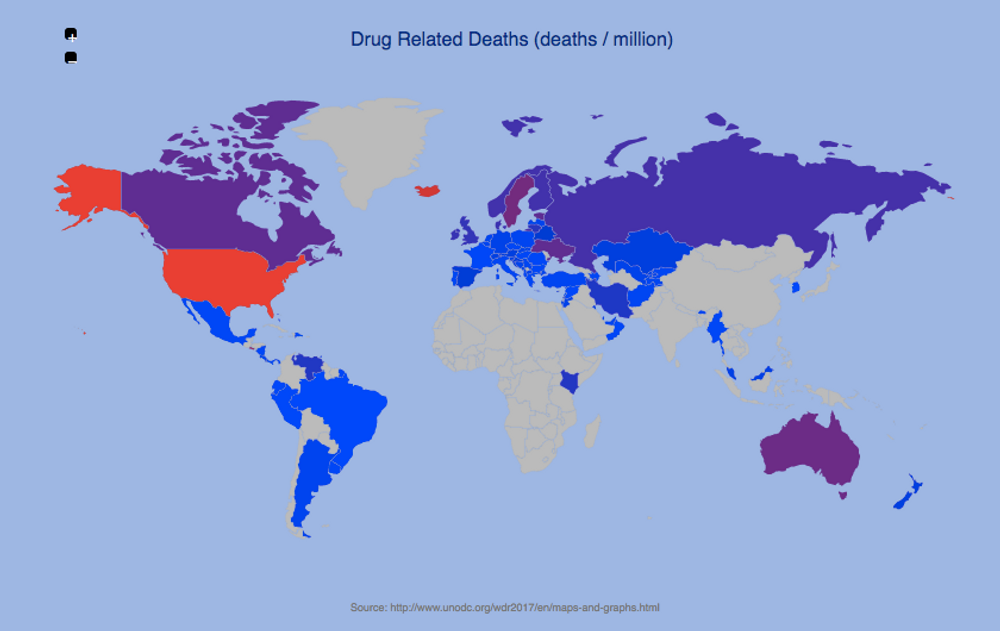
Last week a friend of mine an Anesthesiologist friend of mine was on TV discussing how in the US the opiods abuse has created a huge crisis. I was searching the web for statistics about this subject and I found a 2017 report published by the United Nations Office on drugs and crime that shows that the US indeed has the highest mortality rate related to drugs by far. Those deaths are related mainly to Opiods so the public discussion about this subject is definitely worth it.
Average Internet Connection Speed
Jun 08, 2017
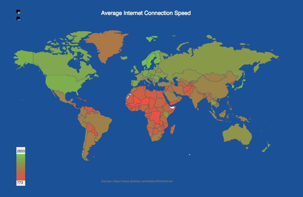
The content delivery company Akami publishes an State of the Internet report where it's possible to get an internet connection speeds and broadband adoption by country. On this dataset is not surprising that South Korea is on top of the chart:
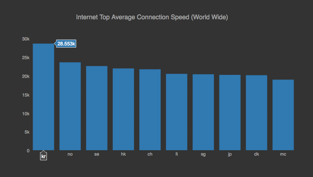
Followed by Norway and Sweden. Most of the South American and African countries are still behind.
Tobacco consumption per capita
Jun 01, 2017
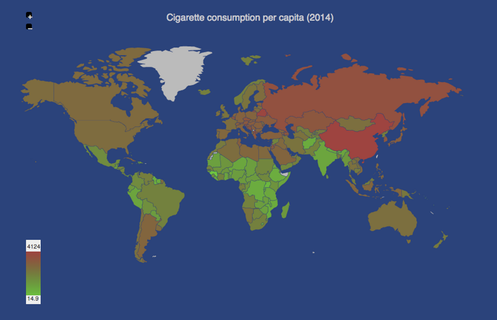
Yesterday it was the No tobacco day, an event setup by the member states of the World Health Organization (WHO) in 1987. This day serves as a good reminder about what is the tobacco consumption world wide. The dataset available in wikipedia shows that China is the biggest consumer in the world. Unfortunately this consumption is on the rise on the developing nations.
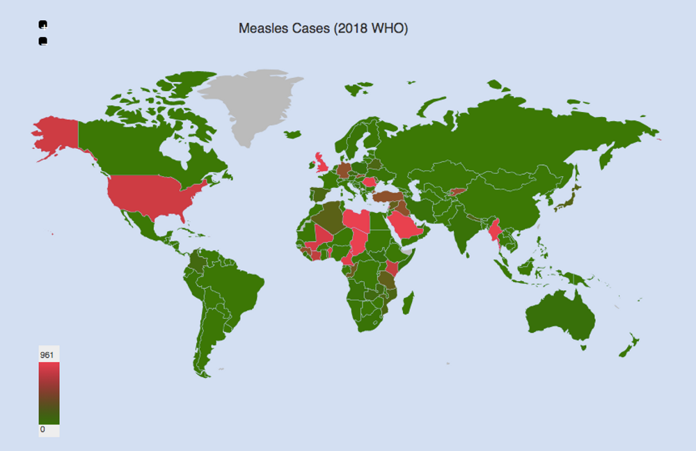
Polio Vaccination Coverage
Apr 13, 2017
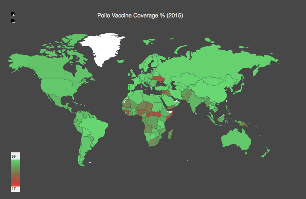
The world health organization has some datasets related to the immnunization coverage around the world.. The map above is generated with the estimates related to Polio. As you can see in the cases of Ukraine, Syria and South Sudan the conflicts don't only destroy people's lifes but also decreases the immunization coverage massively.
World Happiness Report 2017
Mar 20, 2017
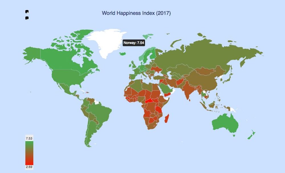
The World Happiness Report, published by the Sustainable Development Solutions Network of the United Nations, attempts to measure the happiness around the world. The 2017 issue published this month, puts Norway on the top of the list followed by Denmark, Iceland, Switzerland and Finland. On the other hand on the bottom of the list, the least happy places are the Central African Republic, Burundi, Tanzania, Syria and Rwanda. You can find the whole report here worldhappiness.report.
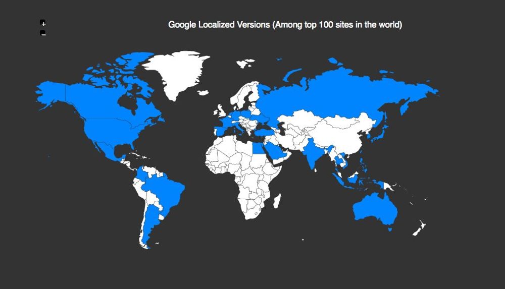
Top 100 websites in the world by type
Feb 25, 2017
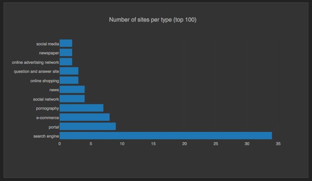
Wikipedia provides an article containing a list of the top 100 sites in the world in terms of traffic, using Alexa and SimilarWeb as sources. The chart above shows the type of sites count based on that list and Search Engines is the top category by far. Now, it's interesting to see how the main reason of this finding is due to the massive popularity of Google around the world: Its localized version on all this countries make it to the top 100 list:
Top Flowers Exporters in the World
Feb 18, 2017
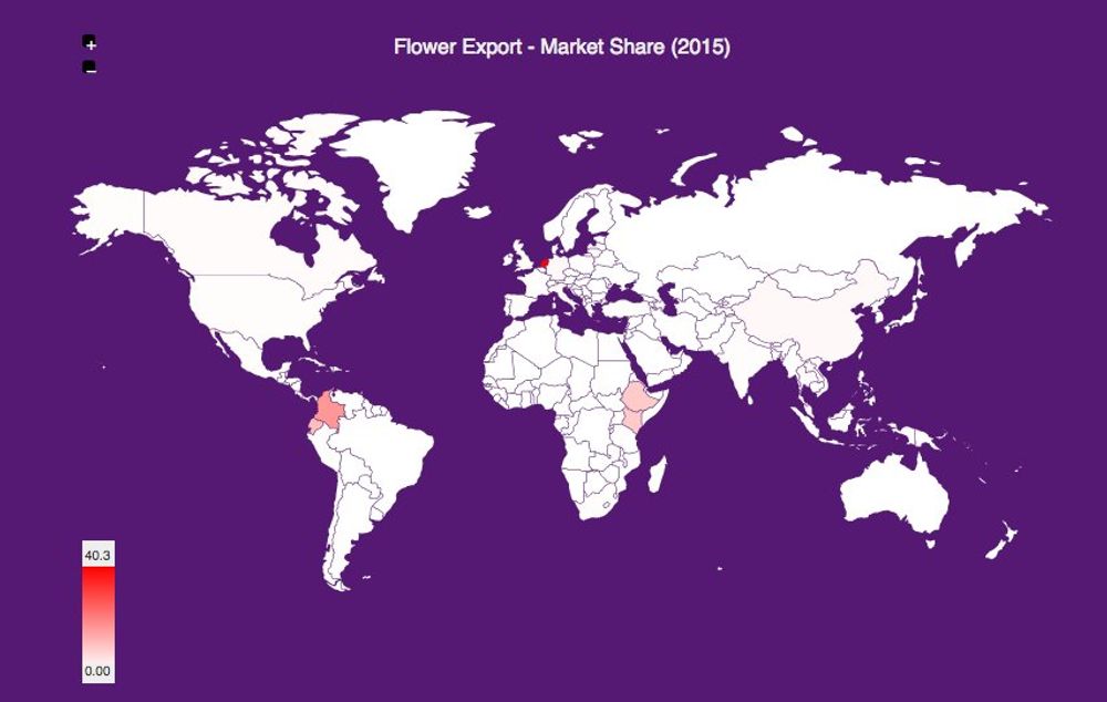
I knew Colombia was one the top flower exporters in the world, but a couple of days ago with all the flowers going around for St. Valentin's day I wondered who was the top exporter overall. Not surprinsing it's the Netherlands with a whooping ~40% market share of the world exports.
Percentage Arable Land per Person
Feb 10, 2017
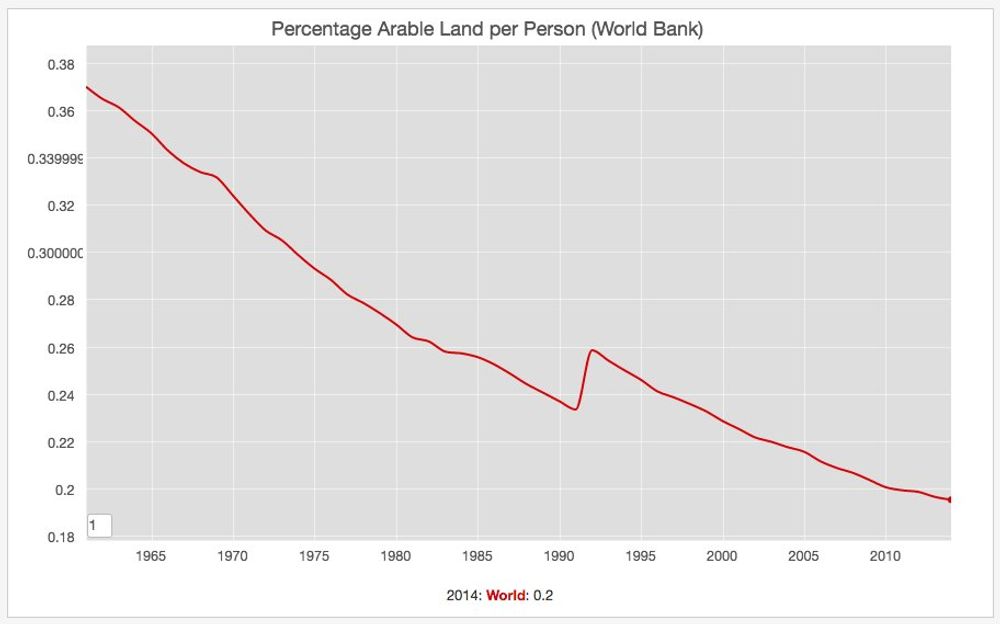
Data from the World Bank shows that the percentage. of arable land per person has been steadily decreasing since the 1960's until now.
Global Peace Index 2016
Feb 4, 2017
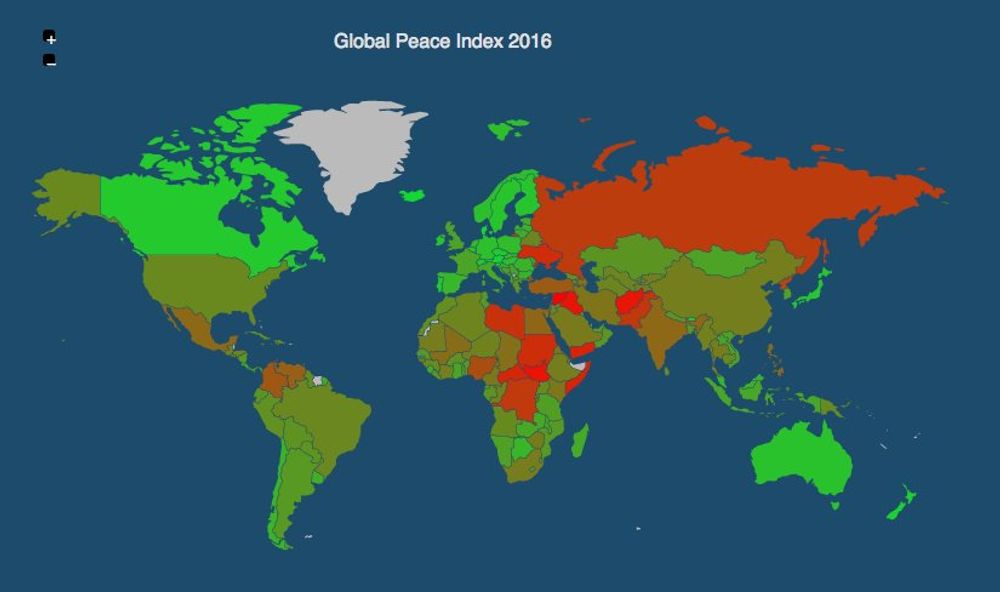
The Global Peace Index (GPI) is an attempt to measure the relative peacefulness of the countries around the world. The latest publication considers Syria, South Sudan, Iraq, Somalia and Afghanistan as the least peaceful places in the world. On the other hand Iceland, Denmark, Austria, New Zealand and Portugal are considered the most peaceful.
Corruption Index 2016
Jan 25, 2017
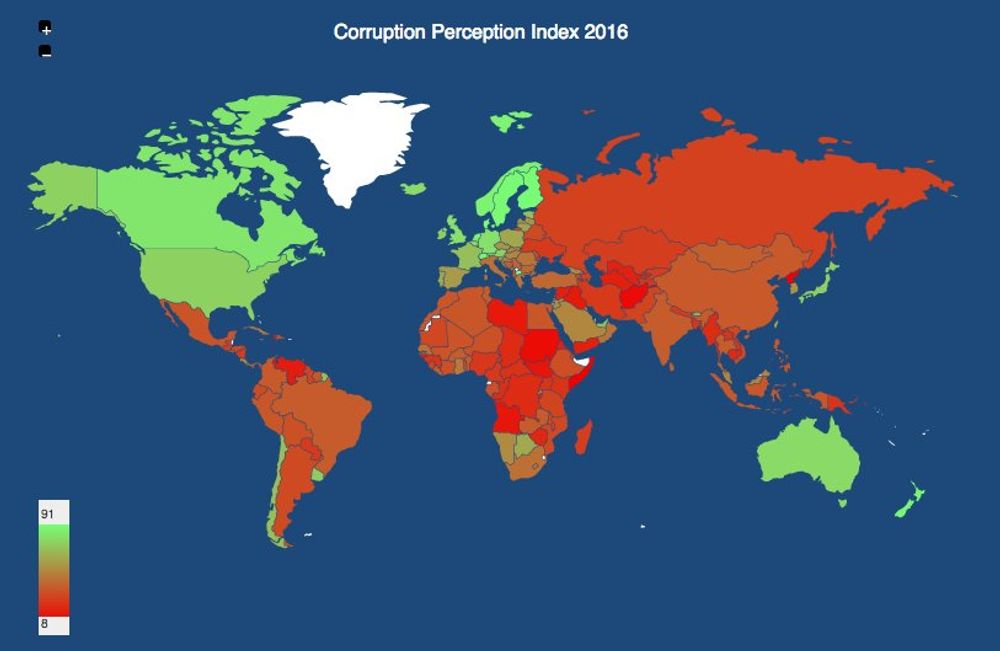
A year ago a published the 2015 update on the Corruption Perceptions Index and the data for 2016 is already available at the transparency international (transparency.org) website. As a recap this organizatio fights for a a world in which government, business, civil society and the daily lives of people are free of corruption. This year the least corrupt countries on the list are New Zealand and Finland and the most corrupt are Somalia and South Sudan.
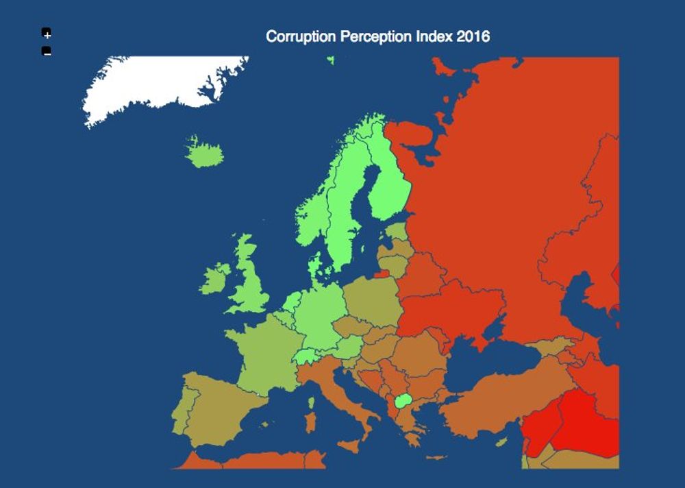
In Europe the trend is similar to last year: the most northern and western countries are least corrupt and viceversa.
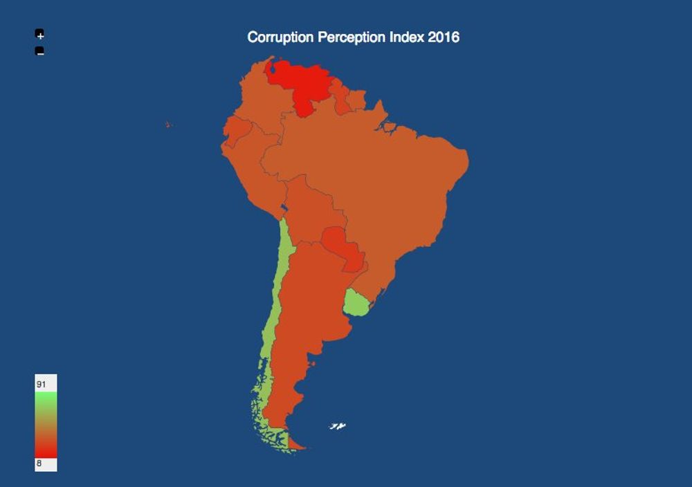
In South America, Venezuela is again this year at the bottom of the list.
2016 Hottest Year Ever
Jan 18, 2017
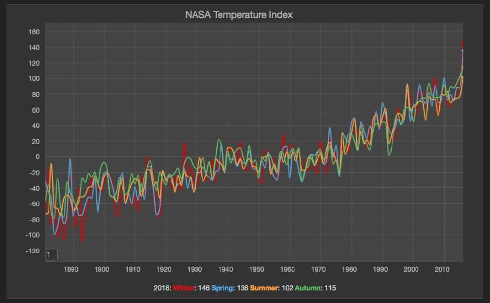
It's very unfortunate but not surprising that 2016 was the hottest year ever recorded. NASA revealed the consolidated reports and the data doesn't lie. Global warming is quite real. See the average by season chart.
CO2 Emissions per country
Jan 8, 2017
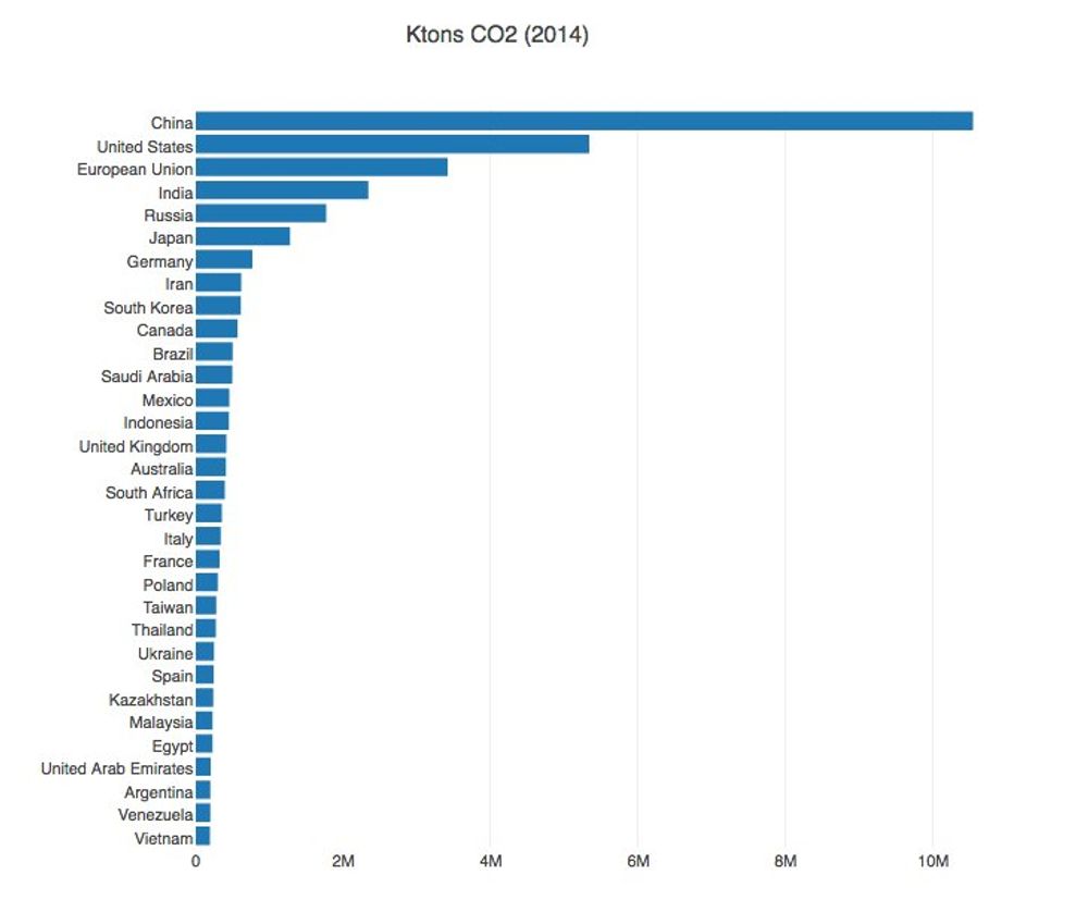
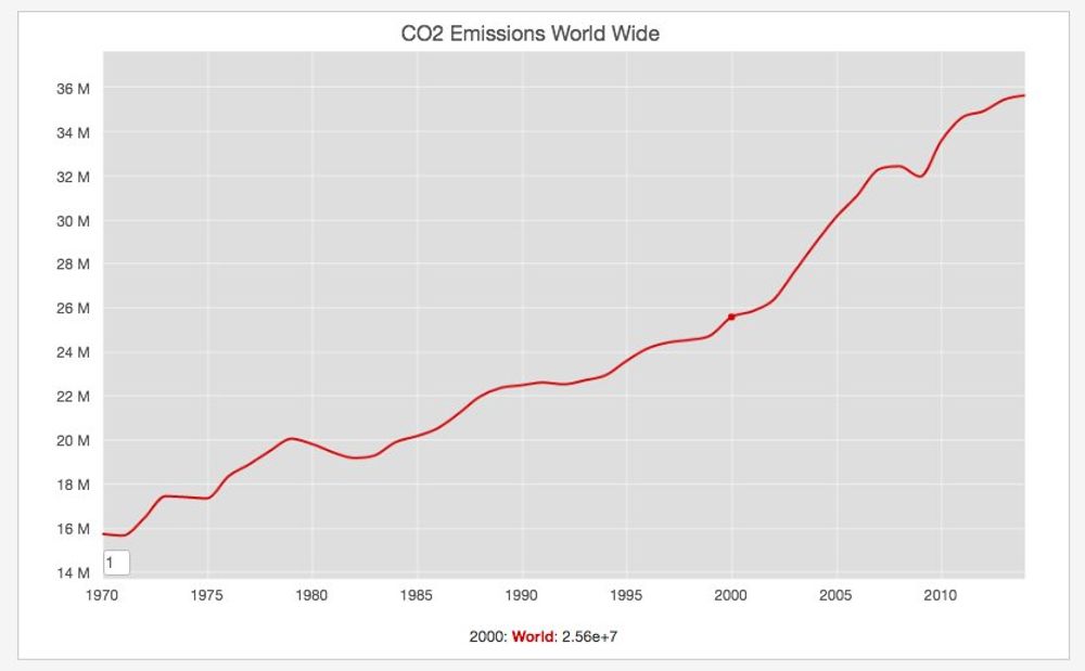
The European Union EDGAR database contains useful information about the CO2 emissions per country and worldwide. The previous graph shows the country with the highest CO2 Emissions (USA and China) and the total Emissions world wide. It's inside the spike the world experienced since 2000.
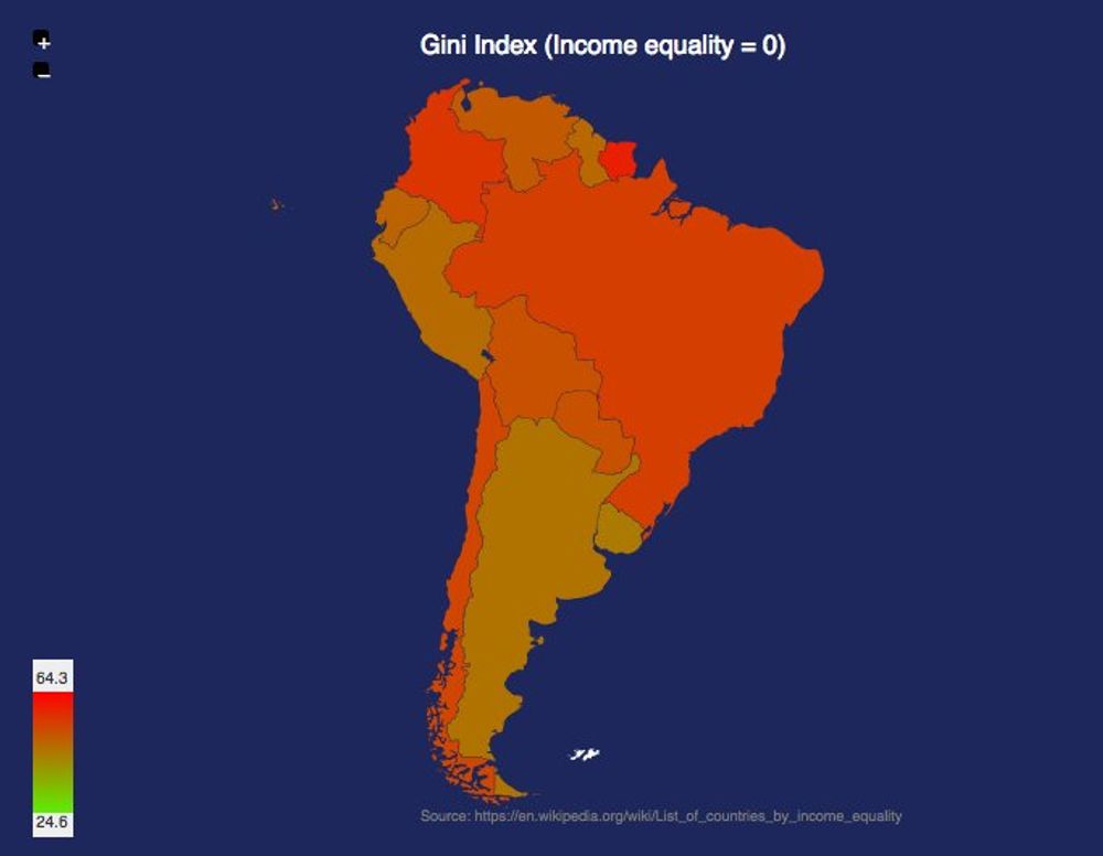
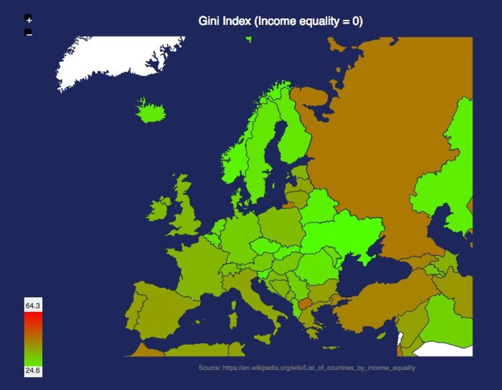
Income Inequality
Jan 6, 2017

One of the many controversies of the incoming US presidential administration is the incoming cabinet composed of very wealthy individuals. It's interesting to note that the US is not a very equal country compared to all the other western democracies. Even it's northern neighboor is way more equal comparing the Gini index.
It shoud be noted that this inequality is even worst in the south. The comparison between South America and Europe is striking:
Global Warming Reminder
Nov 15, 2016
Not surprising. The earth temperature measured by NASA in September was the highest ever warmest month. http://data.giss.nasa.gov/gistemp/tabledata_v3/GLB.Ts.txt. This follows the same pattern as every month this year. The Paris climate agreement clearly recognized the wide impact of Global Warming, but with the recent results of the US Elections, this issue needs to be raised all the time.
Android vs IOS market share 2016
Nov 1, 2016
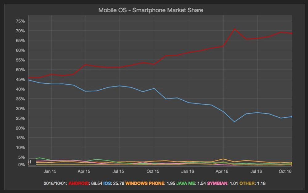
I haven't checked the Mobile OS market share in a while. According to net market share Android has 68.5% and IOS has 25.8% in the last month. I'm curious how this will be affected with the whole Note 7 issue. But still it's impressive the growth compared with just 2 years ago.
15 years ago - 9-11
Sep 11, 2016
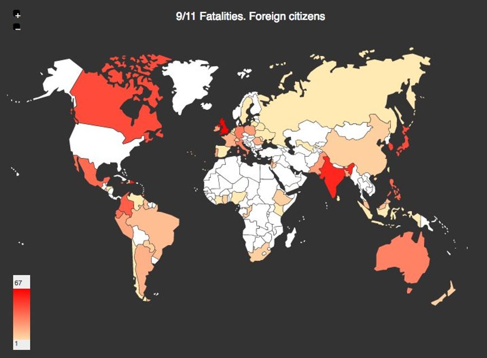
15 year ago today I was working from home when I got a call from my ex. "Are you watching TV? Because it seems there was an explosion in NYC in the WTC". I turn on the small TV set I had in my room and I saw in CNN the footage showing one of the twin towers in flames. Many of the fatalities on that attack where foreigners as you can see in the map above.
Nuclear Arsenals Map
Sep 9, 2016
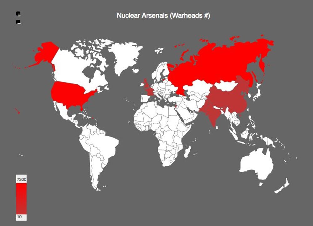
This morning I was reading in the news that North Korea conducted a fifth nuclear test. Pretty scary to think this nation could launch a nuclear attack. There is organization called ican that leads an international campaign to abolish nuclear weapons. They track the arsenals maintained by the different nuclear powers.
Search engines global market share
Sep 6, 2016
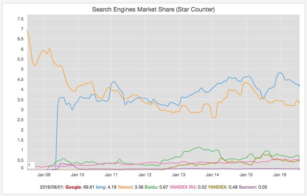
I haven't checked the global search engines market share in a while because clearly Google dominates in almost every country but yesterday I heard an interesting podcast on BBC about the power of Google and I was curious about the position of the 2nd and 3rd players. The chart above is generated with data from startcounter.
Wikimedia Visits by OS Family
Sep 2, 2016
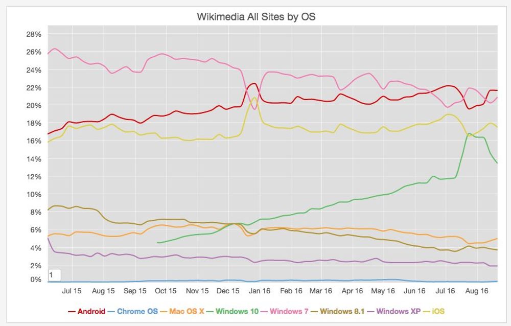
Alexa and Similar web rank Wikipedia as the 7th and 9th most visited site on the web, so the visit statistics produced by the foundation are a good proxy for getting data on the most popular platforms on the web. The previous chart shows the visits by OS family. As you can observe there windows 7 is the most popular desktop OS, but the mobile OS (Android and IOS) are responsible for almost 40% of the visits to those sites.
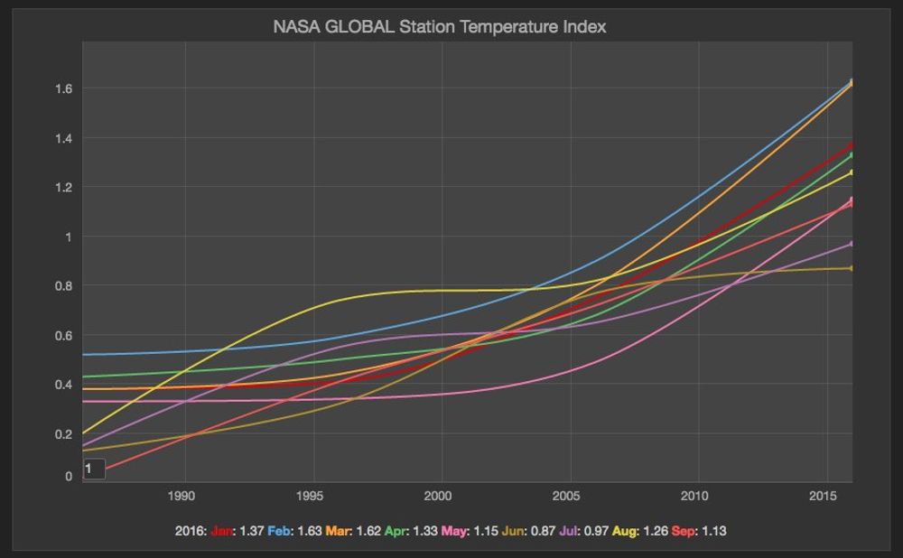
Global Warming Keeps Beating Records
Sep 1, 2016
According to an article published in the Guardian, the earth is warming at a pace unprecedented in 1,000 years. I discussed this point already three times in this blog, but I think it's worth to keep bring it up, because some people are not still convinced this is a real phenomenon.
Natural Disaster Risk
Aug 25, 2016
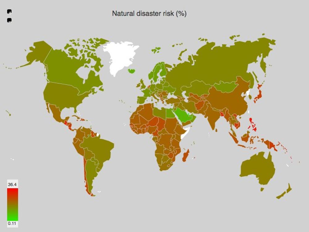
I was reading this morning about the countries having the highest risk of a natural disaster. Wikipedia has a list with the World Risk Index, calculated by the United Nations University for Environment and Human Securit. The map above is generated with this data.
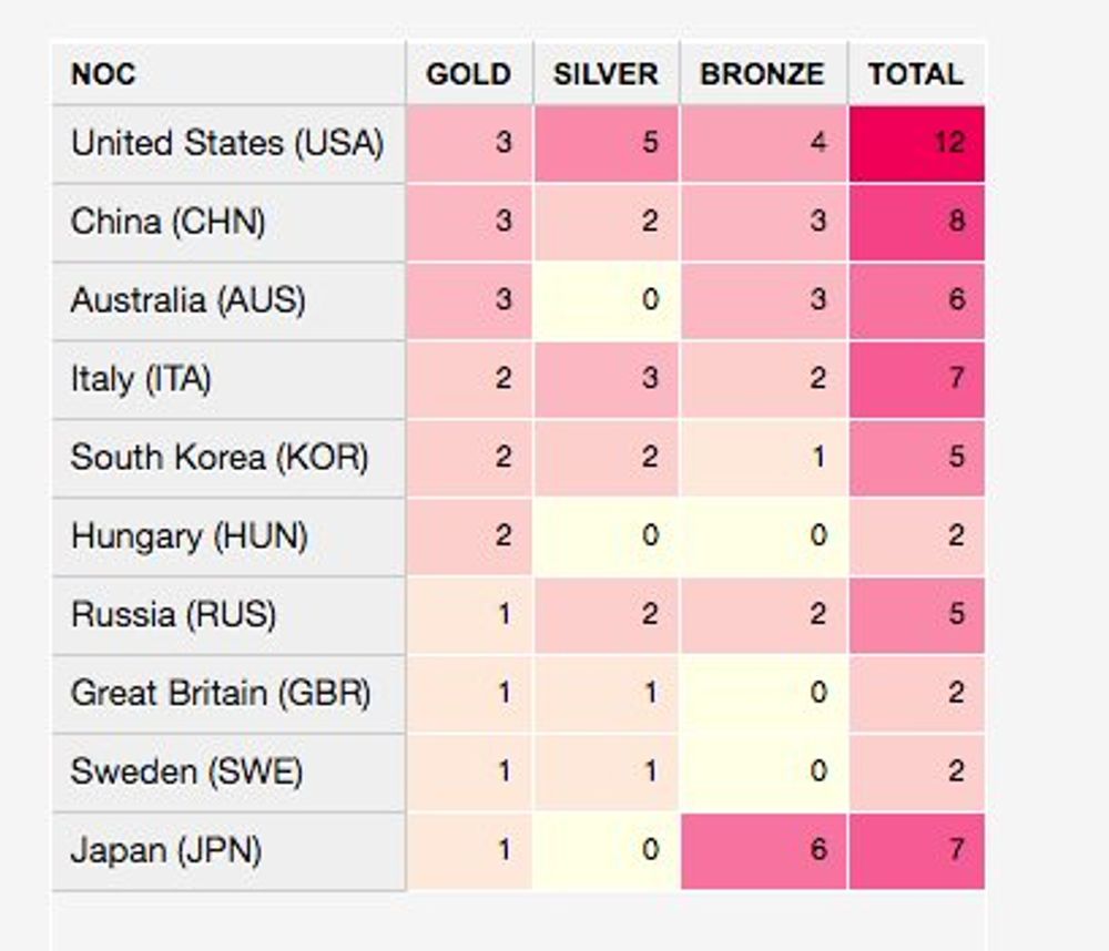
Rio Olympics Medals Table
Aug 8, 2016
After a couple of days of competition in the 2016 Rio Summer Olympics, the medals table starts to look similar to London 2012. This is the current table
And this is how the table looked at the end of the London competition.
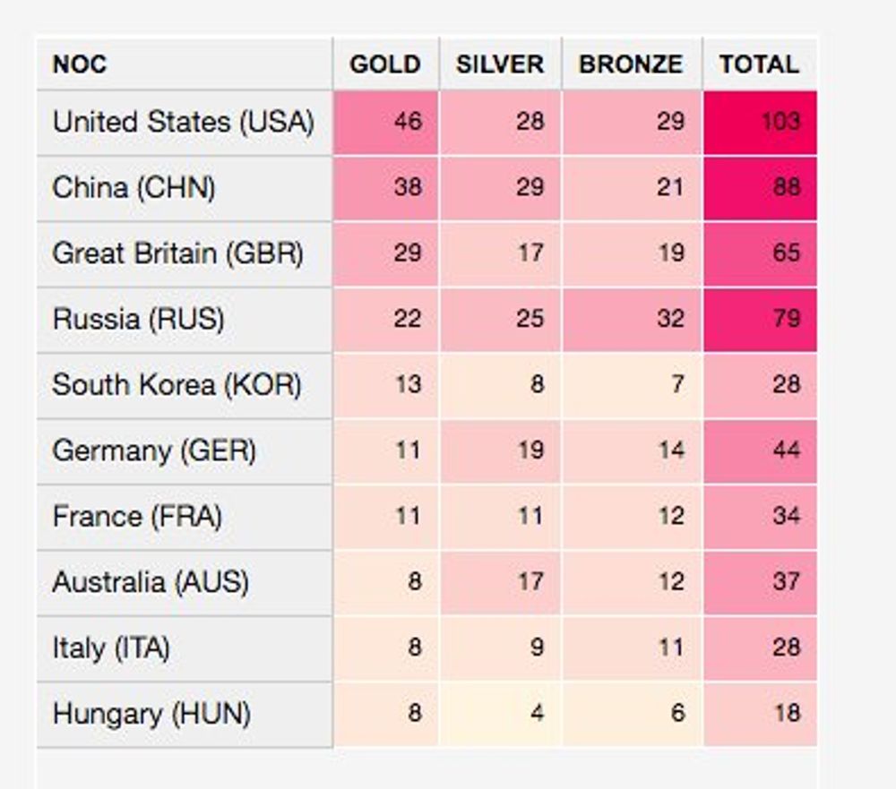
Clearly the US and China are dominating on this sport event.
Countries with a female head of state
Aug 3, 2016
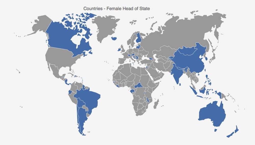
The map aboves shows the countries that currently have or ever had a female head of state. It's true the historic nomination of Hillary Clinton is a milestones achieved in the USA politics, but not in many countries of the world.
Big Mac Index
Jul 27, 2016
According to their website "THE Big Mac index was invented by The Economist in 1986 as a lighthearted guide to whether currencies are at their 'correct' level". It's interesting because even if it was designed to compare the purchasing-power parity, it shows the imbalance between different currencies. This map shows the last calculated index in July 2016.

10 Most Populous Countries
May 30, 2016
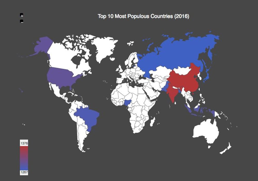
| 1 | China | 1376790000 |
| 2 | India | 1289590000 |
| 3 | United States | 323661000 |
| 4 | Indonesia | 257900000 |
| 5 | Brazil | 206140000 |
| 6 | Pakistan | 193273000 |
| 7 | Nigeria | 187200000 |
| 8 | Bangladesh | 160479000 |
| 9 | Russia | 141800000 |
| 10 | Japan | 126700000 |
10 most populous countries in the world. Almost 60% of the world population live there.
1st. May Workers Day
May 1, 2016
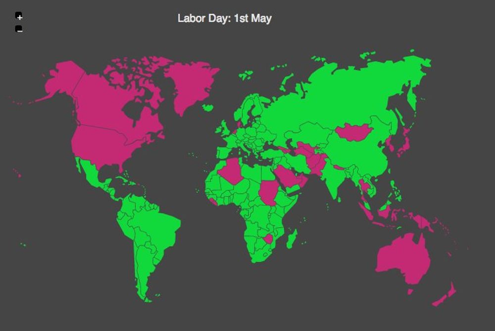
May 1st. was chosen to be the International Workers' Day in order to commemorate the events that happened on May 4, 1886 at Haymarket in Chicago. The police tried to disperse a public meeting during a general strike demanding for eight-hour workday, when an unidentified person threw a bomb at police. The Police responded by firing on the workers, killing four protesters.
This day is celebrated in many countries either today or tomorrow.
Nuclear Power Generation Map
Apr 26, 2016
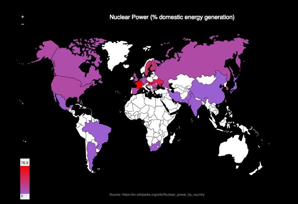
The Chenobyl plant nuclear accident happened 30 years ago today. The previous map show the nuclear energy as a percentage of domestic generation across the world. France have a highest percentage overall.
Even if the evidence shows that nuclear power is a safe means of generating electricity, the problems with major incidents man-made or nature-made are well documented.
Press Freedom Index
Apr 21, 2016
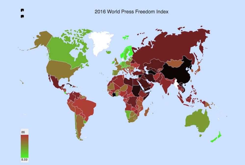
The reporters without borders organization published their last update on the Press Freedom Index around the world. Finland, Netherlands, Norway, Denmark and New Zealand are the best countries to exercise journalism. On the other hand China, Syria, Turkmenistan, North Korea and Eritrea are the worst on that matter.
Countries with most timezones
Apr 16, 2016
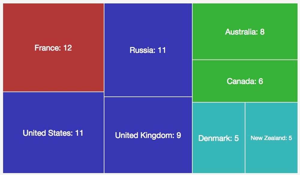
It's surprising but the country with the highest number of timezone is France with 12. This nation has territories in South America, the Caribbean and the Pacific islands. The US, the UK and Russia have also a high number of unique different timezones.
The full list of timezones per country can be found in wikipedia.
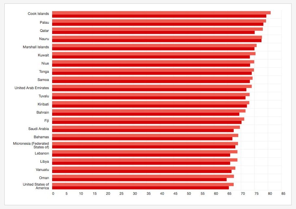
The world is becoming obese
Apr 9, 2016
A recent article published by the lancet magazine shows that obesity is becoming a real world health problem above the underweight issue. They used population-based data sources, with more than 19·2 million adult participants in 186 of 200 countries and found out that the number of obese people has increased from 105 million in 1975 to 641 million in 2014.
The world health organization also publishes data about Obesity and Overweight and the percentage of population with overweight (BMI > 25) is more than half of the population in almost all the industralized countries in the world:
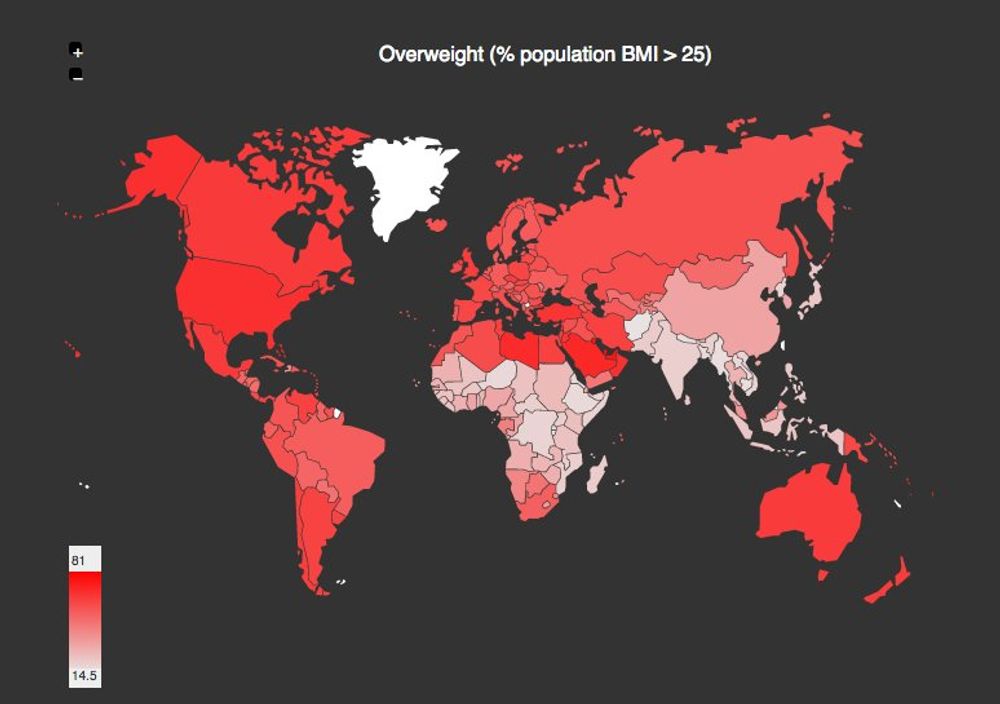
This problem is particularly bad in the pacific islands.
Countries affected by the Panama Papers
Apr 6, 2016
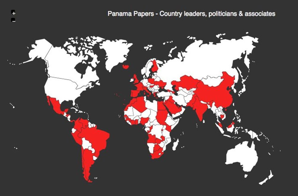
The news cycle during the last couple of days has been dominated by the Panama Papers. Those are a leaked set of 11.5 million confidential documents that provide detailed information about 214000 offshore companies listed by a Panamanian Law Firm. Many of those shell companies were set abroad by World leader, Politicians and Associated around the world.
The map above show the countries that have been mentioned in the Panama Papers.
Minimum Wage Worldwide
Apr 5, 2016
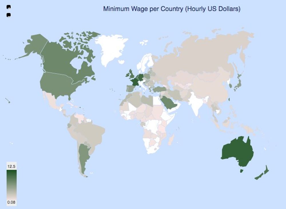
This morning I was reading in the news about the discussion in the US primaries related to the minimum wage in the US, particularly in NY and CA. Wikipedia contains an article tracking the mininum wage worldwide. The map above summarises the data.
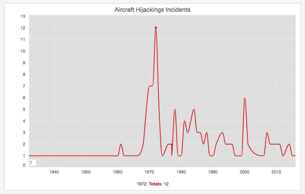
Aircraft Hijacking Statistics
Mar 30, 2016
Last night when I was reading about the EgyptAir hijacking I was thinking that fortunately these type of incidents are now very rare. I remember when I was a kid that these was one of the cliches in the American movies of the 80's (ie. Delta Force), but with the tough security measures in place in most of the airports, this doesn't happen as often.
Wikipedia has a detailed compilation on the aircraft hijacking incidents and there is defintively a decrease compared to the peak on the 70s.
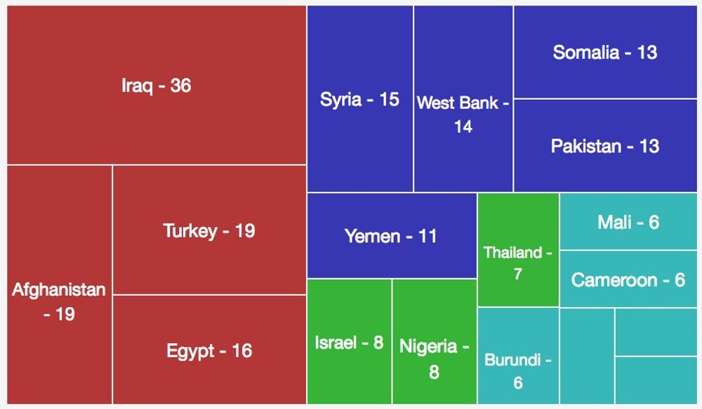
Countries Most Affected By Terrorism Incidents 2016
Mar 29, 2016
Wikipedia has a list of the terrorist incidents that happened during the current year. Based on this information those are the countries most affected by number of terror incidents:
The Most Happy And Least Happy Countries In The World
Mar 17, 2016
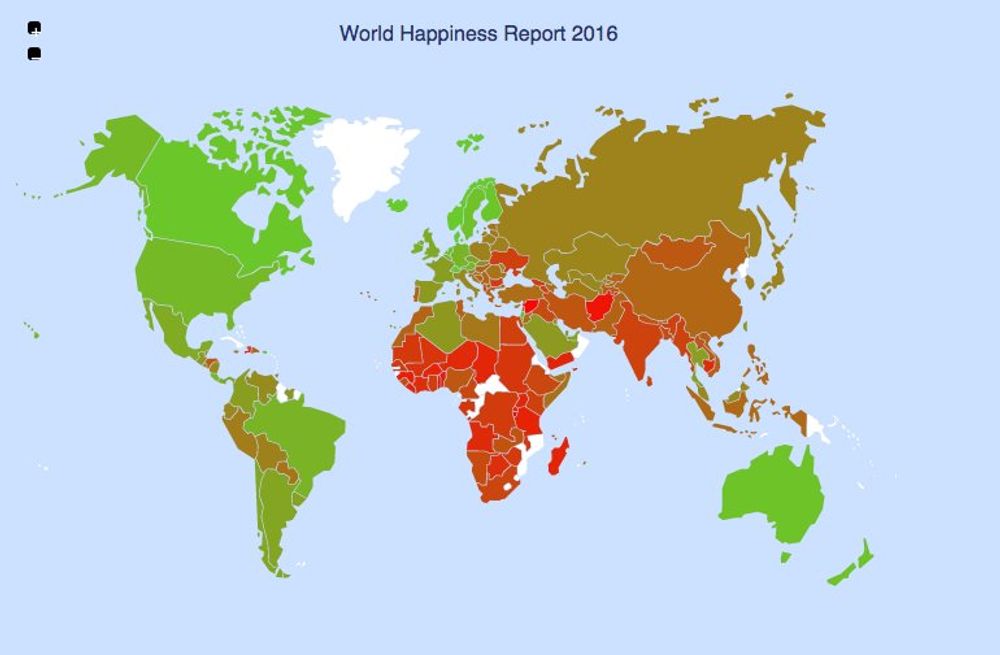
Denmark is the world’s happiest country and Burundi the least-happy nation, according to the World Happiness Report.
Another Global Warming Record
Mar 14, 2016
Back in February I wrote on this blog how the world was really warming up and the data from February 2016 is even worst. The NASA reported that this month had the biggest temperature raise recorded in modern history:
Again the world is warming up!
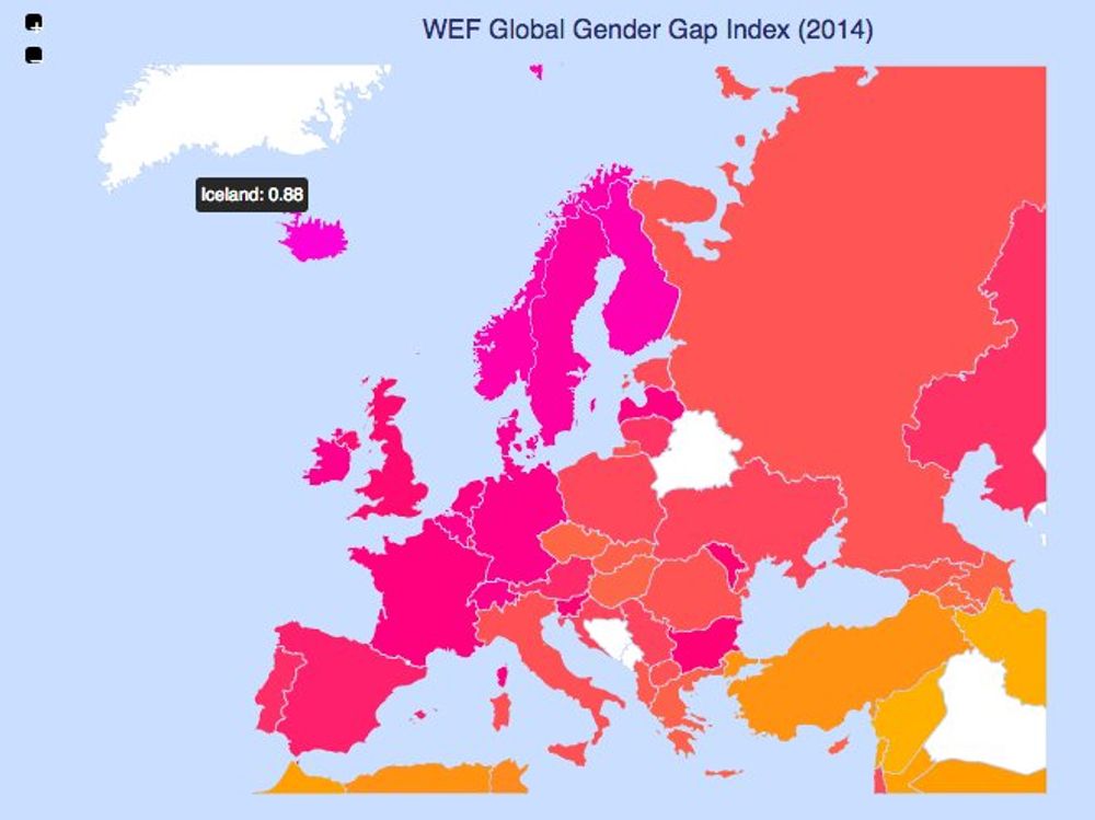
Women International Day And Gender Gap
Mar 10, 2016
A couple of days ago it was celebrated the International Women's Day. Even if some friends get offended by this day, I believe it's important to highlight how unfortunately there are differences between men and women as reported by the WEC Genger Gap Report:
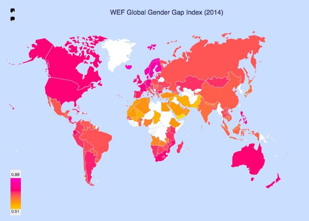
It's nice to see how this index is really good in Europe, particularly in the Scandinavian countires. Kudos to Iceland.
| Country | 2006 | 2007 | 2008 | 2009 | 2010 | 2011 | 2012 | 2013 | 2014 |
|---|---|---|---|---|---|---|---|---|---|
| Iceland | 0.7813 | 0.7836 | 0.7999 | 0.8276 | 0.8496 | 0.8530 | 0.8640 | 0.8731 | 0.8594 |
| Finland | 0.7958 | 0.8044 | 0.8195 | 0.8252 | 0.8260 | 0.8383 | 0.8451 | 0.8421 | 0.8453 |
| Norway | 0.7994 | 0.8059 | 0.8239 | 0.8227 | 0.8404 | 0.8404 | 0.8403 | 0.8417 | 0.8374 |
| Sweden | 0.8133 | 0.8146 | 0.8139 | 0.8139 | 0.8024 | 0.8044 | 0.8159 | 0.8129 | 0.8165 |
| Denmark | 0.7462 | 0.7519 | 0.7538 | 0.7628 | 0.7719 | 0.7778 | 0.7777 | 0.7779 | 0.8025 |
| Nicaragua | 0.6566 | 0.6458 | 0.6747 | 0.7002 | 0.7176 | 0.7245 | 0.7697 | 0.7715 | 0.7894 |
| Ireland | 0.7335 | 0.7457 | 0.7518 | 0.7597 | 0.7773 | 0.7830 | 0.7839 | 0.7823 | 0.7850 |
| Philippines | 0.7516 | 0.7629 | 0.7568 | 0.7579 | 0.7654 | 0.7685 | 0.7757 | 0.7832 | 0.7814 |
| Belgium | 0.7078 | 0.7198 | 0.7163 | 0.7165 | 0.7509 | 0.7531 | 0.7652 | 0.7684 | 0.7809 |
Top Operating Systems In Desktop And Mobile
Mar 4, 2016
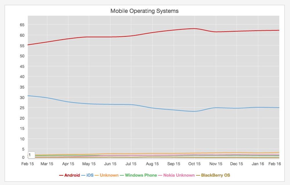
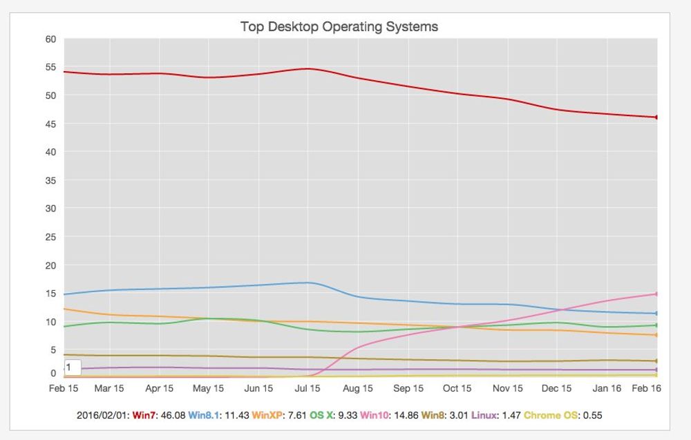
I haven't check the operating systems market share in Desktop and Mobile and based on the data from starcounter the usual suspects: Windows and Android dominate in each sector respectively.
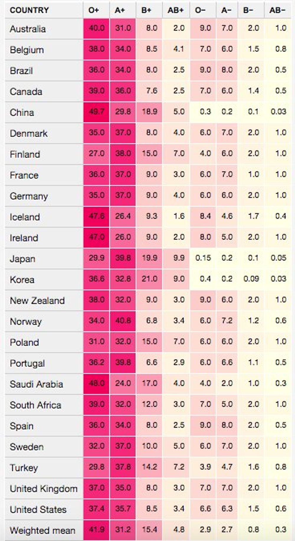
Most And Less Common Blood Type
Mar 2, 2016
When I was at school I learned the blood type 0+ was the most common one and AB- the rarest one. Wikipedia has a good article about this information with a breakdown by country.
O+ and A+ are the most common ones and AB- is the least common:.
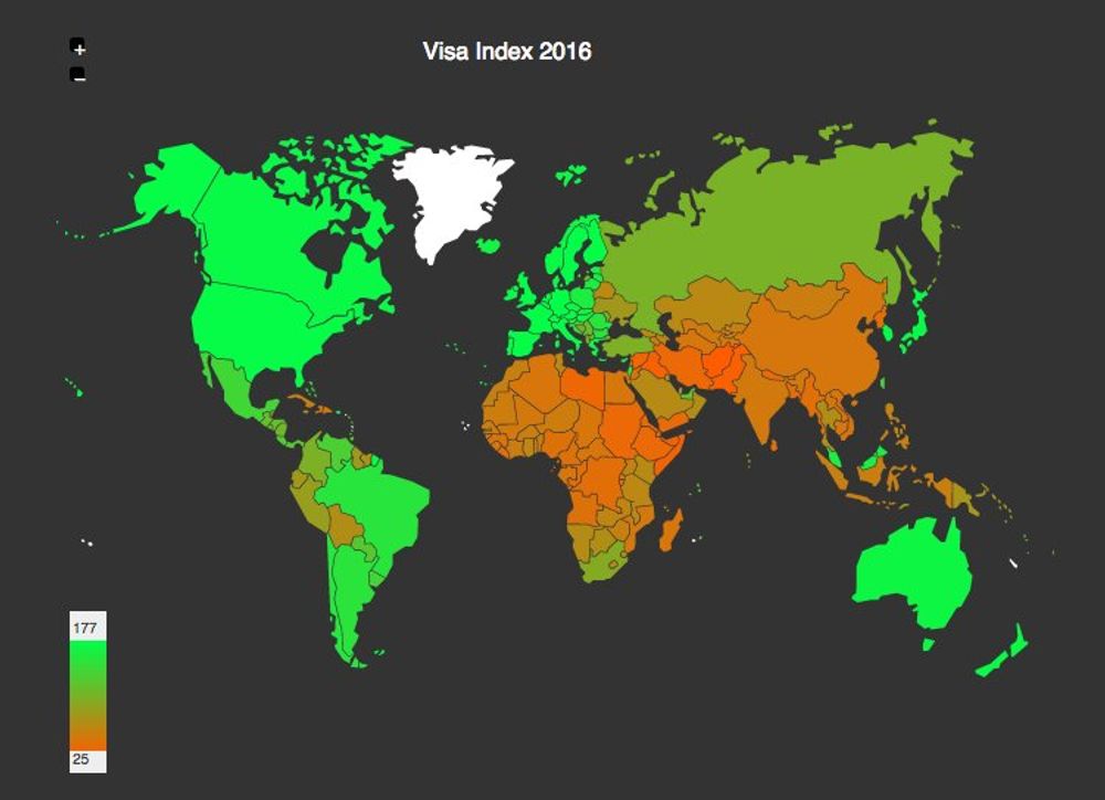
Most Convenient Passport To Travel.
Mar 1, 2016
Today an Irish friend at work shared a very interesting news article describing how the German passport was the most convenient one to travel around the world. There is a visa restriction index that classifies the passports based to the number of countries and territories that a holder can visit visa free. Germany has indeed the highest score followed close by many other European countries. Here is a map of this index worldwide:
Death Penalty In The World
Feb 24, 2016
Amnesty international published a report about the Human Rights in the world and the death penalty (capital punishment) is still a dark spot in many places. A 2014 report published by same organization shows that unfortunately there are still 58 countries in the world that retain and actively use the Death Penalty.

European Passenger Train Percentage
Feb 18, 2016
Last december I have a slight problem with my ear and unfortunately I wasn't able to fly for a little while. I was glad there is an amazing train system in Europe, so I had alternative to travel from an to Berlin. Here is a chart with percentage of train transportation percentage by country in Europe, coming from a dataset published by the European Stats office:

I have been lucky enough to use the trains on all those countries.
Worldwide Earthquake Statistics
Feb 15, 2016
Last Sunday I was reading the breaking news about a cliff that had collapsed into the sea on New Zealand’s South Island following a severe magnitude 5.9 earthquake that happened near to Christchurch. I remembered when I visited New Zealand last year that I heard the nickname of this country is the "Shaky Isles" for it's constant seismic activity. The two islands that compose this country lie on the margin of two colliding tectonic plates, making them earthquake prone.
The usgs.gov website has an interesting section with statistics about Earthquakes worldwide. Please find next a heatmap table with the data they publshed there :

There were two particularly deadly years: 2004 when a [tsunami hit many countries in the Indian Ocean](https://en.wikipedia.org/wiki/2004_Indian_Ocean_earthquake_and_tsunami), and 2010 when a huge earthquake happened in Léogâne, Haiti.
Top Wine Producing Countries In The World
Feb 13, 2016
Yesterday I finished the week with a couple of nice wine glasses from Portugal. This morning when I woke up and I was looking at the bottle, I started to ask myself what are the top counties in the world in terms of wine production. I thought about France?, Italy?, Spain?.
Fortunatelly wikipedia has an article with data coming from the UN Food and Agriculture Organization (FAO), sorting the countries by their volume of wine production for the year 2013 in metric tonnes.
There are no suprises in the Top 3 positions (they are indeed France, Italy and Spain), but it's interesting how China has climbed to the 6th position, above Argentina and Australia:


Decline In Handwriting And Postal Volume
Feb 12, 2016
Yesterday evening I was listening a really cool Freakonomics podcast episode titled How needs handwriting . Stephen Dubner discussed the pros and cons of handwriting, its origins and the emphasis is still given in the high school system. Quite interesting.
I started to think that I use hand writing at work to draw schemas about the different pieces of a project or task that I need to accomplish, but it definitely has been a while since the last time I wrote a proper hand written letter.
I'm wanted to check if there was data about postal volume, because I guess the decline in handwriting has an impact on these numbers. I found two interesting sources:
- [UK Postal Museum](http://www.postalheritage.org.uk/explore/history/statistics/)
- [US Postal Services](https://about.usps.com/who-we-are/postal-facts/decade-of-facts-and-figures.htm)
Both sites show a decline in the number of total mail send. The decline is particularly dramatic after 2005:


Podcast About When CEO Pay Exploded
Feb 11, 2016
Last night I was walking around the neighbourhood, while I was listening a very interesting podcast from NPR, explaining how and when the CEOs compensation packages exploded. You can get it here. What they discussed in a nutshell was that the enterprises tried to match the compensation of their CEOs with the performance (fair enough) using Stock Options, but the companies didn't realize what was the exact value of those offers.
The economic public institute published an article last year about how the CEOs make [300 times the salary of an average worker](http://jco.im/300-times).

Most Active Programming Languages
Feb 10, 2016
It is hard to assess what are the most popular programming languages because there are multiple ways to measure them but none of the are perfect (ie. Repositories, lines of code, occurrences in job offers, etc). For example if work with embedded systems C is very popular, but if you work on the web the history is very different.
One interesting measurement of popularity of a language are the questions related to the language. Stack Overflow features questions and answers on a wide range of programming languages and compiles a list of the most popular tags with total, today and this week breakdown.

This data is a nice proxy on how popular are the different programming languages.

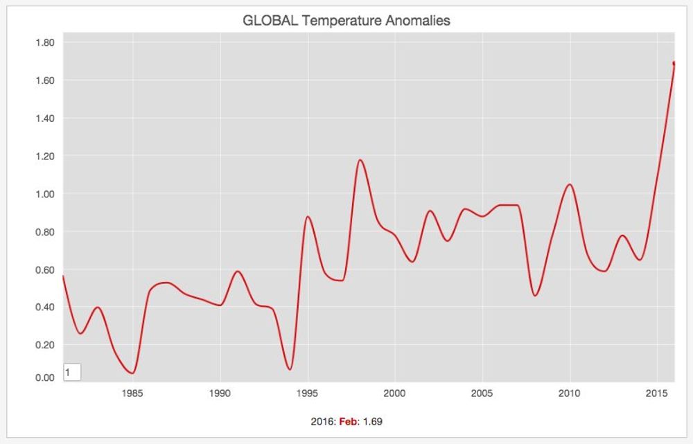
World Is Warming Up
Feb 9, 2016
Last sunday it was really warm here in Berlin. I was able to get on my bike and do a nice ride to the north part of the city. Nevertheless I remembered some data I read back in January about how the world is really warming up:
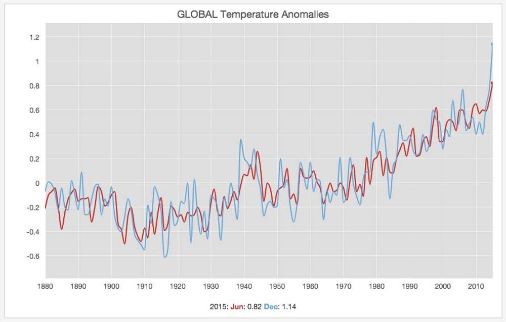
This winter has been really mild in Berlin.
Cities By Murder Rate.
Feb 7, 2016
The Economist published a couple of days ago in their daily chart section an interesting graph with the most violent cities in the world (in terms of homicide rate). They have an analysis on how the Venezuelan economy is in turmoil and how according to a Mexican report "Venezuela's capital Caracas had the highest murder rate in the world last year"
Wikipedia also offers a page compiling a List of cities by murder rate. Unfortunately most of the Top 50 cities from this list are located in South America (and many of those in Brazil!). Take a look at the following chart and map:


The Least And Most Corrupt Countries In 2015
Jan 28, 2016
This morning I was reading the Corruption Perceptions Index 2015 published by transparency international (transparency.org). This organization fights for a a world in which government, business, civil society and the daily lives of people are free of corruption and publishes this report that quantifies perceptions of corruption in the public sector and normalizes the data from multiple countries in an index from 0 (the most corrupt) to 100 (the least corrupt).
I compiled a couple of maps from their data sources.

One of the first conclusions from this report is that the scandinavian countries have the highest scores in the Corruption Perception Index (Least corrupted countries) as it can be observed in the following European map:

In South America, Chile and Uruguay have the highest scores, while Venezuela has the lowest.
