Peaceful evening at the EPFL Campus
Nov 7, 2021
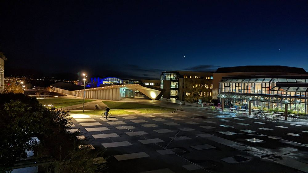
Last week when I was leaving work the light was just perfect to take this snapshopt at the EPFL Campus.
US Northwest Melting
Jun 30, 2021
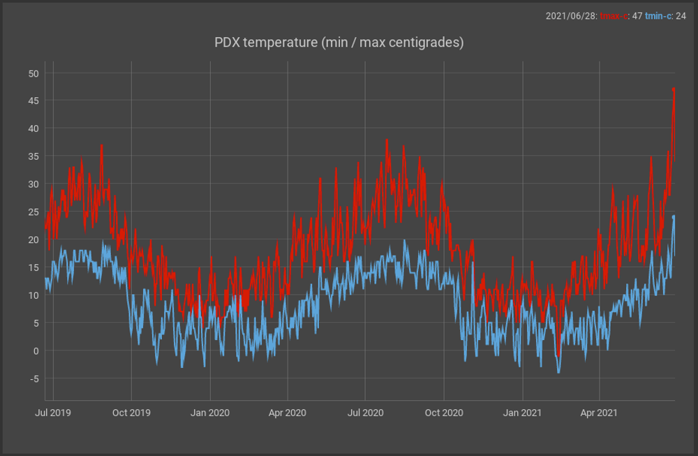
I have been reading the news for the last few days as the northwestern United States has experienced a strong heat wave that has broken all records in its major cities including Seattle and Portland.
There are even reports that it is mentioned that part of the infrastructure of those cities is literally melting due to that heat wave. The PDX airport maintains records of the highest and lowest temperatures every day since 1938 (see charts above) and when observing a graph of these data it is clear that the temperatures of the last days are surprising for that region of the country.
I have been saying it for a while in this blog: Global warming is not a joke!
Photogenic Ouchy
May 11, 2021
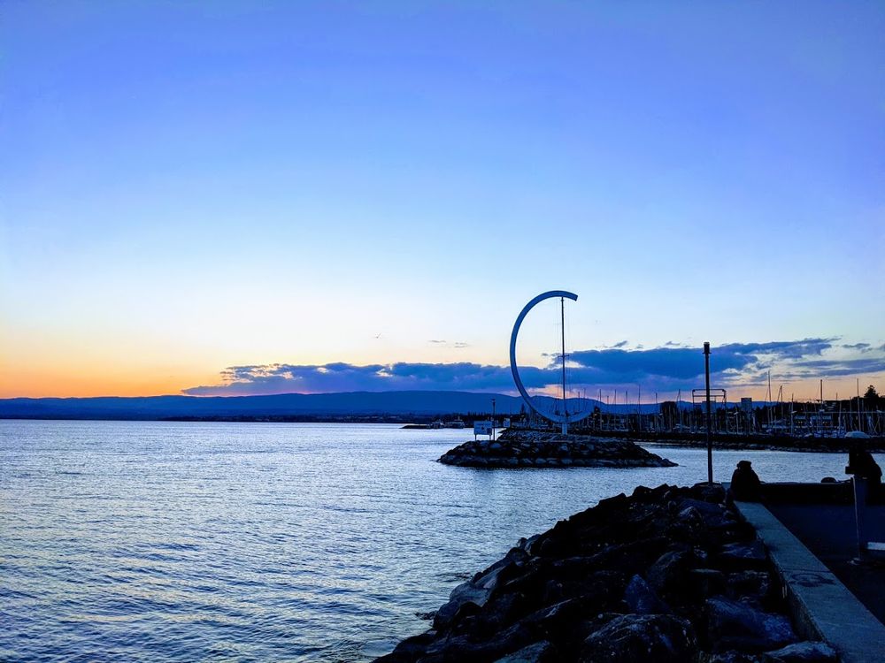
Lausanne is a city that can be quite photogenic, and one of my favorite areas for taking photos is the Ouchy area. This area has stunning views of the lake with the alps in the background. A couple of weeks ago I took this photo of the Éole sculpture created by Clelia Bettua in 1995.
USA 2020 Presidential Election Results
Nov 13, 2020
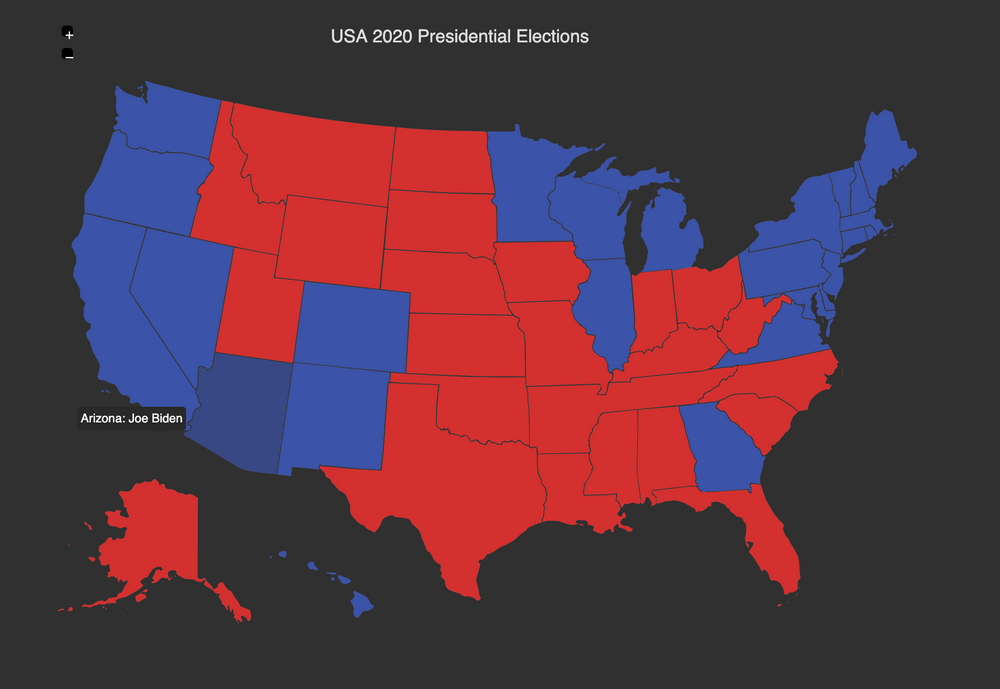
It has been almost a week since the major American television networks projected that Joe Biden would win the U.S. presidential election.
However, with all the noise in the news about the current president's refusal to recognize the election results, and with the dire consequences this attitude can have, the fact is that the Democratic candidate won the election.
Given that COVID-19 cases are skyrocketing in the country, and in much of the world, it is a relief to know that very soon there will be a president there with a concrete plan to deal with the pandemic.
COVID-19 Surges in CA, FL and TX
Jul 21, 2020
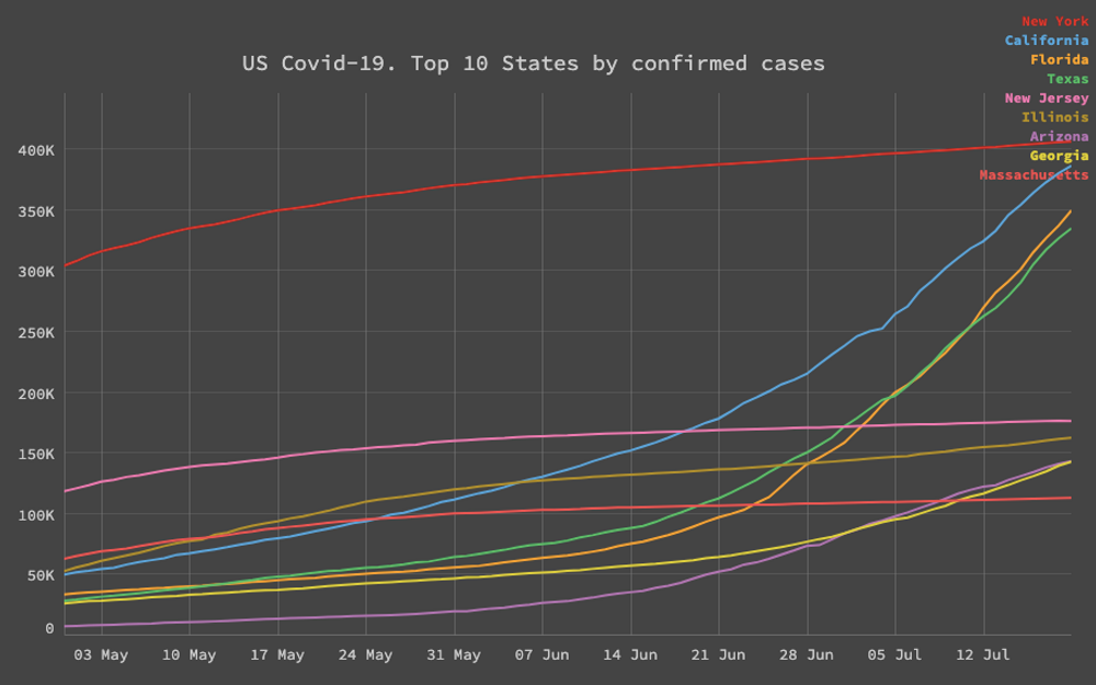
The US has more than 3.7 Million confirmed cases of Covid-19 cases and it's therefore the country with the highest number of those in the world. What it has been in the news lately is how states that rushed up to reopen as quickly as possible such as Texas and Florida, have an steady and exponencial increase on the total number of cases.
Next to California, who has seen also a sharp increase in the number cases, mainly in Los Angeles county, those states are getting closer to match the numbers of New York. It feels like a cautionary tale, that "going back to normal", won't as the precovid-19 normal until there is an effective vaccine or treatment in place.
Fortunately the an mRNA vaccine trial preliminary report in the NEJM stated the vaccine induced anti–SARS-CoV-2 immune responses in all participants, and no trial-limiting safety concerns were identified. Crossing the fingers for the next phases of those promising results.
Biden is leading in the presidential polls
Jun 19, 2020
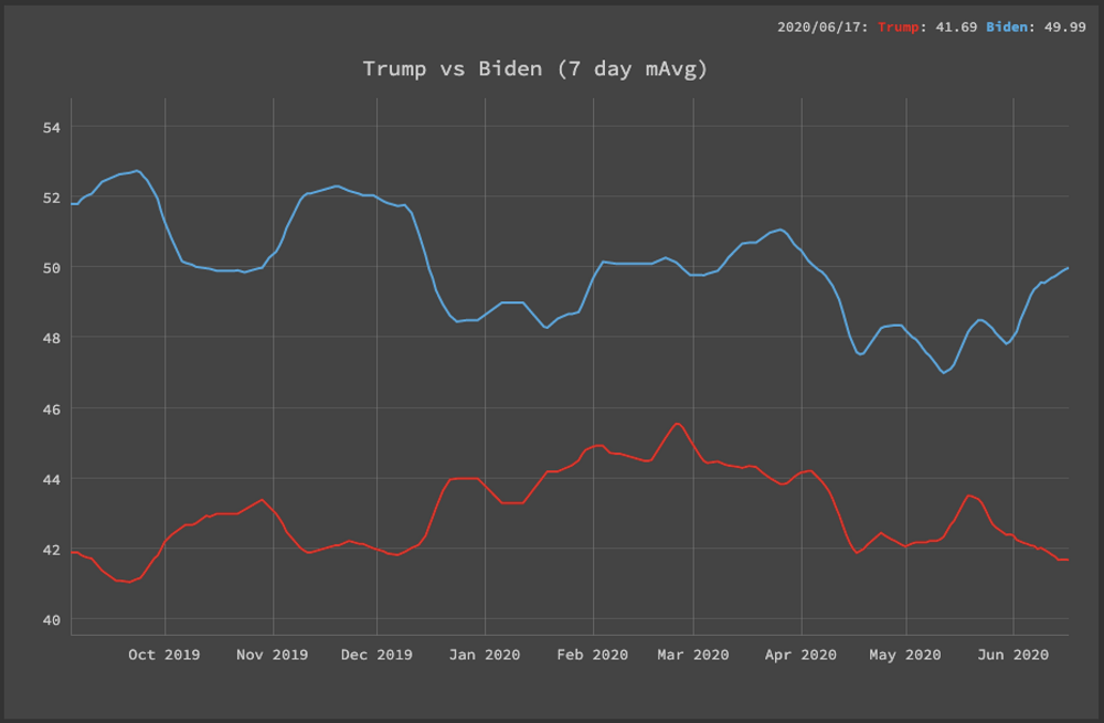
There have been a some articles in the news lately discusing how the current occupant of the white house is losing ground against his democractic rival including: The remarkable collapse of Donald Trumps polling numbers and States that Trump won easily in 2016 are looking tight for him in November. The news are not surprising, giving the horrible COVID-19 numbers on the USA, its ecnomic impact and the wave of protest againts police brutaliy. The data from realclearpolitics seems to confirm this trend.
US Democratic primaries search trends
Feb 02, 2020
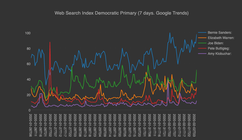
The US democratic primaries are around the corner with the first state voting next monday. I was curious how the Google Search Trends in the last 7 days, reflect on each one of top tier candidates. Bernie Sanders is clearly winning on that “interest” field. Interesting to see what will happen in the actual Iowa caucuses.
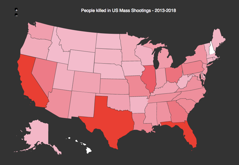
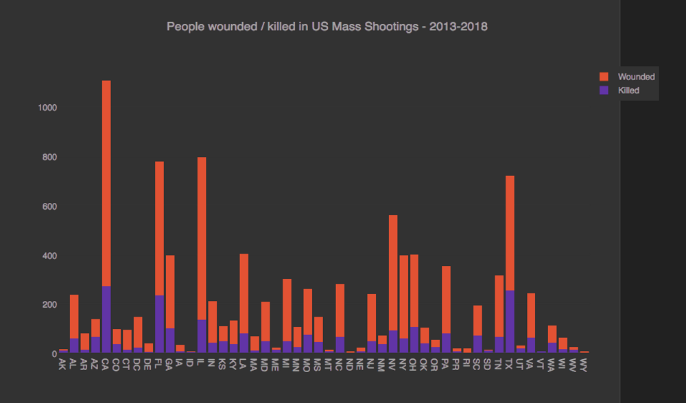
Mass shootings in the US Again
Aug 5, 2019
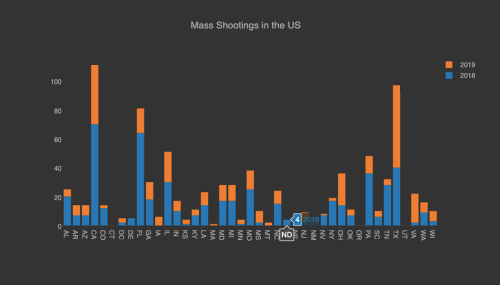
In february last year, I was blogging about how the mass shootings in the US were happening constantly and 86 people had been killed at the time of the Parkland massacre (528 ended up dying that year according to the data from the massshootingtracker.org project). The current year unfortunately has followed a similar pattern (347 people have been killed) and as the NY Times put it: "In a country that has become nearly numb to men with guns opening fire in schools, at concerts and in churches, the back-to-back bursts of gun violence in less than 24 hours were enough to leave the public stunned and shaken..."
The shootings have followed a darker tone this time, as hate speech has been added to the motivation of these horrible events, like the ones that just happened in El Paso, TX.
Democratic Primaries Polls
May 07, 2019
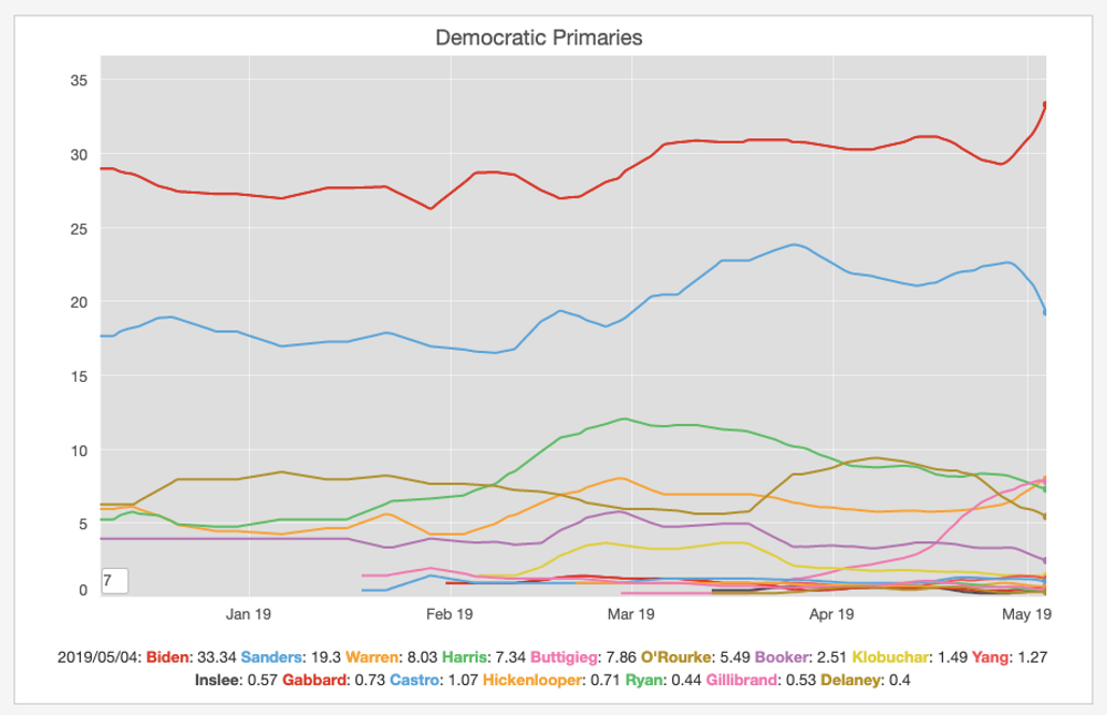
On the 25th of April, Joe Biden announced he was joining the crowded democratic primaries race. The aggregate polls show an interesting trend. Even before his announcement he was leading the polls, but there was a clear but in his numbers afterwards. It's interesting to see what will happen in the months ahead. Will those trends continue and the main race is going to be between him a Bernie Sanders? or will there be another candaidate getting into the top spot?. Time will tell.
2019 Measles Outbreak in the US
May 04, 2019
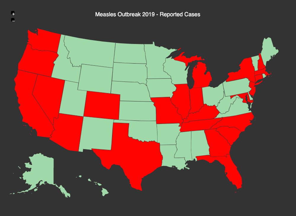
According to the CDC website there have been multiple cases of measles confirmed in 22 separate US states. This a sad figure given the fact that Measles was declared eliminated in 2000 across the United States. The misinformation promoted by the anti-vaxxer movement is having detrimental effects on the epidemiology of this highly contagious, yet preventable disease.
US Congress party control over time
Nov 28, 2018
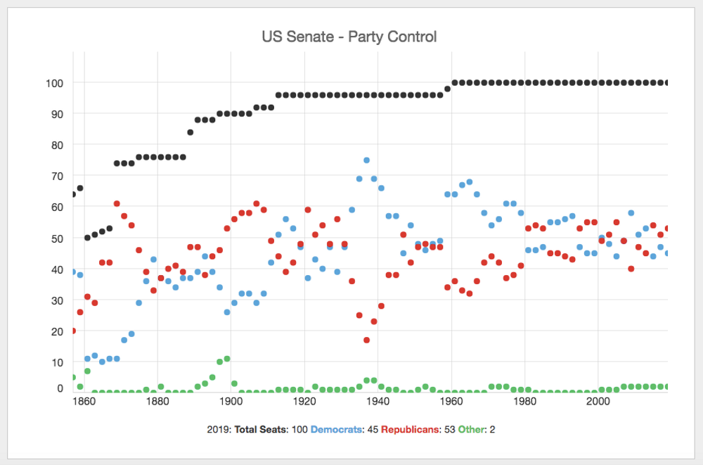
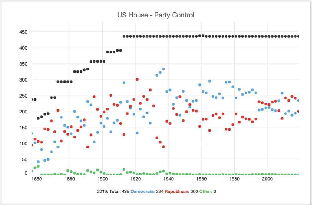
The previous charts show the US Senate and US House party control over time since the 19th century.
Mass shootings in the US
Feb 15, 2018
Unfortunately another day and another mass shooting in the US (In Florida this time). The massshootingtracker.org website compiles all the public data available of those type of incidents in the news and the numbers are staggering. Just this year 86 people have been killed and 142 wounded on those type of incidents. The charts above show how this affect every single state on that country.
Is it time now to discuss sensible gun control laws? or how many more are needed?
Gun ownership in the US
Oct 16, 2017
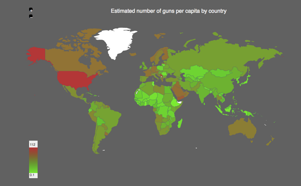
Two weeks ago the horrible mass shooting in las Vegas Ocurred where 59 people were killed and 241 were injured, followed by prayers and minutes of silence, but nothing substantially changed in the US to regulate the Gun Violence. The firearms ownership of that country is insane compared with the rest of the nations of the world.
There are many reasons why people become violent around the plante. but in the United States in particular, this violence become deadly when the perpetrator can get so easily a fire weapon.
Beautiful Big Sur
Apr 18, 2017

Last weekend we had the opportunity to visit the big sur park, a quite beautiful region on California's Central Coast. This region is quite beautiful as you can see in this picture.
I love San Francisco
Apr 10, 2017
It had been awhile but today I had the opportunity to stroll again through nice streets of San Francisco. I really like this city and I'm happy I had the opportunity to visit SFO one time more.
USA Country of Immigrants
Feb 22, 2017
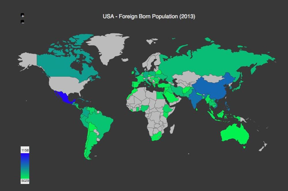
The USA is indeed a country of immigrants. In 2013, 41M people out of the total 316M population were foreign born, coming from all over the world. The top countries from that list are Mexico, China, India, Phillipines and Vietnam, but it's a true multinacional and multicultural society that should be embraced!
Trump Polluting the news headlines
Feb 15, 2017
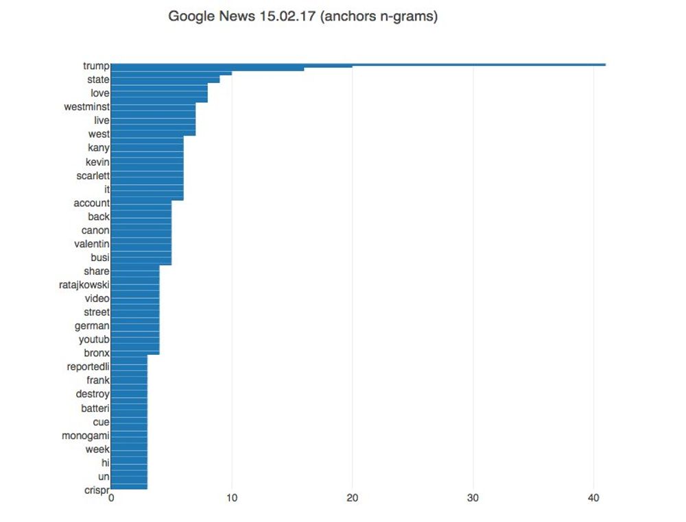
For many years now, Google News has been my main source for information since the algorithm stacks and order quite nicely headlines coming from multiple news sources. Since Trump was inagurated I had the subjective impression that his name is overtaking most of the headlines (He is newsworthy of course, but still). I was making a quick n-grams check on the headlines anchors and his name is indeed taking many of the headline spots.
Trump Unfavorable Ratings
Jan 24, 2017
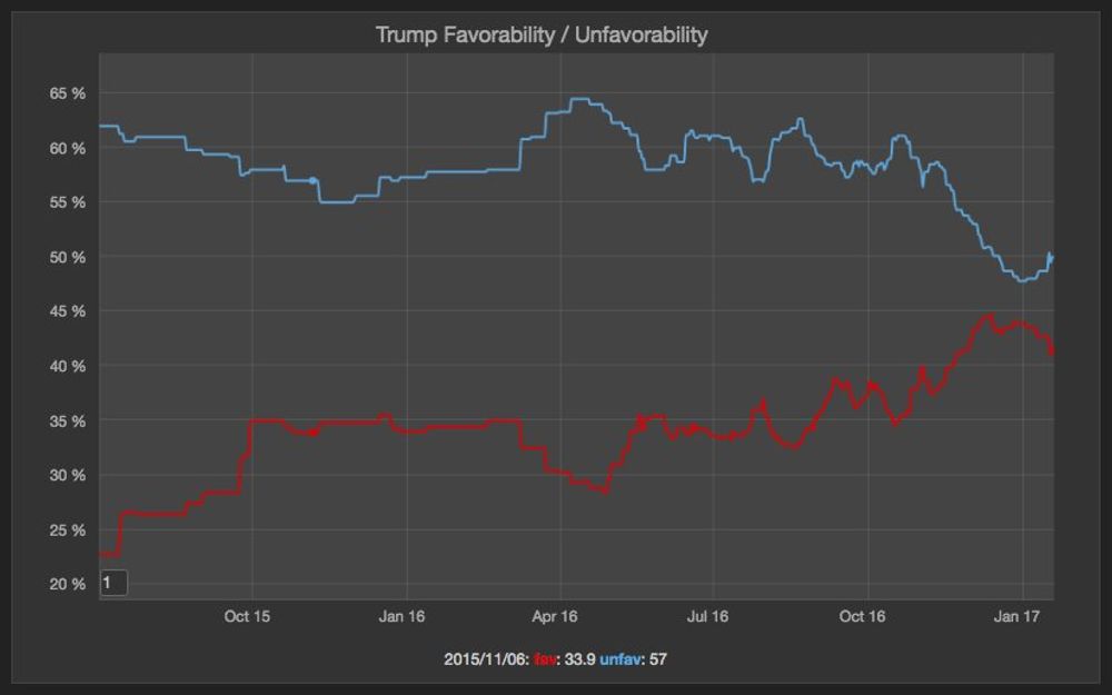
The polls aggregates from Real Clear Politics shows that Trump opinion has never been more favorable than unfavorable. In fact it has been reported he assumed office as one of the most unpopular presidents in the modern history. The trend show it's again down after a short increase following the election.
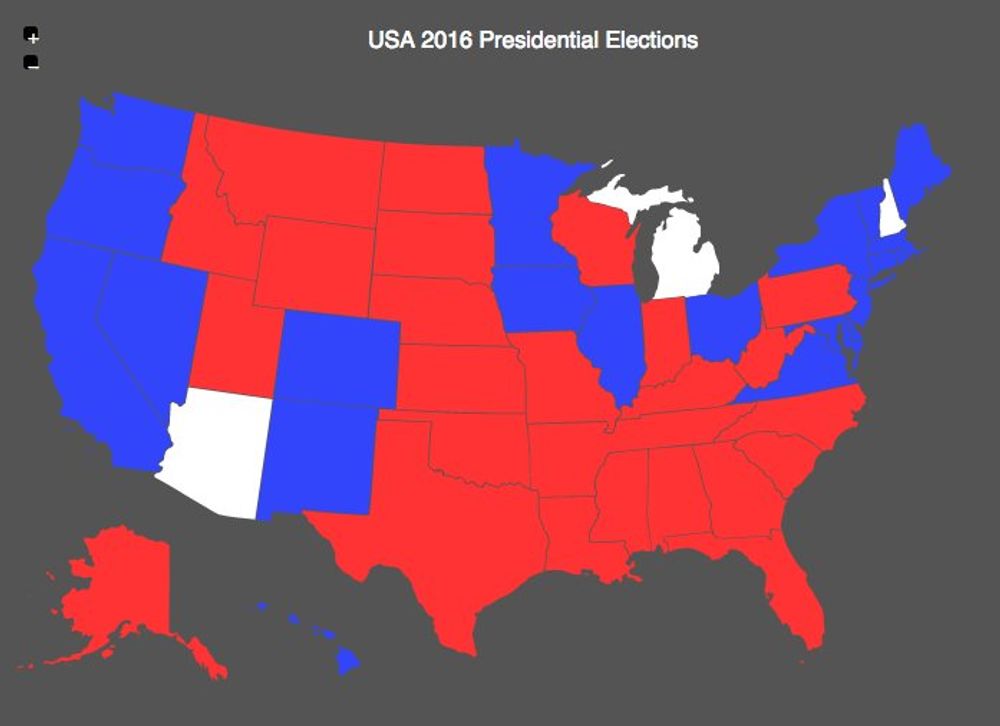
Trump tremendous defeat in California
Dec 29, 2016
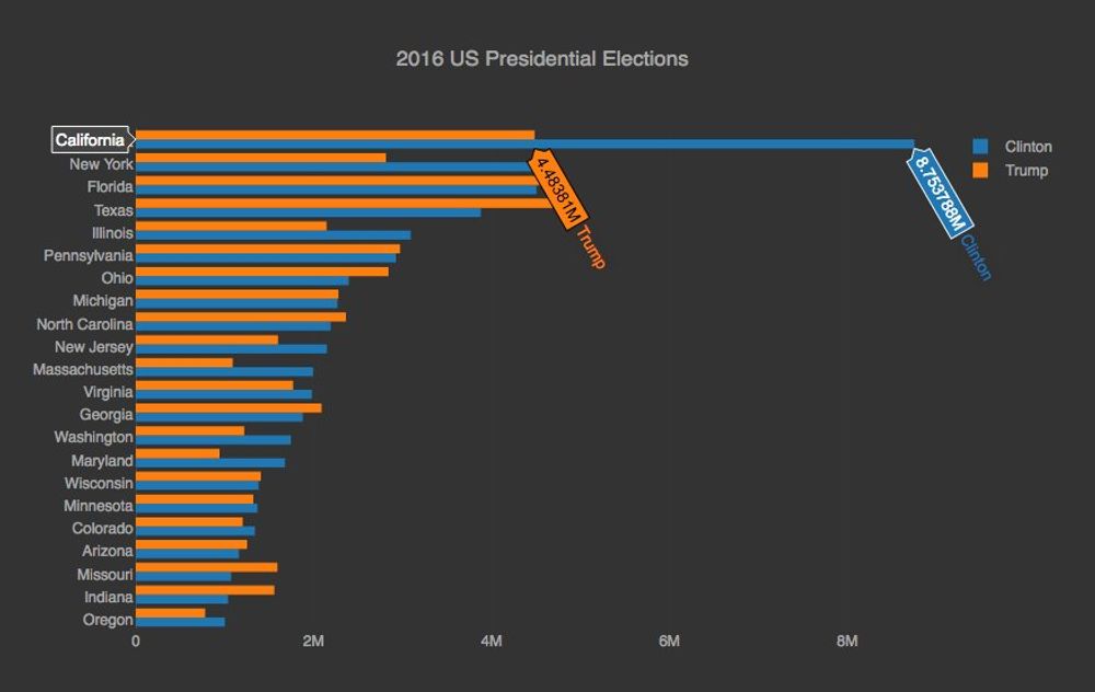
Looking at the final 2016 US presidential election results, it's remarkable how bad trump lost in California. 8.7 million vs 4.4 million votes. It's not surprising that on the days after the election the #calexit hashtag started to trend. Clinton won the popular vote, so many Americans will feel underrepresented based on the electoral college system they have in place, but nowhere this is more dramatic than in California.
Another Poll Miss
Nov 9, 2016
This morning I woke up very early feeling a bit uneasy. I started to follow the live US presidential transmission and then slowly, it began to be clear that the Republican nominee was going to win. I was mentioning a couple of days ago, the main danger with this outcome is that the nationalists groups might feel empowered to spread and promote their hate speech. I'm really hoping this won't happen. And it was definitely a complete poll miss. A dangerous one.
Last US presidential polls
Nov 7, 2016
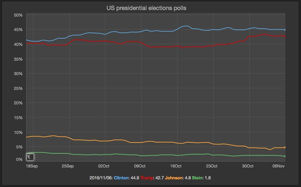
Alright, the last 4 way presidential polls still put Clinton slightly ahead. Crossing the fingers the lead will hold. Yesterday the FBI director sent a letter clarifying there was nothing new in the emails from last week, so I hope the voters in the US will be able to compare the flaws of the democratic nominee against the real sexists, racist, protectionist and xenophobic positions of the Republican nominee.
Hate Rising and the US elections
Oct 30, 2016
Yesterday I saw the excellent documentary "Hate Rising" (https://www.youtube.com/watch?v=gOsRktPBNhI), a film where the journalist Jorge Ramos, explores how the current US election has empowered white nationalist groups, leading to a rise of hate in that country, including attacks to minority communities. This documentary brought memories back of my mother because I'm sure she would be extremely disappointed. Before she got sick and passed away, she worked with the Girl Scouts of the USA, setting up programs to make the Latino girls proud of their heritage and to help all the girls to feel equal and part of one nation.
"The most important task in my job is to make one world, It's important for the Latinos and it's important for the American people.", my mom used to say. I have been following close the US presidential elections, not only because I have many relatives and friends living in that country, but also because I truly believe, its outcome will have important repercussions around the world.
If you don't want to live in a country where hate is normalized, where sexist and misogynist views come from the top of the leadership and where your liberties and rights get curtailed under the "law and order" sophism, please vote on this binary election!. As an European I followed the Brexit vote closely because I still think the European Union project has brought a lot stability and peace to this continent and I thought it would be bad for my adoptive Irish nation. As you know the yes camp won mainly on “immigration control” grounds and unfortunately the attacks against immigrants communities increased immediately after the vote. The future of this nation looks gloomy, since most of the promises of the yes camp where not attainable.
On the other hand as a Colombian I was extremely hopeful about the referendum to accept the peace agreements signed in Cuba to put an end to the oldest civil conflict in the Latino American continent. For the first time of the civil war the two sides were serious about ending the conflict and didn’t use the talks as an strategy of war.It pained my heart to see how a disinformation campaign orchestrated by the opposition, helped the No camp to obtain victory. Now this conflict affecting mainly the minority populations living in the most remote and poorest parts of the country, is in a very dangerous stalemated situation.
As an immigrant on the other side of the atlantic, I'm really hoping the people appearing in Jorge’s documentary are a minority and that they don't reflect the United States population overall. And I really hope the outcome of the US presidential election will reflect this statement.
So please don't fall into the fear trap and go out and vote to make a stand against the people attacking the diversity that’s so needed in this world.
US Incarceration rate
Oct 25, 2016
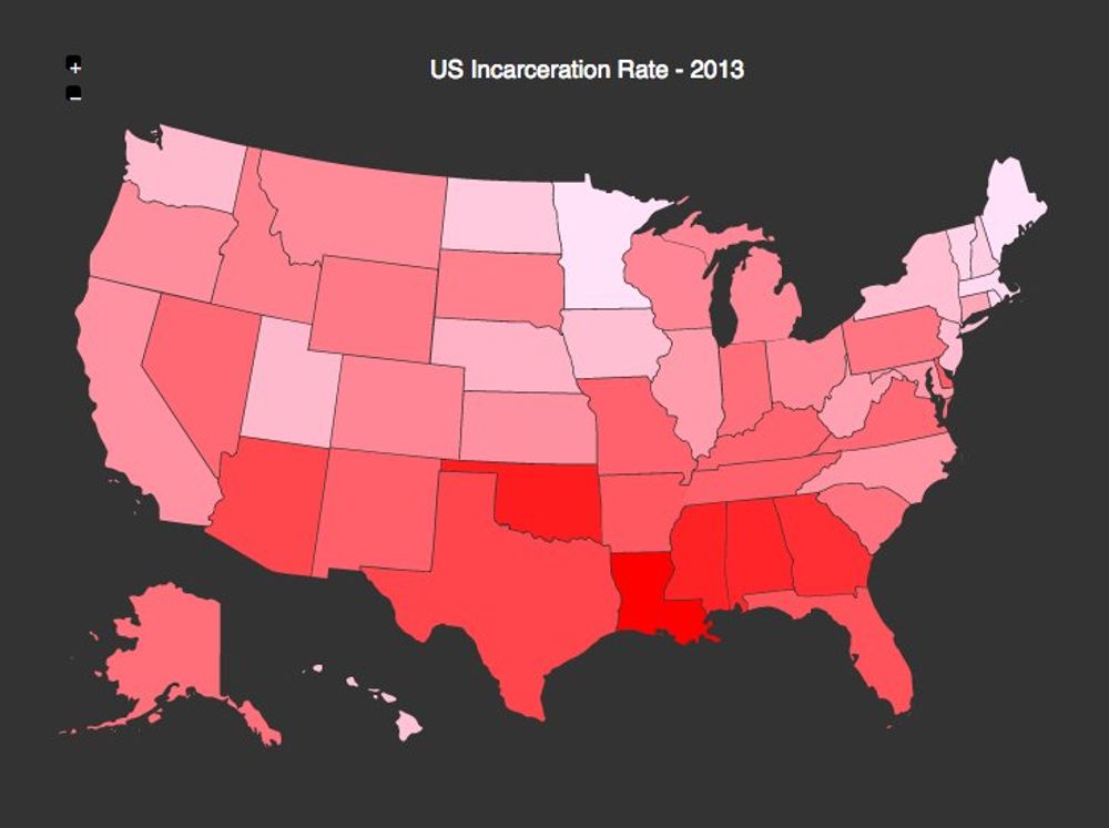
Reading about http://fortune.com/2016/10/06/13th-netflix-documentary-ava-duvernay/. The US incarceration rate is shameful. Particularly in the southern states of the country.
Women might defeat Donald Trump
Oct 14, 2016
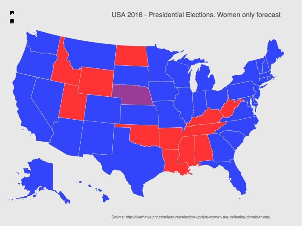
FiveThirtyEight, the interesting site focused on opinion poll analysis, has become of the most quoted sites in political news. A couple of days ago the published an interesting article on how the USA election electoral map would look like if only women voted, based on their polls models. It's interesting on how it would be landslide defeat of Donald Trump!
Clinton vs Trump First Debate
Sep 29, 2016
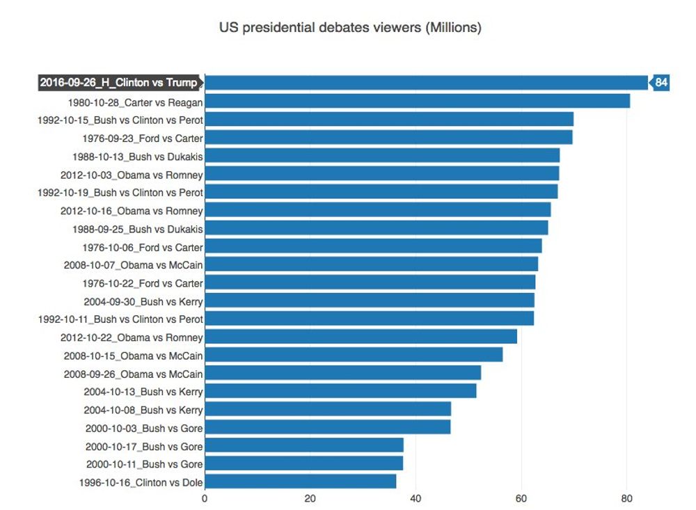
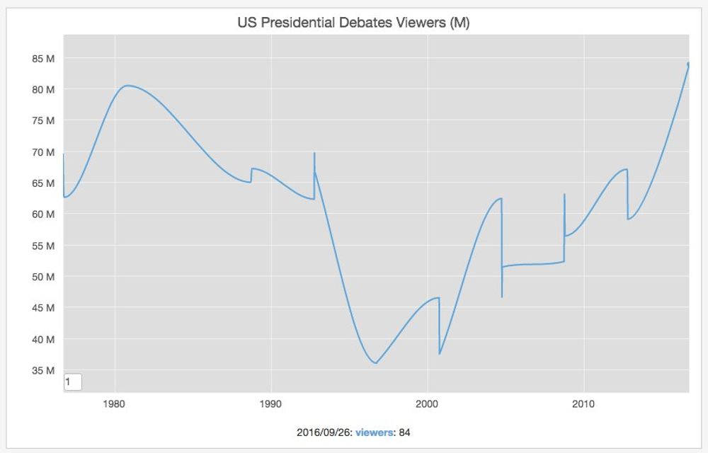
According to Nielsen, the presidential debates number of viewers are out, for the first debate between Trump and Clinton, and this was the most viewed debate in the history of the presidential debates (84 Million viewers). The second closest was the one that happened in 1980 between Reagan and Carter.
US Presidential Election Polls
Aug 16, 2016
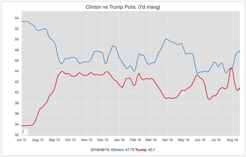
The US presidential election is far from over, since there are still some days ahead until November, but it's comforting to see evidence in the polls that Trump's divisive campaign is not 'winning' at all.
President Obama Approval Rate
Jul 28, 2016
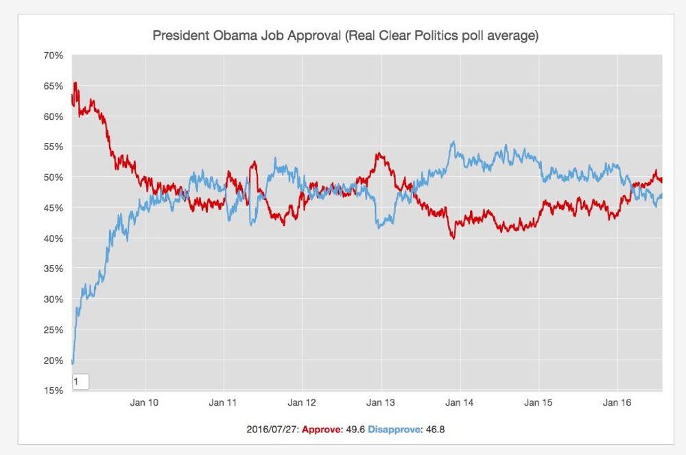
This morning I was reading in the fivethirtyeight site an interesting section dedicated to the US elections. They try to predict who will win the election based on the polls and historic data. They have been very accurate in the past so there are definitely an interesting source.
One of the articles linked on this site was a post titled why obama might be trump's biggest challenge where they discussed how president Obama is enjoying a high approval rate. The chart above is generated with the >>>Real Politics>"http://www.realclearpolitics.com/epolls/other/president_obama_job_approval-1044.html" data they were mentioning in the post.
US Violent Crime Drop
Jul 25, 2016
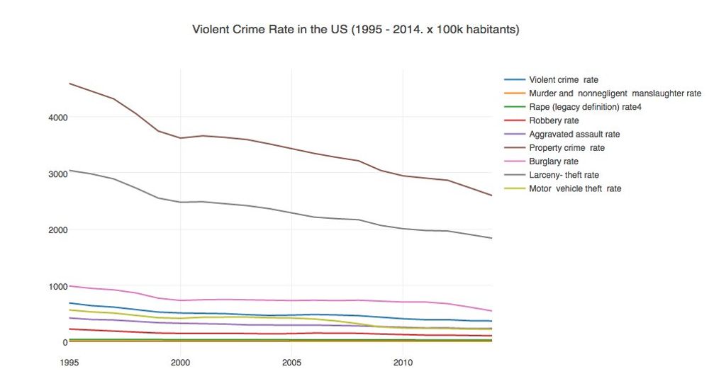
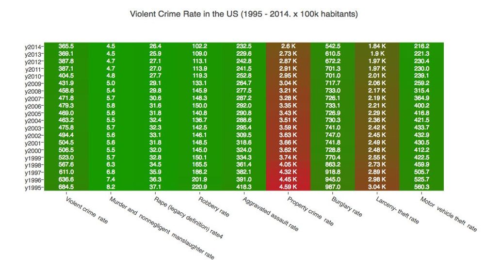
Last week tonight discussed how the RNC "fear" topic related to crime in the US was not backed by facts. The previous charts generated with FBI data support this.
Pokemon Go Madness
Jul 13, 2016
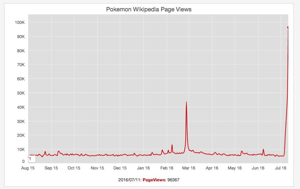
Last Monday we were chatting at the office how everybody is talking about this new augmented reality game: Pokemon Go. In a nutshell this game "allows players to capture, battle, and train virtual Pokémon who appear throughout the real world". I was checking the WIkipedia trends about the Pokemon page and its popularity has increased exponentially during the last 3 days.
Black Lives Matter
Jul 9, 2016
One of the most commented topics on the news this week were 2 separate incidents where black men were shot in what appear to be an excessive use of force by the police. Unfortunately these type of incidents have been a constant during the last years and that have led to the creation of Black Lives Matter, "an international activist movement, originating in the African-American community, that campaigns against violence toward black people"
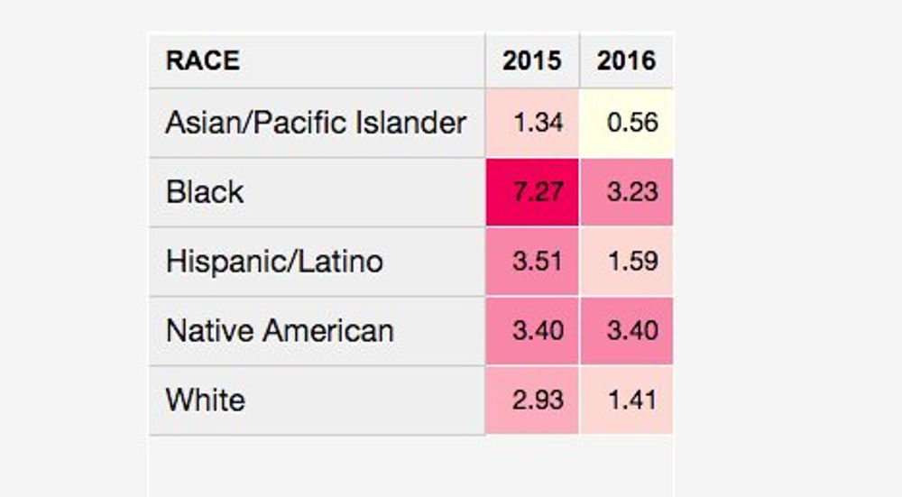
The guardian newspaper has a very interesting section where they track the total number of people killed in fatal shootings by the police in the US both in total and per million habitants. Using this data is clear that people from the black race proportionally died more frequently in those incidents than any other race in 2015 (and next to native americans in 2016).
If you read the numbers you will see the movement definitely has a point.
A head full of dreams in Berlin
Jul 1, 2016

Two days ago. Amazing Coldplay concert in the Olympia Stadium in Berlin.
Top UK artists in history
Jun 30, 2016
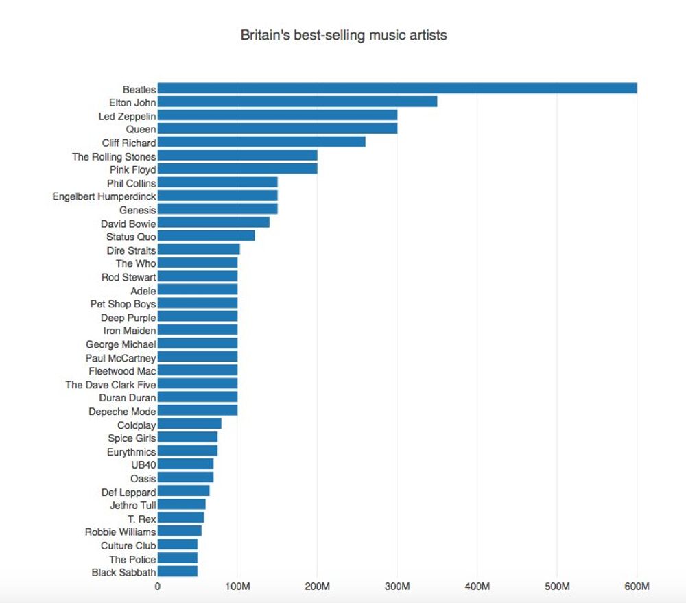
Interesting chart about the top UK selling music acts in history. Data from wikipedia
Newspaper jobs trend
Jun 4, 2016
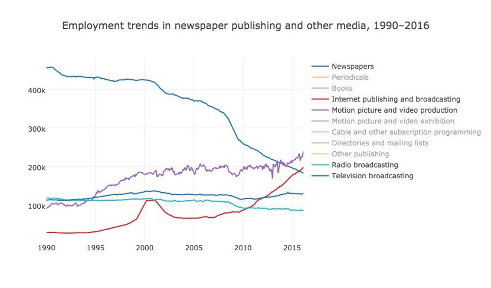
Some people were sharing an article today written with data coming from a very interesting US of Labor Statistics dataset, showing the publishing jobs trends.
The data shows how the information technology had a very important impact in the traditional publishing jobs, particularly in the newspaper industry, during the last 25 years.
US Wealth Redistribution through taxes
Jun 1, 2016
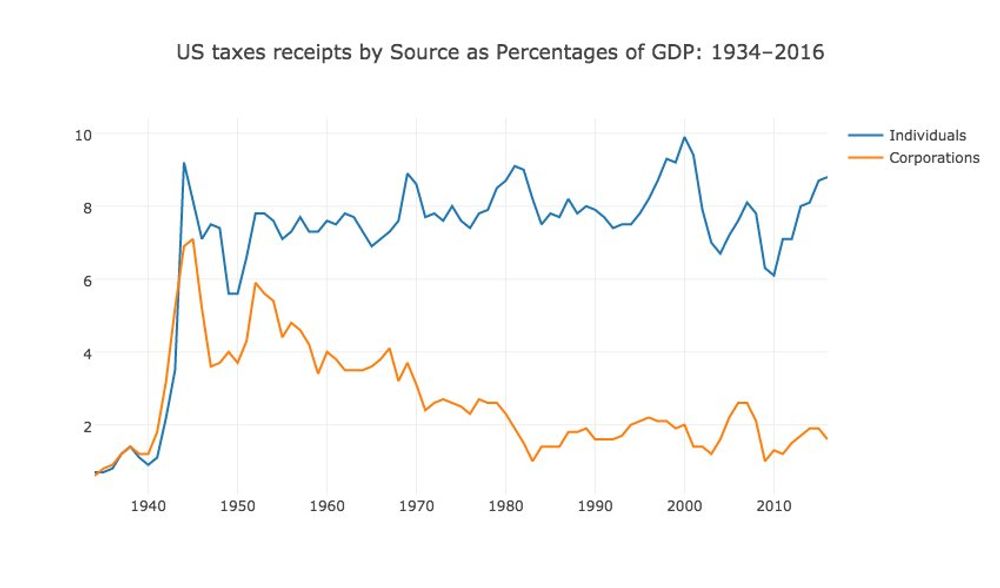
The Bernie Sanders campaign describe on his campaign website on the section Income Inequality of how Wall Street and the billionaire class has rigged the rules to redistribute wealth and income to the wealthiest and most powerful people of this country.
The white house publishes different [data tables](https://www.whitehouse.gov/omb/budget/Historicals/) related to the collected taxes and one of them shows the percentage paid by the individuals and corporations as percentage of the GDP over time.
Plotting this data in a time series shows that vermont senator clearly has a point.
Twitter Word Cloud Trump vs Sanders
May 15, 2016
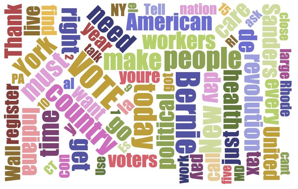
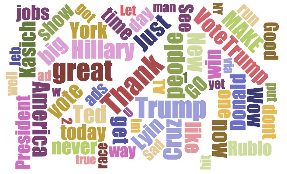
If you analyze the last 30 days of the tweeter feed between Trump and Sanders and plot the word frequency on a word cloud. It's revealing what do they candidates stand for. Guess which one belong to whom?
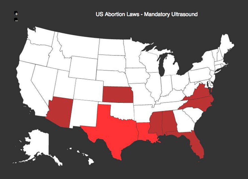
Abortion Restriction Laws In The US
Feb 26, 2016
The last episode of the excellent show Last Week tonight from John Oliver dealt with a very contentious issue in the US: <a href="https://www.youtube.com/watch?v=DRauXXz6t0Y". I really like the approach that he took on this matter, acknowledging there are different positions on this topic, but hammering the "hypocritical" laws that under the umbrella of protecting the "Women's health" target="_blank">The abortion laws crear barriers for people who need this medical procedure and unfortunately don't have the money to go somewhere else.
The next map shows the US states that had enacted laws to force the women requiring an abortion for see an ultrasound on the unwanted pregnancy:
Decline In Handwriting And Postal Volume
Feb 12, 2016
Yesterday evening I was listening a really cool Freakonomics podcast episode titled How needs handwriting . Stephen Dubner discussed the pros and cons of handwriting, its origins and the emphasis is still given in the high school system. Quite interesting.
I started to think that I use hand writing at work to draw schemas about the different pieces of a project or task that I need to accomplish, but it definitely has been a while since the last time I wrote a proper hand written letter.
I'm wanted to check if there was data about postal volume, because I guess the decline in handwriting has an impact on these numbers. I found two interesting sources:
- [UK Postal Museum](http://www.postalheritage.org.uk/explore/history/statistics/)
- [US Postal Services](https://about.usps.com/who-we-are/postal-facts/decade-of-facts-and-figures.htm)
Both sites show a decline in the number of total mail send. The decline is particularly dramatic after 2005:

Us Unemployment Rate - 2016
Feb 8, 2016
The US Bureau of Labor Statistics published the unemployment figures for the month of January and the rate is low: 4.9%. It's one of the lowest unemployment rate since the whole financial crisis of 2008. The rate is half of what it was in the peak of October 2009:
Even if those are very good news for the American people, on the other hand the increase on the wages is still sluggish. In the last quarter of 2015 the rate was 1.9%. It was around 3% before the crisis hit hard.
If I were American I would ask those questions to the presidential candidates.
US Presidential Democratic Primaries
Feb 6, 2016
Last night I was reading in Business Insider the headline about how Bernie Sanders just melted away a 30-point Hillary Clinton lead in a new poll, related to the US presidential elections. Wikipedia has a useful article where they track the different polls for both parties. The results of those polls are reported here on that page: Democratic Primaries.
It's true that the last poll conducted by the Quinnipiac University shows a preference of: Clinton: 44% and Sanders 42%, and with a 4.5% margin of error, they are virtually tied. There is even a newer one performed by "Reuter/Ipsos" showing a similar trend: Clinton: 48% and Sanders 45% (with a 5% margin of error).
It's fascinating to see how this candidate without any of the infamous [superpacs](https://en.wikipedia.org/wiki/Political_action_committee#Super_PACs) behind him has been able to attrack so much attention and how it has become a real contender in the US 2016 presidential elections.
US 30 Year Mortgage Rates
Feb 5, 2016
This morning I was reading on the news how the "Average 30-year mortgage rate falls for a 5th straight week" (3.72%)>. I was checking if the data was available to double check this headline. Fortunately the Federal Reserve Bank of St. Louis offers this data set on their website. It's called MORTGAGE30US and the data goes back all the way to 1971.
Looking at the data it's true that the 30-year mortgage rate has been falling during the last couple of weeks. Nevertheless it's not the lowest point in the graph. Actually last year, around the same time it was even lower (3.59%):
Gun Ownership Rate In The Usa
Jan 26, 2016
One of the constant topics in the news are the mass shootings in the United States and the debates related to gun control, the 2nd amendment of their constitution and the almost impossible effort to regulate this market. This is particularly true now that they have presidential elections at the end of this year.
So how does it look the gun ownership in this country compared to the rest of the world (gun ownership per 100 habitants):
I guessed the USA had the highest gun ownership rate and that turned out to be true, but I never realised how high it was. It seems crazy to me that a country has more firearms than habitants!. The Washington Post has an interesting article where they discuss this issue.